


Build a Web Form with HTML – Part 7
In this series on Web Forms, we’ve been learning how to create and style common form controls. In the last installment, we learned how to customize the standard elements.
Before we move on, however, you may want to refresh your memory by revisiting the previous articles in this series:
- How to Build Web Forms in HTML
- Building Web Forms in HTML: Part 2
- Styling Form Controls with CSS – Part 3
- CSS for Labels, Buttons, and Form Interactions – Part 4
- Styling Radio Buttons and Checkboxes in HTML Forms – Part 5
- Styling the Standard Select with CSS and HTML – Part 6
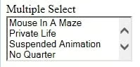
Creating a Multiple Select List in CSS
From an HTML perspective, all you have to do to turn a standard within a
<label for="multi-select">Multiple Select</label>
<div class="select select-multiple">
  <select id="multi-select" multiple>
    <option value="MIaM">Mouse In A Maze</option>
    <option value="PL">Private Life</option>
    <option value="SA">Suspended Animation</option>
    <option value="NQ">No Quarter</option>
    <option value="11:11">11:11 Ultimate Edition</option>
    <option value="UV">Ultraviolence</option>
    <option value="TC">The Core (with outro solo)</option>
    <option value="TK">Telekinetic Killer</option>
    <option value="ALL">All of the above</option>
    <option value="NONE">None of the above</option>
  </select>
  <span class="focus"></span>
</div>
Here is our song list with no styling whatsoever:
General Select Styling in CSS
All of the styles that we employed previously to customize the standard element using the CSS appearance attribute, we now have to set the focus border ourselves. As we did last time, we’ll employ a CSS variable for the color:
select:focus + .focus {
  position: absolute;
  top: -1px;
  left: -1px;
  right: -1px;
  bottom: -1px;
  border: 2px solid var(--select-focus);
  border-radius: inherit;
}
Now, tabbing to the multi-select list shows this:
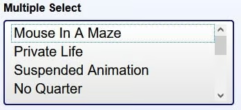
There is also a border around the first option (not added by us) so that the user can navigate through the items using the UP and DOWN arrow keys.
Disabling Selects
The handling of disabled selects must also fall upon our shoulders. To do that, we’ll add the select-disabled class to the
<!-- Multi-select -->
<div class="select select-disabled select-multiple">
  <select id="multi-select-disabled" multiple disabled>
    <!-- options -->
  </select>
</div>

<!-- Standard Select -->
<div class="select select-disabled">
  <select id="standard-select-disabled" disabled>
    <!-- options -->
  </select>
</div>
Using our .select-disabled class, we can alter the select’s appearance to give it that “greyed out” look:
.select-disabled {
  cursor: not-allowed;
  background-color: #eee;
  background-image: linear-gradient(to top, #ddd, #eee 33%);
}
When one hovers the cursor over the disabled select, the it turns into a “not-allowed” cursor, which is a red circle with a line through it, sort of like the Ghost Busters logo.
Behind the scenes, the disabled attribute that we added to the elements. In the next and final article of the series we’ll change gears by integrating JavaScript into an HTML form to make it more interactive.
