Part 2: Select, Radio/Checkbox, and Button Elements
HTML forms have become ubiquitous as organizations try to connect with their customers. Therefore, it is imperative to learn about them for anyone learning how to build websites and/or web apps. In this short series on HTML Forms, we’re familiarizing ourselves with form controls by building one that accepts the user’s contact details for a hypothetical newsletter subscription or site membership. In part 1, we learned how to use the Form, Input, and Label Elements. In this installment, we’ll cover the Select, Radio/Checkbox, and Button controls. Then in part 3, we’ll learn how to employ CSS and JavaScript to enhance our form.
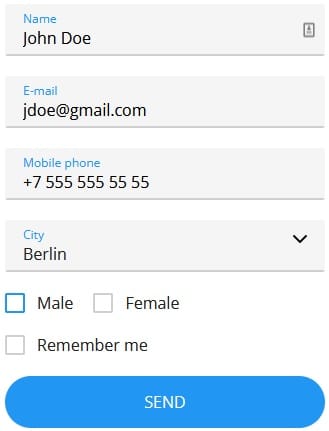
The Demo Revisited
You’ll find the completed form on codepen.io:

It’s really just a fork of Konstantin Bychkov’s project. He added a few CSS and JavaScript enhancements to make his form stand out from your run of the mill HTML Form.
The <select> Element in HTML
As the tag name suggests, the <select> element is used to create a drop-down list from which the user may select one or more items. The <option> tags inside the <select> element define the available choices within the drop-down list. It’s a good control to use when you have anywhere between three and about fifty items to present to the user.
Here is the HTML markup for the City <select> element in our form:
<select class="form-select__select">
  <option selected disabled>Choose your city:</option>
  <option>Tokyo</option>
  <option>Rome</option>
  <option>Paris</option>
  <option>Berlin</option>
  <option>Oslo</option>
  <option>Toronto</option>
  <option>Tulsa</option>
  <option>New York</option>
  <option>Washington DC</option>
  <option>Vienna</option>
  <option>Other</option>
</select>
Know Your Options
The <option> tag supports a couple of extra attributes – a couple of which are used in the “Choose your city” option. These are the selected and disabled attributes:
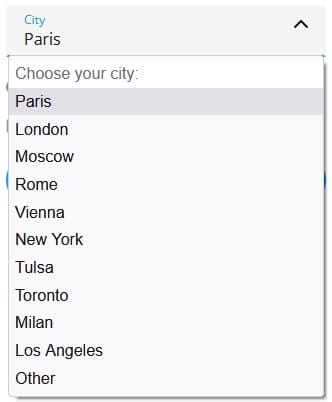
- selected sets the option text that will appear by default, i.e. before the user makes a selection. Here it is in our form:

- Setting the disabled attribute prevents the user from selecting that option. It’s useful for options that provide placeholder information. You’ll notice that disabled options are grayed out in the drop-down list:

We already covered the <input> element in part 1. As alluded to there, the <input> element is the most versatile of all form controls. How versatile? Just take a look at how many controls it covers:
- <input type=”checkbox”>
- <input type=”color”>
- <input type=”date”>
- <input type=”datetime-local”>
- <input type=”email”>
- <input type=”file”>
- <input type=”hidden”>
- <input type=”image”>
- <input type=”month”>
- <input type=”number”>
- <input type=”password”>
- <input type=”radio”>
- <input type=”range”>
- <input type=”reset”>
- <input type=”search”>
- <input type=”submit”>
- <input type=”tel”>
- <input type=”text”> (default if no type attribute provided)
- <input type=”time”>
- <input type=”url”>
- <input type=”week”>
We won’t be covering every one of those here, but we are including the “checkbox” and “radio” types in our form for the Gender and “Remember me” fields, respectively.
Let’s start with the radio buttons, since they appear first in our form. Radio buttons are normally presented in a group which pertain to a set of related, but mutually distinct, options (like Gender). Being distinct, only one radio button in a group can be selected at the same time.
Take a look at our two gender radio buttons in the source code:
<div class="form-checkbox">
  <label class="form-checkbox__label">
    <input class="form-checkbox__input" type="radio" name="gender">
    <span class="form-checkbox__text">Male</span>
  </label>
</div>
<div class="form-checkbox">
  <label class="form-checkbox__label">
    <input class="form-checkbox__input" type="radio" name="gender">
    <span class="form-checkbox__text">Female</span>
  </label>
</div>
Here they are again with all of the class attributes removed for easier readability:
<div>
  <label>
    <input type="radio" name="gender">
    <span>Male</span>
  </label>
</div>
<div>
  <label>
    <input type="radio" name="gender">
    <span>Female</span>
  </label>
</div>
We can see how members of the same radio group are defined via the name attribute, or, more specifically, by the the name attribute value. In our case, both share the name of “gender”. Selecting any radio button with the same name automatically deselects any other selected radio button. You can have as many radio groups on a page as you want, as long as each group has its own name.
Although we aren’t using it, the optional value attribute defines a unique value associated with each radio button. The value is not visible to the user, but is the value that is sent to the server on form “submit” that identifies which radio button was selected. This value tends to correlate with an ID in the database.
The checkbox is shown as a square box that is ticked (checked) when activated. Similar to radio buttons, checkboxes are employed to let a user select one or more options of a limited number of choices. The key phrase there being that “one or more” checkboxes within a group may be selected (We don’t see that behavior in our form because we only have the one checkbox).
Here is the “Remember me” checkbox in the HTML markup:
<div class="form-checkbox">
  <label class="form-checkbox__label">
    <input class="form-checkbox__input" type="checkbox">
    <span class="form-checkbox__text">Remember me</span>
  </label>
</div>
And again without the classes:
<div>
  <label>
    <input type="checkbox">
    <span>Remember me</span>
  </label>
</div>
There are actually two ways to define a clickable button:
- Using the <button> tag:
<button class="btn">Send</button>
- Using the <input> tag with a type of “button”:
<input type="button" value="Send">
The difference is that, inside a <button> element, you can include tags like <i>, <b>, <strong>, <br>, <img>, etc., in addition or instead of text. That is not possible with a button created with the <input> element because the value attribute can only accept a string (text).
In this installment of the Build a Web Form with HTML series, we covered the Select, Checkbox, and Button controls. In part 3, we’ll learn how to employ CSS and JavaScript to enhance our form.


