Part 3: Styling Form Controls with CSS
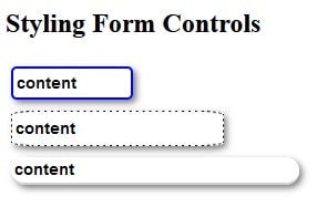
In this series on Web Forms, we’ve been learning how to use various form controls to collect data from your users. In the first and second installments we focused mainly with HTML, which determined the raw building blocks of the form. Today, we’ll be changing gears and turning our attention to the role of CSS in customizing the appearance HTML forms. To do that, we’ll apply various CSS properties to three text input fields.
You can find the first two parts in this series below:
Popular CSS Properties
There is a wealth of CSS properties that can make form fields more attractive. Here are a few of the most common ones:
- Padding/Margin
- Border
- Box shadow
- Border radius
- Width/Height
- Font
The rest of this article will cover each of these properties in more detail.
Padding and Margin in CSS
Padding and Margin are two very similar properties. Padding is used to create space around an element’s content, whereas margins are used to create space around elements.
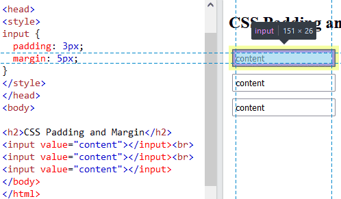
Adding some inner (padding) and outer (margin) space to the input field can help give everything a little breathing room. Here are some input fields with padding of 3 pixels (shown in purple) and a margin of 5 pixels (shown in yellow):

Border in CSS
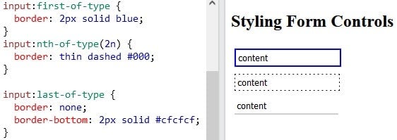
The border property is a line that delineates the outer edge of an element. They come in all sorts of colors, thickness, and styles, which include solid, dashed, double, and many more. If you look at the text inputs above, you’ll see that they have a thin grey border. We can easily change that via the border property.
Borders are made up of three components, as alluded to in the preceding paragraph. There are: the width, style, and color. There are distinct properties for each of these, but we’ll use the shorthand border property in order to set all three at once!

In the last example, all except the bottom border are removed, which gives the user the impression of writing on a line in a notebook.
Box shadow in CSS
Simply put, the CSS box-shadow property applies shadow to elements. In turn, this gives elements a more three dimensional appearance. It accepts many parameters, but the ones we’ll be using are:
- h-offset: The horizontal offset of the shadow. A positive value puts the shadow on the right side of the box, a negative value puts the shadow on the left side of the box.
- v-offset: The vertical offset of the shadow. A positive value puts the shadow below the box, a negative value puts the shadow above the box.
- blur: Optional. The blur radius. The higher the number, the more blurred the shadow will be.
- color: Optional. The color of the shadow. The default value is the text color.
Here are the three input fields with a box-shadow applied:

Border Radius in CSS
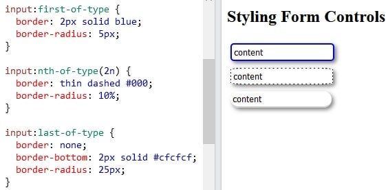
The CSS border-radius property can give any element the popular “rounded corners” effect. All you need to do is pass it a number with units or percentage; the larger the number, the more rounded the corners. There are properties for each corner, but we’ll give all four corners the same treatment.
We can see its effect on our three input fields below:

Height and Width in CSS
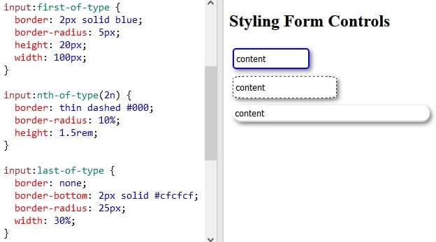
As you may have guessed, the height and width properties are used to set the height and width of an element. Just keep in mind that the height and width properties do not include padding, borders, or margins. Hence, they set the height/width of the area inside the padding, border, and margin of the element.
It accepts a value that may be either absolute or relative. Examples of absolute values would include “20px” and “2cm” while “20” and “1.5rem” are examples of relative values. Both types are shown in our demo below:

Fonts in CSS
Most browsers use a different font family and size for form elements, so it’s a good idea to define your own if you want them to have a consistent look across browsers. You can either inherit the font from your document rule(s) or define the font at the form level using the special inherit value. Here’s a rule that sets the font-family, font-size, and font-weight properties:
input {
  font-family: inherit;
  font-size: inherit;
  font-weight: inherit;
}
So let’s unpack each of these and go over what each property accepts as a value.
font-family
Browsers support a limited number of fonts, so you should specify multiple fonts to be on safe side. The CSS font-family property defines the priority for the browser to choose from multiple fonts. There are two general types of font families which you can use:
- a specific type of font like Arial, Verdana, Tahoma
- a general font such as “serif, Sans-serif”. These enjoy almost universal support across all major browsers.
Examples include:
- “Times New Roman”, Times, serif
- Arial, Helvetica, sans-serif
- “Lucida Console”, “Courier New”, monospace
font-size
The font-size property accepts both absolute and relative size units. Hence, “40px”, “2.5em”, and “100%” are all valid values.
font-weight
The font-weight defines how thick or thin characters in text should be displayed. Its value can either be a number from 100 to 900 as well as a predefined constant such as “normal”, “bold”, “bolder”, and “lighter”.
Let’s apply some font rules to our demo:
font-family: Arial, Helvetica, sans-serif;
font-size: 14px;
font-weight: 600;

You’ll find the demo for this tutorial on codepen.io.
Going Forward
In the next installment, we’ll learn how to apply CSS to other types of form controls.


