


Build a Web Form with HTML – Part 6
In this series on Web Forms, we’ve been learning how to create and style various form controls. In the last installment, we learned how to style radio buttons and checkboxes by first hiding them using the appearance CSS property. We’ll once again be putting the appearance property to use in order to customize the appearance of the <select> element. It’s a tough one for several reasons. For starters, the control is made up of several sub-components. Moreover, it can also be displayed as a list in order to accept multiple selections. Finally, the Select’s appearance should change when disabled. Today’s article will cover the standard <select> element, while the next one will cover the multiple <select> as well as how to disable custom controls.
Before we move on, however, you may want to refresh your memory by revisiting the previous articles in this series:
- How to Build Web Forms in HTML
- Building Web Forms in HTML: Part 2
- Styling Form Controls with CSS – Part 3
- CSS for Labels, Buttons, and Form Interactions – Part 4
- Styling Radio Buttons and Checkboxes in HTML Forms
Anatomy of a Standard <select>
As you can see in the image below, the standard <select> element consists of several constituent parts, including a read-only text field that shows the currently selected item, an arrow icon, and a drop-down list:
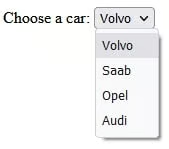
In terms of markup, the <select> contains a number of options. These make up the items that appear in the drop-down list, when you click on the down arrow, or any part of the text field. Here’s the markup for a <select> that lets the user choose a favorite single from a completely random music artist:
<label for="standard-select">Standard Select</label>
<div class="select">
  <select id="standard-select">
    <option selected disabled>Make a selection</option>
    <option value="MIaM">Mouse In A Maze</option>
    <option value="PL">Private Life</option>
    <option value="SA">Suspended Animation</option>
    <option value="NQ">No Quarter</option>
    <option value="11:11">11:11 Ultimate Edition</option>
    <option value="UV">Ultraviolence</option>
    <option value="TC">The Core (with outro solo)</option>
    <option value="TK">Telekinetic Killer</option>
    <option value="ALL">All of the above</option>
    <option value="NONE">None of the above</option>
  </select>
  <span class="focus"></span>
</div>How to Reset CSS Styles
As we did with radio buttons and checkboxes previously, we will remove the native control using the appearance attribute. The following CSS will remove the dropdown arrow as well:
select {
  // styles reset, including removing the default dropdown arrow
  appearance: none;
  -webkit-appearance: none;
  -moz-appearance: none;

  background-color: transparent;
  border: none;
  padding: 0 1em 0 0;
  margin: 0;
  width: 100%;
  font-family: inherit;
  font-size: inherit;
  cursor: inherit;
  line-height: inherit;

  // Stack above custom arrow
  z-index: 1;

  // Remove focus outline, will add on alternate element
  outline: none;
}
The padding is a short-hand property that sets a value to each of the <select>’s four sides, whereby:
- top padding is 0 (note that units are not required for zero values)
- right padding is 1em (the em unit is relative to the font-size of the element, thus 1em means the same size as the current font)
- bottom padding is 0
- left padding is 0
Adding Our Own <select> Styles
The next set of rules customize the appearance of our <select> by targeting the <div> that encloses the <select> element:
But before we get to that, here’s something in the CSS that you may not have seen before:
:root {
  --select-border: #393939;
  --select-focus: #101484;
  --select-arrow: var(--select-border);
}
These are CSS variables. They are really useful for defining colors that you’d like to use in a few places. The var() method reads the variable value. You can see the –select-border variable being read below:
.select {
  width: 100%;
  min-width: 15ch;
  max-width: 30ch;
  border: 1px solid var(--select-border);
  border-radius: 0.25em;
  padding: 0.25em 0.5em;
  font-size: 1.25rem;
  cursor: pointer;
  line-height: 1.1;
  background: linear-gradient(to bottom, #ffffff 0%, #e5e5e5 100%);
}
The ch is a CSS unit that is relative to the character width of the “0” (zero). Hence, a value of 15ch is 15 times the width of the character “0“.
Here’s our <select> at this point:
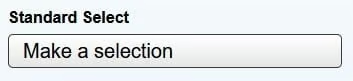
Notice that it’s still missing the down arrow. Let’s add it now.
Creating the Custom Arrow in CSS <select>
To render the drop-down arrow, we’ll be using a modern CSS property called clip-path. Clip paths let us make all sorts of shapes by “clipping” the otherwise square and rectangular shapes we get as defaults for most elements. Prior to the clip-path attribute, SVG would have been the go-to solution. However, it doesn’t work well as a background because we can’t alter its appearance in any way without redefining the SVG entirely. It would not support the use of CSS custom variables either.
We’ll define the arrow as an :after pseudo-element of the .select <div>:
.select {
  //custom select rules...

  //Custom arrow
  &::after {
    content: "";
    justify-self: end;
    width: 0.8em;
    height: 0.5em;
    background-color: var(--select-arrow);
    clip-path: polygon(100% 0%, 0 0%, 50% 100%);
  }
}
You may be wondering what the &::after does. It’s part of Sass (Syntactically Awesome StyleSheets), which is a CSS extension that compiles to straight CSS. It makes CSS easier to code and eliminates a lot of duplication. It does that – at least partially – through nesting. The ampersand character refers to the parent selector when nesting.
Positioning the Arrow
In order to accommodate the :after‘s width, we have to update the .select rule to use a CSS grid layout. Then, to position the arrow, we’ll define a grid-template-areas called “select” and add a rule that assigns it to the <select> element and ::after content. The grid-template-areas property specifies areas within the grid layout. You can name grid items by using the grid-area property, and then reference the name defined by the grid-template-areas property:
.select {
  display: grid;
  grid-template-areas: "select";
  align-items: center;
  position: relative;

  select,
  &::after {
    grid-area: select;
  }

  min-width: 15ch;
  max-width: 30ch;
  //etc...
}
We can now tell the .select to align-items in the center (see above snippet), while aligning the ::after content at the “end” via the justify-self attribute:
//Custom arrow
&::after {
content: "";
justify-self: end;
//etc...
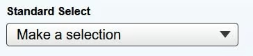
}Here at last is the finished result:
You’ll find the demo for this tutorial on codepen.io.
Conclusion
In this installment of the Build a Web Form with HTML series, we utilized several new CSS properties, including appearance and grid-template-areas in order to customize the appearance of a standard <select> element. The next article will cover the multiple <select> as well as how to disable custom controls. The series finale will change gears to expound on the role of JavaScript in making HTML forms more interactive.
