


Implementing search engine optimization (SEO) techniques is crucial to ranking high on Google and other search engines so you can drive traffic, expand your brand’s reach, increase sales, and more. But, since more users are accessing the web on their smartphones more than ever, mobile SEO is just as essential as its traditional counterpart.
Today, we will explain what mobile SEO is and how it differs from traditional SEO, plus reveal some of its best practices and tools for implementation.
You can learn more about traditional SEO techniques by reading the following digital marketing guides:
What Is Mobile SEO?
Mobile SEO is the process of optimizing your website and ensuring it provides a solid user experience for visitors who view it through their smartphones or tablets. In short, you want your site to look, and perform, well on smaller devices, just as if it was being viewed on a laptop or desktop. By making your site mobile-friendly and optimized, you can gain better placement in the search engine results pages (SERPs). This can result in greater visibility, more visitors to your site, and increased sales and conversions, plus other benefits.
Why is Mobile SEO Important?
The primary reason why mobile SEO is so important is the significant shift towards web usage on smartphones and tablets. According to StatCounter, mobile usage took 58 percent of the market share in 2021. It looks to continue its domination over desktops well into the future as people increase their need to access information on the go. While standard SEO is crucial, you must ensure your site is optimized for mobile, since statistics show that at least half of your potential visitors will probably come from that source.
Another reason behind mobile SEO’s importance is Google. The tech giant is easily number one in the search engine landscape. Need proof? In April 2022, SimilarWeb found that Google accounted for nearly 94 percent of the mobile search engine market. In other words, most of your mobile SEO efforts should be aimed at ranking high on Google, and since the search engine switched to a mobile-first index, that indicates that you need to target smartphone and tablet users most. What is mobile-first indexing? It is using a page’s mobile content instead of its desktop version to determine search engine ranking.
Voice search is another area where the importance of mobile SEO is on display. Mobile search is on the rise, and voice search is not far behind. What makes voice search so appealing to users? It is convenient and quicker than having to type in a query while staring at your phone. And although voice search can be accessed in a desktop setting, it is much more likely to be used on a smartphone when someone is out and about and needs information quickly. What makes voice search appealing to marketers and business owners? The fact that many businesses are still ignoring voice search despite its growth in popularity. Use mobile SEO to optimize for voice search, and you could grab a significant piece of a relatively untapped market.
What about sales? Mobile SEO can also boost them greatly, as Google found that most users research products and services on their smartphones or tablets before investing their money. And, while it looks like mobile is the preferred environment for pre-sale research, many users are also completing transactions via their on-the-go devices. In 2017, Google found that 40 percent of users preferred completing their entire shopping journey on mobile, from the research stage to making a purchase. Now, you can expect that number to be much higher.
Mobile SEO vs. Traditional SEO
Mobile SEO differs from traditional SEO in several key ways. And, while both are essential to building your brand and boosting your visibility, you should know the main differences between the two, so you can see their importance and work them into a single comprehensive digital marketing strategy.
If you had to pick one area where mobile SEO and traditional SEO differ most, it would have to be location. Users are typically on their mobile phones when seeking local results. For instance, if you are hungry and want to find a place to eat, you will probably look for it while on your phone and in the car versus sitting in your home in front of your laptop or desktop computer. Google can tell what type of device you are using to search, and in doing so, it can tweak its search engine results for optimal accuracy.
How can Google tell where you are to provide accurate local results? By using the GPS data on your mobile device. Search engines can see such data and use it to give the exact results you want without doing too much manual research. Desktop devices also have location monitoring, but are seen as less relevant than mobile in this regard. In short, if you are using a mobile device to search for something, your location will probably have a bigger impact on the results you see compared to if you were on a desktop.
Here is an example of how your location can determine your search engine results. Imagine you are planning a trip to Paris from your home in New York City. You want to make a list of must-see restaurants in Paris while using your laptop. The results you will get will differ from those if you performed the same search on your smartphone while in Paris, as the second scenario would likely be a lot more location-intensive.
The same holds true with pay-per-click (PPC) ads. Google uses your current location to decide which ads to show. If you are using your laptop at home, you will probably see the same range of ads repeatedly. But if you are on the road and using your smartphone, you will likely see different ads as your location varies. You can learn more about PPC by reading our guide What is Paid Search?
Your location is just one way in which mobile and traditional SEO differ. Another is screen size. The size of your smartphone or tablet’s display can determine what SERP layout you see after inputting a query. Search engines have various SERP layouts that depend on your device’s model, so the results you see on your smartphone could look different from those on your desktop.
What you see on one smartphone could differ from another model. As for the search queries themselves, Google can fit them all regardless of what device you are using.
Your device’s operating system is another example of how mobile and traditional SEO differ. If you are targeting keywords related to mobile applications, you will need to focus on mobile SEO since Google will detect the device’s OS so it can show the most relevant results. For instance, if a user is searching for an app on Google via their Android device, the search engine will show the app packs that are Android-compatible versus ones for iOS. If this was not the case, the Android user could be overwhelmed with irrelevant results that are not compatible with their device. Will you see such app packs when browsing on a desktop? Probably not since device operating systems only impact mobile search results since many apps are not desktop-friendly.
Want to understand more about local SEO and its best practices? Check out our ultimate guide to Local SEO Tips for Web Developers.
Is Your Site Mobile-Friendly?
Before we jump into mobile SEO best practices, let us discuss how you can first check if your site is mobile-friendly. Doing so will let you know where you stand so you see how much work needs to be done.
There are plenty of SEO tools that can help you determine your site’s mobile-friendliness. Two come from Google.
Up first is the Mobile-Friendly Test. It asks the very simple question of “Is your web page mobile-friendly?” To find out, enter your URL or paste code to test. Doing so will help you see how easily a user can access your page on a mobile device.
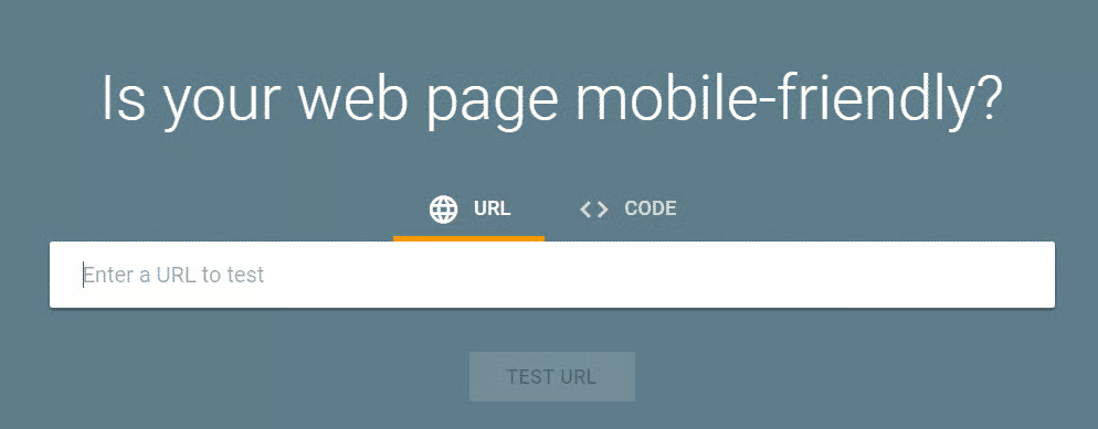
The results will tell if your page is mobile-friendly and detail any issues that need to be fixed. From there, you can tackle each issue until your page is where it should be in terms of mobile-friendliness.
A second way to test your site’s mobile-friendliness is through the Google Mobile Usability report. It shows you which pages on your site have usability issues when viewed on smartphones and tablets. You can see all of the pages with mobile problems through the top level view, and you can dive deeper into those issues to see how to fix them. You will need to go into your Google Search Console account to access the Mobile Usability report. Like the Mobile-Friendly test, it is free.
Looking for other search engine optimization tools? Check out our list of Best SEO Software and Tools (Paid and Free).
Mobile SEO Best Practices
Now that you know why mobile SEO is important and how it differs from traditional SEO, here are some of its best practices you can follow to give your smartphone and tablet users a positive experience and enhance your placement in the SERPs.
User Experience for Mobile SEO
In 2020, Google stressed the importance of page experience as a ranking factor. Through great page experiences, visitors can engage more and accomplish what they intended to do. On the flip side, negative page experiences can lead to lost time, frustration, and the need to continue searching for the information they seek. Create a solid page experience for your users on mobile, and they will likely keep coming back to your site. And in the process, Google will reward you for it with a better ranking.
How can you improve your page experience for mobile users? You can start by making sure that your content is easily readable, regardless of the device that is being used. If someone cannot decipher what they are looking at on their screen, they will bounce off your site quite quickly. To ensure optimal readability, do the following:
- Use high-contrast text so visitors can see it easily despite any changes in environmental lighting.
- Implement negative space between page elements and text for better readability.
- Avoid long paragraphs or walls of text. Use shorter paragraphs that span 2-3 lines so readers can easily scan and absorb the content.
- Use a 15px or 16px font size. You may also want to use a bolder font that is easier to pick up on smaller screens.
While your text should be readable, your mobile site should also be scrollable. Can a visitor easily scroll through your site and click on links or elements using their thumb? If not, adjust for a more thumb-friendly design.
What about navigation? It is another essential part of the mobile user experience, and your user should feel comfortable when navigating your site on their smartphones or tablets, just as they would if on a laptop or desktop. In going back to the thumb-friendly design, you will need to space your clickable elements so someone does not accidentally click on a link. This can happen if your clickable elements are too close together. Beyond offering sufficient spacing, also make sure that anything to be clicked is not too compact. If it is, people with larger digits could have trouble getting to their intended destination.
Speaking of clickable elements, you cannot forget your calls to action (CTAs). They are essential for conversions, as CTAs entice the user to take a desired action, such as making a purchase. Your calls to action should be easily noticeable and easy to click. If not, do not be surprised if your conversions suffer.
Another important part of the mobile user experience is the proper implementation of forms and fields. It can be more difficult to fill in forms on a smaller device, so only ask for essential information. The fewer form fields you have, the better. Other ways to make your forms and fields mobile-friendly is to use placeholder text, discard dropdown menus, and denote any fields that are optional.
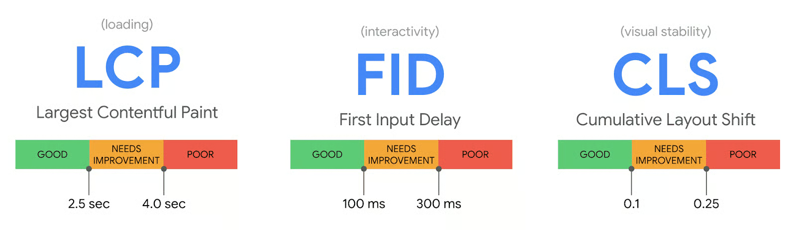
We have two great articles discussing Google’s Core Web Vitals that can help you ensure your users are getting the best user experience possible: Google Web Vitals for Beginners and Core Web Vitals Tips are both great places to get started.
Page Speed
According to past Google research, just a one second delay in mobile load time can impact conversions by 20 percent. And if your page speed is extremely slow, it can lead to a customer bouncing from your site and directly to a competitor’s. In short, your mobile page’s speed is highly important and must be optimized to ensure customer satisfaction and higher rankings. And besides that statistic that shows the importance of page speed as it pertains to customers and conversions, it is also crucial in Google’s eyes since it is a ranking factor.
How can you see if your mobile site speed is up to snuff? One handy tool is Google’s PageSpeed Insights. It can tell you where your speed stand, but more importantly, suggest why it could be running slow and what you could do to fix it. Can you use other tools to test your site speed? Absolutely, but PageSpeed Insights is a great place to start since the tool comes from Google itself.
Beyond using PageSpeed Insights to check your site speed, you can also do the following for faster mobile pages:
- Take a close look at your plugins and website extensions. Only keep the ones you need, as excessive plugins can slow down your site. To see if any plugins or extensions are bogging you down, run tests with and without them running to see if there is a difference.
- One place where you should not try to skimp on costs is with your website hosting provider since you need minimal server response time, and the web host plays a big part in that. Research web hosting providers and pick one that minimizes lethargic performance and slow server response times. If you do not and aim for the cheapest provider, you will probably have to upgrade later on anyway once you notice your site’s performance and ranking taking a hit. We have a great list of the Best Web Hosting Providers that can help you choose the best web host for your website.
- Many visitors love to see videos on sites, as it lets them absorb info in the background without having to dedicate time to reading content. However, if not properly implemented, video can slow down your site significantly. To avoid slow speeds due to video issues, replace animated GIFs with videos. Embed video and animated content with HTML5, and avoid loading video content with Flash. We have some great tips for video SEO in our tutorial: YouTube SEO Guide.
- Videos can keep your customers happy, and so can images. But like videos, images can slow down your site if not properly implemented. We discuss how to optimize images for mobile SEO in a separate section below.
- Do not overdo it with redirects. They can help in certain situations, but too many of them will slow down your site.
- Use HTTP caching, as it can greatly increase site speed for your return visitors. With caching, browsers save page resources for first-time visitors. The next time they come to your site, they will not have to wait as long for your page to load, as all of the CSS, test, scripts, images, etc. will be saved and ready to go.
Check out our tutorial on How to Optimize Your Website Performance for more tips on how to improve website speed.
CSS and JavaScript Considerations
You want to make sure that
your website’s code is up to snuff and free of any flaws. Your CSS, HTML, and JavaScript must be optimized and compressed to achieve maximum performance. Several tools can help you achieve this “minification” goal to minimize code and markup in your pages. Google recommends the following:
- HTMLMinifier for HTML.
- CSSNano and csso for CSS.
- UglifyJS and Closure Compiler for JavaScript.
Images and Mobile SEO
A fast website will be tough to achieve without image optimization. And, since images can take up a ton of disk space and bandwidth, you will need them to be compressed if you do not want your site and the user experience to suffer. How much can your site suffer if it loads slow due to non-optimized images and other factors? Incredibly, as Think With Google found that if a mobile site takes longer than three seconds to load, it will make 53 percent of visitors head elsewhere.
Besides being compressed, you want your images to be responsive so they can automatically scale with the device’s size whether the user is on mobile or desktop. You also want them to be clear on every device.
How can you achieve all of these goals? You could begin by compressing your images to their optimal sizes either manually or with a plugin like Imagify. You could also serve responsive images with proper dimensions and use the Google WebP image format. WebP will make your images smaller and lightweight, but they will also appear richer while speeding up your site. Statistics show that by using WebP, you can save 25 percent or more storage than if you used the PNG or JPEG formats.
Lazy loading is another way to accelerate your mobile page speed via optimized images. It does this by delaying the loading of large elements such as images until they are needed when browsing on a mobile device. You can implement lazy loading via a free or premium plugin. If you have a WordPress site, Lazy Load by WP Rocket, Autoptimize, and Optimole are three free examples.
If you want to save up to 80 percent in image file size to optimize your site’s speed, consider a CDN or content delivery network. Many consider CDNs a must on mobile since they create a shorter connection distance between the original server and the user. Thanks to the shorter connection distance from the CDN, you can enjoy decreased latency and faster load times.
As technology advances, you may forget that some users are still on slower connections. You should keep any potential 3G users in mind and create smaller images for such situations as slow connections can lead to frustrating load times, especially when pictures are involved. For 3G users, compress the images and use lazy loading for any pics below the fold.
Learn all about Technical SEO and how it can improve your site’s ranking in the SERPs.
Meta Data, Titles, and Tags
Due to the smaller screen sizes, mobile searches display less info than their desktop counterparts, as there is not as much room to do so. As such, you must optimize your meta data, meta titles, and meta description tags for mobile by putting all the essential info and keywords towards the front so nothing critical gets cut off.
We have a great guide on SEO Headers: Best Practices and Tips.
Structured Data
Google will have an easier time understanding what type of content you have on your mobile site if you use schema markup aka structured data. It is code that is the language of search engines and can result in better placement in the SERPs.
Mobile Responsive Design
Google slowly but surely showed the development world that mobile was going to be a huge factor in its ranking algorithm. It all started in 2015 when Google launched a mobile-friendly algorithm.
In May 2020, it launched a huge user experience update containing new metrics for responsiveness, speed, and visual stability. Then, two months later in July 2020, Google made mobile-first indexing official.
After all of these announcements, it became quite clear that your search engine rankings will not reach their potential if you are not stressing mobile responsiveness when creating your sites. Luckily, you have three options to do so, with the first being responsive design.
What is responsive design? It is a mobile setup where the same HTML code gets sent to all devices via one URL address. From there, the content adapts to the width of the user’s screen thanks to pre-defined breakpoints and fluid grids. If the page’s rendering needs to be altered according to the target device, the CSS code will do so.
If implemented, responsive design is automatically recognized by Google’s algorithm when the Googlebot crawls the page and all of its CSS and JavaScript assets, plus images.
Using responsive web design offers several benefits that may lead you to choose it over the other two options, which are to set up a separate mobile site or use dynamic serving. Perhaps the biggest benefit of mobile responsive design is that it is less costly and quicker to develop and maintain. It uses just one URL for all devices, and takes less work to optimize for search engines. Responsive design is also more accessible since you do not have to worry about URL redirection or device detection.
While it offers many benefits, mobile responsive design has its downsides. When it comes to user experience, responsive design offers less flexibility. If you do not plan its implementation carefully, you could fall short when trying to optimize your mobile and desktop sites. Responsive design often results in slower page load speeds, and it could result in data bloating that causes your users to download unnecessary info.
What Is Dynamic Serving?
Another option for mobile responsiveness is dynamic serving. With this method, the user’s device gets detected and redirected at the server level, and your site will feature different CSS and HTML codes on the same URL.
Dynamic serving can be implemented in two ways: Unidirectional redirecting and bidirectional redirecting. Unidirectional redirecting has a site’s links set to the desktop version by default. If a user on a mobile device tries to access the site, they will get redirected from the desktop version to the mobile one. Bidirectional redirecting employs adaptive content and has code on desktop and mobile sites. So, no matter what device the user has, they will get the information they need.
The benefits of dynamic serving are numerous. Its faster and easier for SEO and offers a completely personalized user experience since its layouts can serve a wide variety of devices. Page load speed is faster with dynamic serving, plus it is easier to adjust if you want to leave everything the same and only tweak data for a specific screen size. Complex annotations are not necessary with dynamic serving, and users will experience less confusion due to the use of a single URL. Lastly, dynamic serving offers tons of flexibility when creating landing pages for devices of all shapes and sizes, from tiny smartphones to larger tablets and massive smart TVs.
What are the downsides to dynamic serving? It can cost a lot to implement and maintain, as you will need a knowledgeable IT staff on hand to manage any content changes and source code requirements.
Dedicated Mobile Websites
Besides responsive design and dynamic serving, you could also create a dedicated mobile website to appease your smartphone and tablet visitors. With this setup, you would create a separate domain solely for your mobile traffic, which would likely feature the exact same content on different URLs.
Some say creating a dedicated site is similar to dynamic serving since both employ developing content strictly for mobile devices. They are not the same, however, since dedicated mobile sites do not use redirection at the server level due to having distinct URLs.
You have probably come across dedicated mobile sites while browsing the web, as they have similar URLs to the desktop versions but with minor tweaks.
And those tweaks are what determine the type of content that should be displayed according to the user’s device.
For example, you could use the following to denote a dedicated mobile site:
- Mobile subdomain: m.site.com
- Different domain: site.mobi
- Subfolder: site.com/mobile
While in different formats, all serve the same purpose, which is to display mobile content.
Why create a dedicate mobile website? In terms of SEO, it gives you a better chance to rank higher in local searches. You can also provide a better user experience if you specifically optimize the site for mobile devices. Dedicated sites often have faster page speeds, offer easier access, and give you more options in terms of navigation, content, page copy, etc. you can provide. Plus, there is no need for backward compatibility when dealing with older desktop browsers.
Is creating a dedicated mobile site your best choice? Not if you are working with a limited budget, as it costs more to implement and maintain. And unless you do it yourself, you will have to pay others to handle the extra marketing and SEO efforts. Responsiveness will still be an issue due to tons of mobile devices with varying display sizes and resolutions. And lastly, a dedicated mobile site could present problems with cross-linking between different platforms and user redirecting.
Now that we have gone over the three options for mobile responsiveness, which is best? If you are going by Google’s standards, you can eliminate dedicated mobile sites right off the bat. Why? Because the company says it is way too difficult to implement and maintain. What is Google’s top pick for mobile-friendliness? Responsive design since it is fast and easy to implement, but in the end, you will have to weigh the pros and cons of each method before picking one, as even Google’s top choice has the major downside of lackluster site performance since it uploads desktop and mobile elements in the same place.
Tools for Mobile SEO
More people are leaning on their smartphones and tablets to browse the web. Combine that fact with Google’s mobile-first indexing, and it is rather obvious that you will need to spend more time implementing mobile SEO practices, if you have not already. What can make your mobile SEO strategy easier to implement? The following mobile SEO tools.
Google Test My Site

Google Test My Site makes its main function clear on its homepage: “Improve your mobile site to boost your business.” How? By entering your domain URL to see your mobile site speed in your country via a specific connection (like 4G or 3G). You can get a rating on your speed (Good, Needs Improvement, or Poor) and see if it has changed since the last quarter. And if you want to dive deeper to see how to optimize your mobile site, Google will help with a full report featuring a complete list of recommendations.
Google Analytics
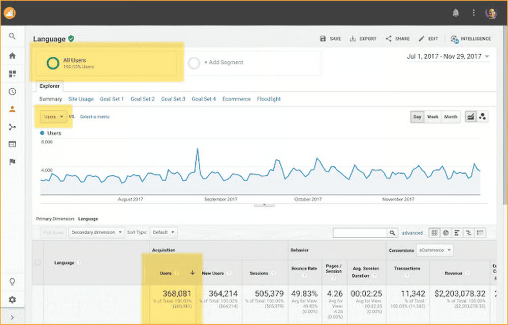
If you want to compare mobile versus desktop traffic for your site, Google Analytics can help. It gives you instant insight into traffic according to device category (desktop, mobile, tablet), bounce rate, and more. And you can use that data to create reports and pie charts to see whether desktop or mobile deserves more of your attention.
Google Search Console
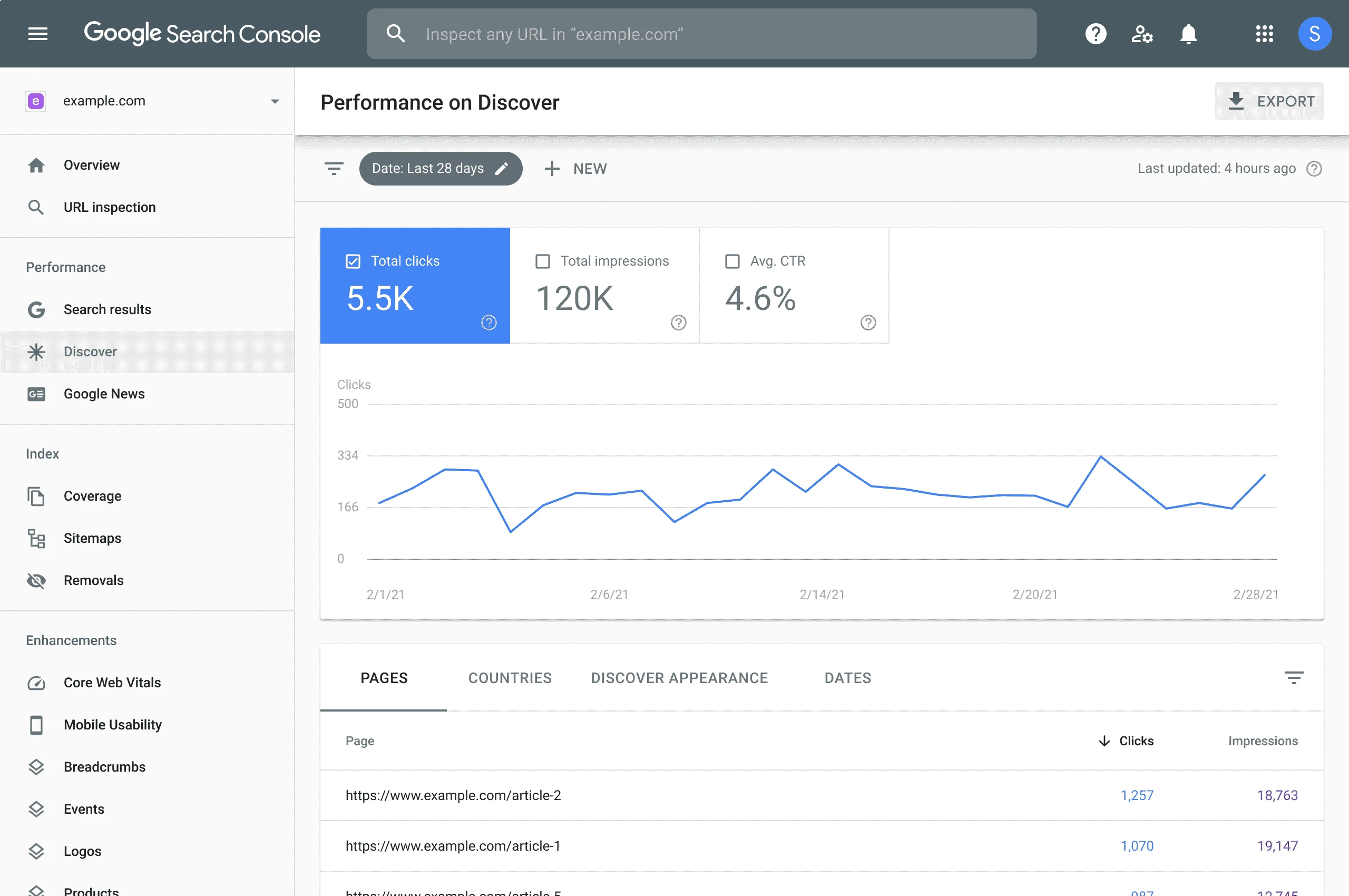
The Mobile Usability report in Google Search Console pinpoints pages with excessive mobile issues. You can view details on each issue and recommendations on how to fix them.
Mobile Friendly Test
Another mobile SEO tool from Google is Mobile-Friendly Test. Enter your URL or a snippet of code to see if it is optimized for mobile visitors. If all is good, the test will reveal that your page is mobile-friendly. If not, it will let you know that the page is not mobile-friendly and why, such as:
- Content wider than screen.
- Text too small to read.
- Clickable elements too close together.
- Uses incompatible plugins.
- Viewport not set.
Mobile-First Index Checker
Zeo’s Mobile-First Index Checker Tool will let you know within seconds if your pages are ready for mobile-first indexing. The tool works as an on-page SEO tool, plus will show you any differences between your mobile and desktop site in terms of internal links, images, metadata, structured data, etc.
Mobile-First Index Tool
Merkle created the Mobile-First Index Tool. It can tell you if your site is ready for Google’s mobile-first index by comparing your desktop and mobile pages to see if there are any discrepancies between structured data, content, and SEO signals. The tool will also see if your site is mobile-friendly using Google’s API.
Tools for Responsive Design
If you are looking for responsive design tools to make your website mobile-friendly, try the following. Each offers different features that can provide a more enjoyable user experience for mobile users, resulting in an SEO boost to help you land higher in the rankings.
Justinmind
Justinmind is a drag-and-drop responsive design tool for Mac and Windows that lets you create wireframes, highly interactive prototypes, and more without the need for coding.
Wirefy
Web designers and developers can use Wirefy to create fast and manageable wireframes, which help you see what your site will look like, with ease.
FlowType
When designing a site, text if often overlooked by developers. With FlowType, digital marketers can create responsive text to get the optimal character count per line for any screen width.
Adaptive Images
Made for responsive design, Adaptive Images automatically detects user screen size to create, cache, and deliver re-scaled versions of a web page’s embedded images without the need for any markup changes.
Bootstrap

Bootstrap is a frontend toolkit helps you build fast and responsive websites through the use of Sass, a prebuilt grid system and components, and potent JavaScript plugins.
Multi-Device Layout Patterns
If you are trying to figure out the best layout for your site’s content on mobile, give Multi-Device Layout Patterns a try. It has multiple layouts you can test to see which meets your needs.
Stackrole
If you are looking for some free templates to build a mobile site, you will find them via Stackrole.
SEO Tools and Software
Looking for more traditional SEO tools and search engine optimization software? Check out the following guides to different types of digital marketing tools to find the best options for your needs:
