When web developers build forms in any Internet application, it is a must to apply validation. Validating forms is a crucial process in any application development process because it helps to prevent security threats or junk data in your database. Applying validations on the server-side can be performed conveniently through a framework or developer tools used in the backend. On the front-end, however, it is sometimes painful for developers to validate forms as it involves lots of effort. You are also required to use lots of JavaScript libraries for HTML form validations as well, increasing the knowledge and effort involved.
To overcome this issue, HTML5 gives us a number of features to validate forms. These features can handle most of your validation needs without requiring any JavaScript code. HTML5 also makes it easier to control styling with CSS. In addition, it also provides built-in validation features through the use of special attributes and new input types.
Read: Introduction to HTML5 Forms
Below is a list of some of the new input types and associated attributes featured in HTML5:
- number
- email
- search
- tel
- url
- range
- color
- date
- month
- week
- time
New attributes introduced in HTML5 include:
- required
- autofocus
- autocomplete
- placeholder
- minlength
- readonly
- pattern
- list
Knowing the new HTML5 input types and attributes is necessary to validate forms. We cover this process in our next section.
The ‘required’ attribute in HTML5
By simply adding the required attribute to any <input>, <textarea>, or <select> element, you tell the browser that some value is required in this field:
<form>
<span>Name</span>
<input type="text" name="name" required>
</form>

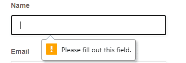
When a user tries to submit this form without entering the required field, it will show a warning message or it simply prevents the form from being submitted.
You can also use the required attribute on checkboxes, radio buttons, and select dropdowns. With that applied on a form field, a form control with a blank value cannot be submitted.
Read: How to Build a Web Form with HTML
Limit Number Values on HTML5 Forms
With HTML5, now you can set the limits on the maximum and minimum values for numbers. For instance, this method prevents any string longer than the field’s max limit from being entered. If you try to paste a string which exceeds the limit of the field, the form will clip the string accordingly.
If you are using a text field or textarea, then you need to use the maxlength attribute instead:

The patterns Attribute in HTML5
The patterns attribute allows web developers to use regular expressions. When this attribute is applied, it tells the browser to compare the value of regex with the input supplied by the user; if it matches, then only the form can be submitted. Regular expressions are primarily used for filtering data and provide great control over input entered into web forms.
The following code snippet shows how to use regular expressions in HTML5 forms:
<input type="password" required pattern="^(?=.*\d)[0-9a-zA-Z]{6,}$" title="Password should be a minimum of 6 character long and must contain at least one number">

In this example, a regular expression is applied to a password field, which tells the browser to only accept the password which contains at least 6 characters, with at least one numeric value. This is how the pattern attribute uses regular expressions to filter data.
Styling with CSS in HTML5
CSS3 comes with handy pseudo-classes which allow us to style any form field depending on its state. These classes are as follows:
- :valid
- :invalid
- :required
- :optional
- :in-range
- :out-of-range
- :read-only
- :read-write
To understand how these CSS pseudo-classes work, consider the following code example:
<form>
<span>Age</span>
<input type="number" name="age" min="18" required>
</form>
<style type="text/css">
  input:focus:invalid
        {
            border:1px solid #F5192F;
            box-shadow:0 0 4px #F5192F;
        }
</style>

For input that is valid, you can use the following styles:
<style type="text/css">
        input:focus:valid,
        {
            border: 1px solid #64C364;
            box-shadow: 0 0 4px #64C364;
        }
</style>

Read: Styling Radio Buttons and Checkboxes in HTML Forms
HTML5 introduced some new input types. These input types are user-friendly and work perfectly on mobile-based browsers, as well as, desktop-based browsers. They were invented for accepting only specified data. Here is the list of some frequently used HTML5 input types:
- url
- color
- date
- search
- tel
- time
To use any of these input types, you can include them as the value of the type attribute. For instance, take a look at the following code snippet:
<input type="url" placeholder="Enter your Website" required>
Note that some of the input fields, such as “tel” and “email” behave differently on a mobile device. They will cause a mobile device to open a specific keyboard with a limited number of keys, and not the full QWERTY keyboard. Another thing to take note of is that if any specific input type is not supported on a browser, it will simply behave as a regular text input field on that browser.
We hope this post helped you to get up to speed with validating HTML5 forms. Thanks for reading!


