The modal window is a smart dialog that is displayed over the parent window to interact with the users of the Web site. It’s quite useful in getting a user’s attention fully to convey some message or get their feedback because it retains the focus until the user dismisses it. In the Create Modal Dialogs using the Bootstrap Modal Plugin article, we learned how to employ jQuery Bootstrap’s excellent Modals plugin to create a variety of responsive modal dialogs. In this follow-up, we’ll explore how to customize Bootstrap Modals to position them, as well as change their appearance in a number of ways.
Changing the Modal Position
Although Modals typically display in the center of the viewport, there is no reason why you can’t have it open in a specific region, for example, near the edge of the screen. You can set the top, bottom, left, or right attributes to specific values such as 50px or percent like 5%:
#customPositionModal {
  top:5%;
  right:50px;
  outline: none;
}
Changing the Modal Size
Although, as of Bootstrap 3.1.0, there are three pre-defined Modal widths to choose from – default, small and large – but you certainly are not bound by them. In fact, you can assign any width by targeting the .modal-dialog class:
.modal-dialog  {
  width: 75%;
}
Using CSS media queries, you can choose different widths based on the viewport size. In the following example, large screens will trigger the @media query rule of 50% width:
.modal-dialog  {
  width: 75%;
}

@media screen and (min-width: 768px) {
  .modal-dialog {
    width: 50%;
  }
}
Maximum Responsiveness using JavaScript
If media queries are still not dynamic enough for your purposes, you can step up to full scripting using to the ‘show.bs.modal’ event. It fires immediately when the show() instance method is called.
Here’s an admittedly slightly contrived example that displays the Modal width as defined in the stylesheet. This offers the advantage of being able to express the width in the original unit type – i.e. pixels, EMs, or percentage. There’s also the challenge of knowing which of the two values are being used, i.e. the media query width of 75% or default width of 50%. I solved it using a combination of matchMedia() and type test on the parent rule. Unfortunately, JS does not have an exclusive OR (XOR) condition operator so I had to mimic it using the mql.matches === true || mql.matches === false pattern. As you can see, testing for a rule that is enclosed by a media rule is fairly simple thanks to the parentRule and type attributes. There is even a constant type of CSSRule.MEDIA_RULE to compare against. Like any good search function, once we’ve got our rule, it’s important to break from the loop so that it doesn’t continue on with the remaining rules:
$('#customSizeModal').on('show.bs.modal', function() {
var rules = document.styleSheets[1].rules || document.styleSheets[1].cssRules;
for (var i=0; i<rules.length; i++) {
var rule = rules[i];
if (rule.selectorText == '#customSizeModal .modal-dialog') {
var mql = window.matchMedia("screen and (min-width: 768px)");
if ( (mql.matches === true
&& rule.parentRule
&& rule.parentRule.type === CSSRule.MEDIA_RULE )
|| (mql.matches === false && !rule.parentRule) ) {
$(this).find("#width").text(rule.style.getPropertyValue("width"));
break;
}
}
}
});
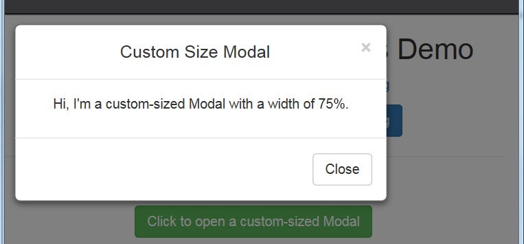
Here is the Modal in a small(ish) viewport with the correct width value of 75%:
Think of the all-white look of the Modal as a blank canvas for you to express yourself upon. Each Modal section – header, body and footer – may be enhanced with the addition of other special classes. For instance, there are Contextual Classes for panels named .panel-default, .panel-primary, .panel-success, .panel-info, .panel-warning and .panel-danger.
The catch is that the above contextual classes must be applied to the parent element and not to the modal-header itself. You’ll also have to add the following special class to the header element. It retains the rounded corners:
.panel-heading {
    border-top-left-radius: inherit;
    border-top-right-radius: inherit;
}
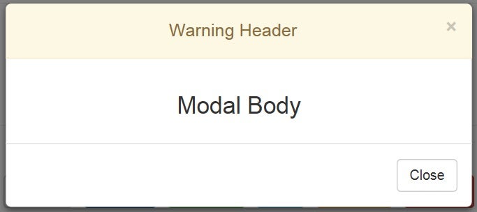
Here is a Modal that includes the panel-warning class:
<div class="modal fade" id="customHeaderModal" tabindex="-1"
    role="dialog" aria-labelledby="customHeaderModal" aria-hidden="true">
  <div class="modal-dialog">
      <div class="modal-content panel-warning">
          <div class="modal-header panel-heading">
          <button type="button" class="close" data-dismiss="modal" aria-hidden="true">×</button>
          <h4 class="modal-title" id="myModalLabel">Warning Header</h4>
          </div>
          ...
That will produce a Modal like this one:
Reusing the Same Modal
There’s no need to declare a bunch of modals for every type of message you might want to display. You can reuse the same one with a little help from JavaScript (and jQuery).
We already saw how to use the ‘show.bs.modal’ to customize a Modal’s appearance. Now let’s take a look at how to change the panel-* classes based on the source element that launched the Modal.
What I didn’t mention thus far with respect to the ‘show.bs.modal’ event, is that the JS event object is passed to it. As it happens, the MouseEvent has an attribute called “relatedTarget” that returns the element related to the element that triggered the mouse event. We can use it to check which link or button launched the Modal and set the panel-* class and heading text accordingly:
$('#customHeaderModal').on('show.bs.modal', function(event) {
var label = $(event.relatedTarget).text().trim();
$(this).find('.modal-content')
.swapClass(/\bpanel-\w+\b/,
'panel-' + label.toLowerCase())
.find('.modal-title').text(label + ' Header');
});
Note that swapClass() is a custom function. Follow the demo link at the end of this tutorial to examine its code.
The event.relatedTarget attribute will return one of the color-coded links or buttons below:
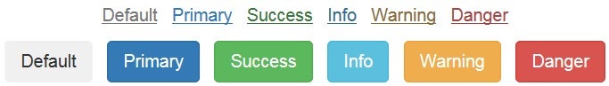
<p><a href="#"
data-toggle="modal"
data-target="#customHeaderModal"
class="text-muted">Default</a>
<a href="#"
data-toggle="modal"
data-target="#customHeaderModal"
class="text-primary">Primary</a>
<a href="#"
data-toggle="modal"
data-target="#customHeaderModal"
class="text-success">Success</a>
<a href="#"
data-toggle="modal"
data-target="#customHeaderModal"
class="text-info">Info</a>
<a href="#"
data-toggle="modal"
data-target="#customHeaderModal"
class="text-warning">Warning</a>
<a href="#"
data-toggle="modal"
data-target="#customHeaderModal"
class="text-danger">Danger</a>
</p>
<p><button type="button"
class="btn btn-muted"
data-toggle="modal"
data-target="#customHeaderModal">
Default
</button>
<button type="button"
class="btn btn-primary"
data-toggle="modal"
data-target="#customHeaderModal">
Primary
</button>
<button type="button"
class="btn btn-success"
data-toggle="modal"
data-target="#customHeaderModal">
Success
</button>
<button type="button"
class="btn btn-info"
data-toggle="modal"
data-target="#customHeaderModal">
Info
</button>
<button type="button"
class="btn btn-warning"
data-toggle="modal"
data-target="#customHeaderModal">
Warning
</button>
<button type="button"
class="btn btn-danger"
data-toggle="modal"
data-target="#customHeaderModal">
Danger
</button>
</p>
Conclusion
The demo beautifully demonstrates positioning, sizing and how easily one can change the header’s appearance using some JS scripting. Modals can do a lot more than display a message to the user. Next time, we’ll learn about other uses for Modals, as well as how to include visual elements like Glyphicons.


