Create Modal Dialogs using the Bootstrap Modal Plugin
Bootstrap’s tremendous popularity among mobile app developers can in part be attributed to its outstanding responsiveness and many ready-to-use components and plugins. Without a doubt, one of the most useful jQuery Bootstrap plugins is Modal. It provides a declarative means of showing a window that forces the user to interact with it before they can go back to using the web app. It can be anything from an alert box to one that contains several buttons for prompting the user to make an important decision. In today’s tutorial, we’ll learn how to create a variety of modal dialogs using Bootstrap 3.
Declarative Design at Work
The biggest advantage to using a declarative approach is that you, the developer, don’t have to write any JavaScript code to use it. All the code and styles are predefined by Bootstrap and invoked via HTML5 custom data-* attributes. We’re going to use two custom data attributes: data-toggle and data-target. The toggle sets the command for Bootstrap to execute and the target assigns the element that holds the modal’s elements. Hence, clicking a link or button with a data-toggle value of “modal” and a data-target of “basicModal” will open a modal version of the “basicModal” DIV.
<!
<a href="#"
data-toggle="modal"
data-target="#basicModal">Click to open Modal</a>
<!
<button type="button"
class="btn btn-primary btn-lg"
data-toggle="modal"
data-target="#basicModal">
Click to open Modal
</button>
Now let’s examine the markup for our basicModal DIV:
The modal DIV needs to be contained within a parent DIV having the same ID as we used in the trigger elements above. In our case it would be “basicModal”.
The dialog itself is made up of a content DIV nested inside a parent modal DIV. Inside the content DIV are three distinct dialog sections: the header, body, and footer. The header contains the title as well as the “X” close button. Directly below it is the modal body. A perk of Bootstrap is that the body may contain just about any kind of HTML elements, including embedded YouTube videos, images, or even a text message. The footer is right aligned by default and usually contains buttons such as Close, OK, Yes, No, or Save. However, like other Modal sections, the footer can contain whatever you like.
The “aria-labelledby” and “aria-hidden” attributes are included for greater accessibility and are used by tools such as screen readers. It’s a good practice to always include these attributes in order to make your web apps as accessible as possible.
<div class="modal fade" id="basicModal" tabindex="-1"
    role="dialog" aria-labelledby="basicModal" aria-hidden="true">
  <div class="modal-dialog">
      <div class="modal-content">
          <div class="modal-header">
          <button type="button" class="close" data-dismiss="modal" aria-hidden="true">×</button>
          <h4 class="modal-title" id="myModalLabel">Basic Modal</h4>
          </div>
          <div class="modal-body">
              <h3>Hi, I'm the basic Modal.</h3>
          </div>
          <div class="modal-footer">
              <button type="button" class="btn btn-default" data-dismiss="modal">Close</button>
        </div>
    </div>
  </div>
</div>
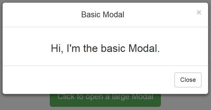
Here’s a screenshot of our basic modal in action:
Setting the Modal’s Width
Bootstrap 3.1.0 introduced two new modal sizes that affect the modal’s width: Large and Small. These are activated by adding either the “modal-lg” or “modal-sm” modifier class to the modal-dialog DIV. These produce a larger or smaller modal respectively.
<!
<p><a style="font-size:1.2em;" href="#"
data-toggle="modal"
data-target="#largeModal">Click to open a large Modal</a></p>
<!
<p><button type="button"
class="btn btn-success btn-lg"
data-toggle="modal"
data-target="#largeModal">
Click to open a large Modal
</button></p>
<br/>
<!
<p><a style="font-size:0.9em;" href="#"
data-toggle="modal"
data-target="#smallModal">Click to open a small Modal</a></p>
<!
<p><button type="button"
class="btn btn-success btn-sm"
data-toggle="modal"
data-target="#smallModal">
Click to open a small Modal
</button></p>
Here is the markup for the large and small Modals. You can see that the IDs match those above and the inclusion of the modal-lg and modal-sm classes on the modal-dialog DIV:
<! -- Large Modal -- >
<div class="modal fade" id="largeModal" tabindex="-1" role="dialog" aria-labelledby="largeModal" aria-hidden="true">
<div class="modal-dialog modal-lg">
<div class="modal-content">
<div class="modal-header">
<button type="button" class="close" data-dismiss="modal" aria-hidden="true">×</button>
<h4 class="modal-title" id="myModalLabel">Large Modal</h4>
</div>
<div class="modal-body">
<h3>Hi, I'm the large Modal.</h3>
</div>
<div class="modal-footer">
<button type="button" class="btn btn-default" data-dismiss="modal">Close</button>
</div>
</div>
</div>
</div>
<! -- Small Modal -- >
<div class="modal fade" id="smallModal" tabindex="-1" role="dialog" aria-labelledby="smallModal" aria-hidden="true">
<div class="modal-dialog modal-sm">
<div class="modal-content">
<div class="modal-header">
<button type="button" class="close" data-dismiss="modal" aria-hidden="true">×</button>
<h4 class="modal-title" id="myModalLabel">Small Modal</h4>
</div>
<div class="modal-body">
<h3>Hi, I'm the small Modal.</h3>
</div>
<div class="modal-footer">
<button type="button" class="btn btn-default" data-dismiss="modal">Close</button>
</div>
</div>
</div>
</div>
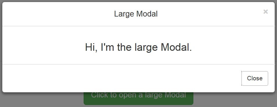
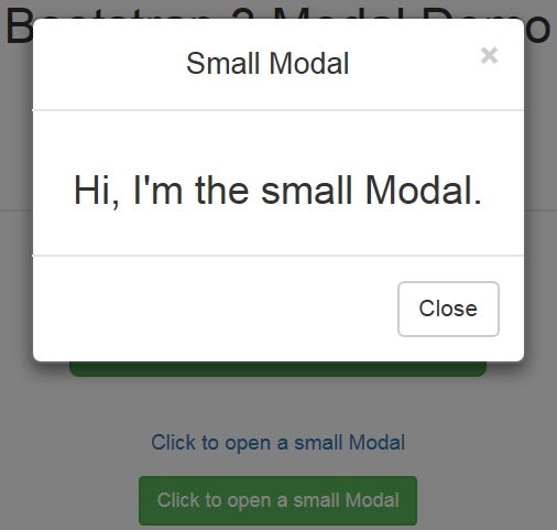
And last but not least, here are the large and small Modals in the demo:
Conclusion
In the next installment, we’ll cover how to customize the appearance of our Modals and how to listen for Modal events using JavaScript code.