Last week we showed you how to detect the iPhone & iPad’s user agent. This week we’ll show you how to use Apple’s Safari web browser for testing your iDevice-ready website by simulating an HTTP request from Safari on the iPad, iPhone and iPod Touch.
Most tutorials make the assumption that developers currently possess an iPhone to test their iDevice-ready website on, but we won’t do that. Apple’s Safari web browser can easily be used to test your site by simply changing the user agent that the browser identifies itself with.
Here’s how it works. When you use a web browser, whether it’s on your desktop computer, laptop or mobile device, any time you go to a web page, that browser sends a string of text that lets the web server know specifically which browser is being used to request the page. The string includes identifying characters that also tell it if the browser is on an iPhone, iPad or iPod Touch. Safari allows developers to modify the string that the browser sends out, fooling the web server into sending back the page as it was designed to appear on the device as specified by the developer. Safari then shows you how that page would look if you were viewing it on the actual iDevice. Simple enough!
Let’s get started! If you don’t already have it installed, downloadand install the Safari web browser.
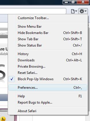
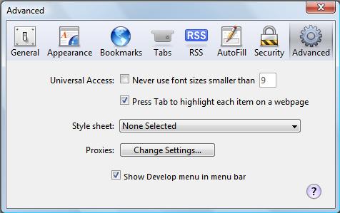
Once it’s finished installing, open the browser, and go to Safari’s Advanced Preferencepane. You can get to it by clicking the dropdown next to the little asterisk image at the top right of the Safari browser.

Advancedis the last icon to the right in the popup window. Enable the “Show Develop menu in menu bar” by clicking the checkbox and closing the window (oddly, there is no OK or close button–you will have to close it by clicking on the X in the top, right of the window).

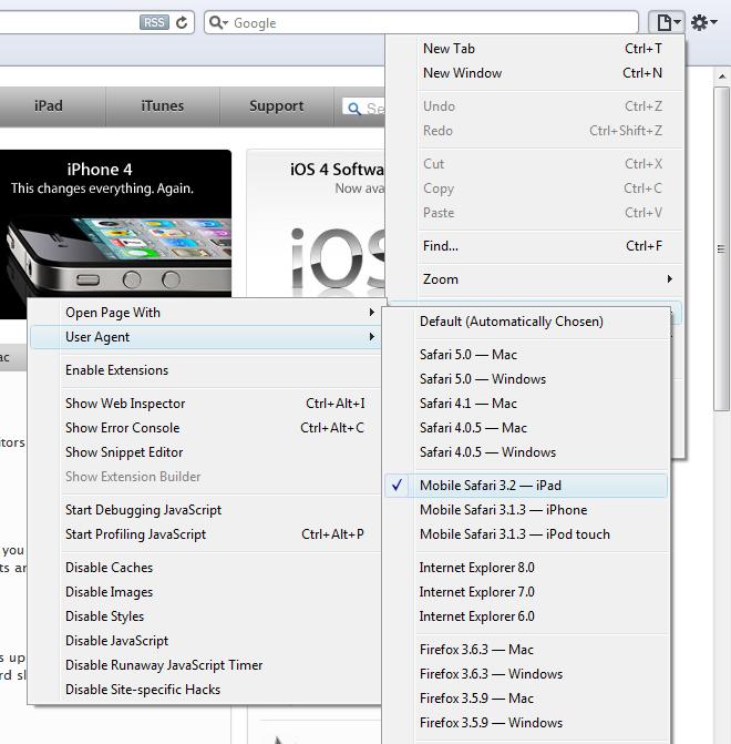
Now by clicking the little “page” icon next to the asterisk icon, select Develop, User Agent, iPhone(or iPad or iPod Touch) from that menu. Previous versions of Safari required you to add the code for each iDevice yourself, but as of version 5.0, they are available as an included option.

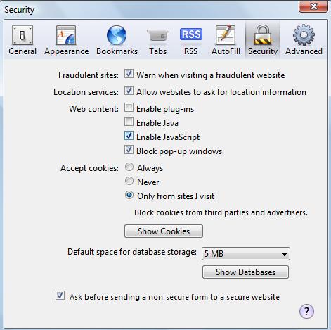
When you click OK, the page will reload and show you what your page looks like in the iPad. Well, not quite yet. It will still show any plugins that are in use on the page. Obviously we need to disable Flash, which is enabled by default, and Java, which is also enabled by default. Go to Safari’s Security Preferences area, the same way you got to the Advanced Preferences area. Disable plugins and Java by clicking the checkboxes and closing the window.

Now you are ready for testing–the page will appear in the Safari browser just as it appears on the iPad, iPhone or iPod Touch (whichever one you selected in the step above).
iPad Peek
Another option is to use Pavol Rusnak’s iPad Peekweb service. It is useful, however in my own tests, some pages that look normal on Rusnak’s emulator do not look the same on an actual iPad if you aren’t using Safari to view the emulator itself. In fact, to use iPad Peek effectively, it is recommended that you use the Safari browser, change the user agent string and disable plugins, as we have already discussed above. The main thing the emulator adds is the look of the iPad hardware itself. You can see the difference by using the emulator in MSIE, and then viewing it using Safari as configured above.
Using Apple’s iPhone Simulator
If you are serious about developing for the iPhone and iPad, you will likely want to join Apple’s Developer Connection. Ir costs $99 per year, but you will have access to the latest version of their Software Developer’s Kit (SDK) which includes their own iPhone Simulator, which also supports the iPad. This tool is the best way to test your iPhone-ready website (or application), and doesn’t require you to be connected to the internet.
This week we have discussed how you can test your iDevice-ready website using the Safari web browser. Next week we will delve back into web development for the iPhone and iPad, and show you how to detect and set the devices’ viewport orientation to Landscape or Portrait using JavaScript, CSS and META tags!

