In the Build a User Interface using the Vaadin Mobile App Framework tutorial, we generated a variety of built-in controls for the Exercises Catalog application that we later updated in the Extending the Vaadin Mobile Application Framework’s Built-in Themes tutorial. The updated controls replaced the default textboxes generated by the FieldGroup class’s buildAndBind() method. As we’ll see in today’s article, you are by no means limited to controls that are native to Vaadin. There are hundreds of add-ons available including UI & Data components, themes, tools, and more.
The TokenField Add-on
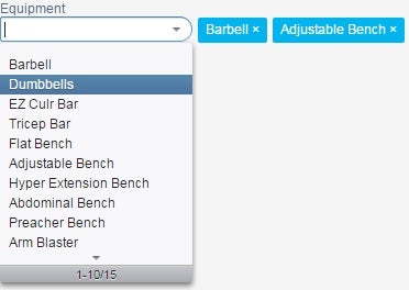
One interesting UI add-on I came across is the TokenField. It’s the control that WordPress uses to manage Taxomomies. Being a somewhat novel control type, I’ll show you now what it’s going to look like when done:

Installing the TokenField Add-on
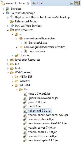
Unzip the downloaded package and follow any instructions provided within the archive. Typically you just need to copy a jar file to your web project under the WEB-INF/lib directory and recompile your project.

It basically operates like your standard dropdown list, but selections are added beside the element as tokens. Their position relative to the listbox is configurable via the constructor’s InsertPosition argument. Other properties are the same as for a SelectList box:
TokenField equipmentTokenField = new TokenField("Equipment", InsertPosition.AFTER);
BeanContainer<String, Equipment> equipContainer = new BeanContainer<>(Equipment.class);
equipContainer.setBeanIdProperty("caption");
equipContainer.addAll(EnumSet.allOf(Equipment.class));
equipmentTokenField.setContainerDataSource(equipContainer);
equipmentTokenField.setFilteringMode(FilteringMode.CONTAINS);
equipmentTokenField.setTokenCaptionPropertyId("caption");
equipmentTokenField.setInputPrompt("Enter equipment used");
equipmentTokenField.setRememberNewTokens(true);
layout.addComponent(equipmentTokenField);
The enum that we are using to populate the equipmentTokenField is slightly more complex than the one we saw in the last tutorial. In addition to the names and ordinals contained in the MuscleGroups enum, each value of the Equipment enum also have a caption property that’s set in the Equipment constructor and stored in the private caption field. Hence, the FLATBENCH item would have an ordinal of 4, a name of “FLATBENCH”, and a caption of “Flat Bench”:
public enum Equipment {
    BARBELL("Barbell"),
    DUMBBELLS("Dumbbells"),
    EZCURLBAR("EZ Curl Bar"),
    TRICEPBAR("Tricep Bar"),
    FLATBENCH("Flat Bench"),
    ADJUSTABLEBENCH("Adjustable Bench"),
    HYPEREXTENSIONBENCH("Hyper Extension Bench"),
    ABDOMINALBENCH("Abdominal Bench"),
    PREACHEBENCH("Preacher Bench"),
    ARMBLASTER("Arm Blaster"),
    STABILITYBALL("Stability Ball"),
    DIPPINGBAR("Dipping Bar"),
    CHINUPBAR("Chin Up Bar"),
    SQUATRACK("Squat Rack"),
    SMITHMACHINE("Smith Machine");

    private String caption;
    private Equipment (String caption) {
        this.caption = caption;
    }

    public String getCaption(){
        return name;
    }
    public int getId(){
        return ordinal();
    }
}
Styling the Tokens
The default look of the tokens is a bit underwhelming in my opinion – a simple text link. The “blue button” you see in the image above was achieved by adding the following CSS to the exercisesTheme.scss file:
.tokenfield .v-button-link {
background-color: #00B4F0;
border-radius: 2px;
-moz-border-radius: 2px;
-webkit-border-radius: 2px;
height: 23px;
padding: 4px 7px;
margin-left: 5px;
}
.tokenfield .v-button-link .v-button-caption {
color: #fff;
text-decoration: none;
}
Uploading Images with EasyUploads
Although Vaadin does come with an Upload component, its rather low level API is sometimes hard to use for simple tasks.

The EasyUploads add-on simplifies the Upload component with the use of wrappers.
Installing the EasyUploads Add-on
The library be downloaded from the Github site. From there, copy the easyuploads-7.4.1.jar file to your project’s WEB-INF/lib directory and recompile your project.
Writing the code to generate the control is a snap. Just Declare a new UploadField and add it to the layout. There are a few properties that you can set including the main caption, the button caption, the Accept filter, and the field’s upload type. For some reason the setAcceptFilter() method did not set the File element’s accept attribute as I thought it would. Having said that, you can’t rely on front-end filtering anyway so you have to check the type in the event handler code.
UploadField ufStartPositionImage = new UploadField();
ufStartPositionImage.setCaption("Start Position Image");
ufStartPositionImage.setButtonCaption("Choose file...");
ufStartPositionImage.setAcceptFilter("image/*");
ufStartPositionImage.setFieldType(FieldType.BYTE_ARRAY);
ufStartPositionImage.addListener(new Listener(){
@Override
public void componentEvent(Event event)
{
}
});
layout.addComponent(ufStartPositionImage);
The code for the End Position Image is almost identical except for the element name:
UploadField ufEndPositionImage = new UploadField();
ufEndPositionImage.setCaption("End Position Image");
ufEndPositionImage.setButtonCaption("Choose file...");
ufEndPositionImage.setAcceptFilter("image/*");
ufEndPositionImage.setFieldType(FieldType.BYTE_ARRAY);
ufStartPositionImage.addListener(new Listener(){
@Override
public void componentEvent(Event event)
{
}
});
layout.addComponent(ufEndPositionImage);
The Completed User Interface
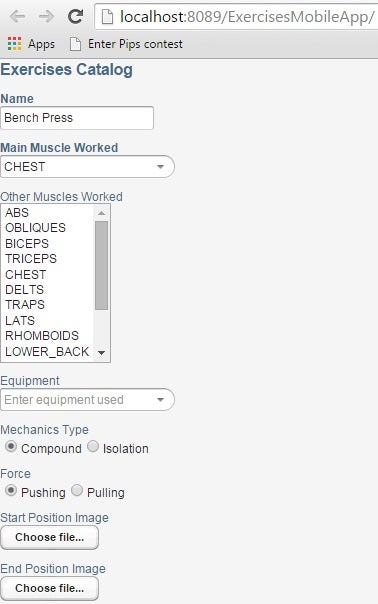
Here is the updated UI with the new add-on controls:

Conclusion
While the UI looks great, it doesn’t do anything yet. In the next tutorial we’ll learn how to write event handlers for the various controls.


