Extending the Vaadin Mobile Application Framework’s Built-in Themes
In last month’s Using Built-in Vaadin Themes in your HTML5 Applications tutorial, we learned how Vaadin uses Sass’s (“Syntactically Awesome Style Sheets”) CSS3 extension format to apply styling themes to its applications. You may choose between several pre-defined themes or extend one of them to make it your own. In today’s tutorial, we’ll modify the Exercises Catalog application to employ a custom theme.
Defining your Theme
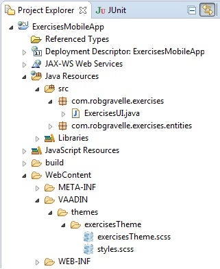
You’ll need two files to configure your theme: <yourTheme>.scss and styles.scss. Both should be placed in a subfolder that defines your theme. The folder in turn should reside in the VAADIN/themes folder. We’ll name ours “exercisesTheme” so that means you would create a new folder beneath VAADIN/themes named “exercisesTheme”. Then you will need to create two new files in that folder, one named exercisesTheme.scss and one named styles.scss. Once you are done, you should have the following directory structure beneath VAADIN/themes:

The exercisesTheme.scss File
Your custom .scss file will import the parent theme as well as add your own CSS rules. Both are accomplished via the @import and @mixin annotations. The trick with the @import statement is getting the path correct. All Vaadin themes reside in the VAADIN/themes folder, which makes it the parent. Therefore, you need to include two periods at the start of the reference path, meaning “one level up”. Hence, to refer to the reindeer theme, we would use a path of “../reindeer/reindeer.scss”.
Our own theme rules are defined within a @mixin {} block. Since we’ve imported the reindeer theme, we can include it in our mixin via the @include annotation. After that, the CSS rules follow the usual CSS conventions. Here is a simple theme file with two custom rules:
@import "../reindeer/reindeer.scss";
@mixin exercisesTheme {
  @include reindeer;
  .v-table {
    background-color: red;
  }

  .v-captiontext {
    color: #44698b;
  }
}
The styles.scss File
The format of the styles.scss file is quite similar to your theme file, but without any CSS rules. It imports your theme’s .scss file and declares your theme as a class with a single @include for your theme:
@import "exercisesTheme.scss";
.exercisesTheme {
   @include exercisesTheme;
}
Determining the Correct CSS Class Names
You’ll notice that in the exercisesTheme.scss file above, CSS rules are all applied to classes. Moreover, all of the Vaadin classes start with the “v-” prefix. That is done to prevent any potential CSS conflicts with other CSS for the same HTML page. For instance, if you embed a Vaadin app inside another HTML page that had styles defined for class “button”, those would not affect Vaadin components and vice-versa. This is actually a fairly standardized way that most web frameworks prevent style collisions. For example, GWT uses a “gwt-” prefix and Sencha employs a prefix of “x-“.
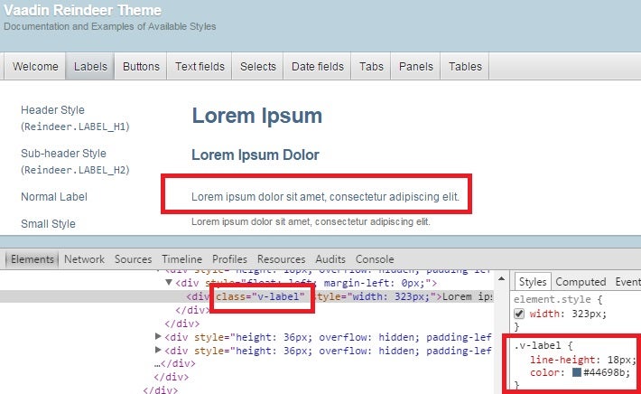
Rather than try to guess at class names, I suggest that you look at the Vaadin Demo Pages to find the page element that you’re interested in styling, then inspect it using your browser. Let’s suppose that we were interested in changing the color of normal label to match the blue of headings. Navigating to the reindeer demo, we can then right-click the label text and select “Inspect Element” from the popup menu. That not only brings up the label markup, but also displays the CSS rules. We can then copy the color property from a heading label into the v-label class to test the effect of our new rule:

Once we are happy with the results, we can include a new rule in our exercisesTheme.scss file.
Creating Your Own Styles
In the last article, we saw how you can utilize theme constants to set a particular style on an element:
header.addStyleName(Reindeer.LABEL_H2)
You can apply the addStyleName() method to set your own styles as well. Just store the results of the binder.buildAndBind() invocation in a Field<?> type and then call addStyleName(), passing in the CSS rule name that you want to set. For example, here’s some code that applies a bold font to the name label in order to show that it’s a mandatory field:
final BeanFieldGroup<Exercises> binder = new BeanFieldGroup<Exercises>(Exercises.class);
binder.setItemDataSource(exercises);
Field<?> name = binder.buildAndBind("Name", "name");
name.addStyleName("bold");
layout.addComponent(name);
Note that the caption element retains its original name, but with your style name appended:
.v-caption-bold {
    font-weight: bold;
}
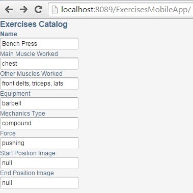
Here is the Exercises app with our custom styles applied:

Plain Ole’ CSS vs. Sass Themes
I should mention that you can create your own themes using regular CSS, but bear in mind that CSS themes are more restricted than Sass. An application can only have one CSS theme while you can have multiple Sass themes. A CSS theme is defined in a “styles.css” file in the VAADIN/themes/mytheme folder. You need to import the legacy-styles.css of the built-in theme as follows:
@import "../reindeer/legacy-styles.css";

.v-app {
    background: yellow;
}
Conclusion
Our form is looking better than ever, but the input controls were are all built using the default (textboxes). In the next instalment, we’ll learn how to use other form controls.


