In the last article, we talked about the input element and how it can transform into many different form elements. The input element can do many things, but it cannot do it all. What about drop-down lists or text areas? Well, there are HTML elements to handle those and other form field items. In this article, we will discuss the rest of the form field elements which includes a way of grouping elements together.
The SELECT Element
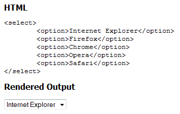
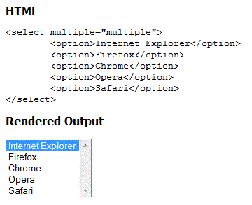
The "select" element is used to provide a drop-down list (see figure 1) and a select list (see figure 2). The select element is used in conjunction with the "option" element to provide a list of values.

Figure 1

Figure 2
Syntax:
<select name="<value>" multiple="multiple" disabled="disabled" size="<value>">
     <option label="value" selected="selected" value="<value>" disabled="disabled">Text to Display</option>
</select>
The "name" attribute is the same as it is for the input element. It is used to reference the elements data when the form is submitted to the form processor.
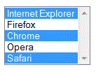
The "multiple" attribute converts the select list to a multiple select list (see figure 2). The multiple values can be selected by holding down the CTRL key and clicking on each item to select or using the SHIFT key to select a group (see figure 3).

Figure 3
The "disabled" attribute disables the select element just like it does with the input element. The user cannot click on the element when it is disabled. This is the same for the "option" element. Any option element that has the disabled attribute that particular value cannot be selected. This allows you to disable certain options while keeping others available.
The "size" attribute converts the select list from a drop-down list to a select list (see figure 2) only if the value is greater than 1. When the size value is less than the number of list items, the user agent (UA) adds a vertical scrollbar (see figure 4). If you omit the size element, the select list will be expanded to show all elements.

Figure 4
The OPTION Element
The "option" element is used with the select element to define the list items. Each option element represents a single list item.
The element text is the text between the opening "<option>" and closing "<option>" tags. The "label" attribute provides a shorter value for the option element text. This is only supported in IE7+ currently.
The "selected" attribute is used to select a default item when the page is rendered. When used in a drop-down list, the selected item is shown in the drop-down by default.
The "value" attribute is the value sent to the form processor.
The OPTGROUP Element
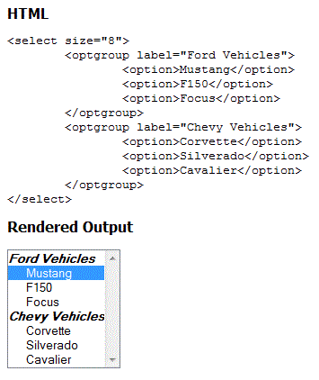
The "optgroup" element allows you to group items in a select list or drop-down list (see figure 5).
Syntax:
<select name="<value>" multiple="multiple" disabled="disabled" size="<value>">
     <optgroup label="<value>" disabled="disabled">
     <option label="value" selected="selected" value="<value>" disabled="disabled">Text to Display</option>
     <optgroup>
</select>
The "label" attribute provides a heading for the group of items. The "disabled" attribute disables the entire group of items.

Figure 5
The TEXTAREA Element
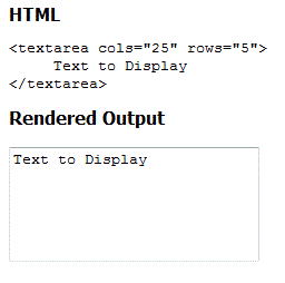
The "textarea" element provides a larger area to enter text (see figure 6). It supports multiple lines and line breaks to make entering and editing larger text easier. The textarea element supports an unlimited amount of text. Unlike the input element, there is not an attribute to specify length. This can be limited using JavaScript.
Syntax:
<textarea name="<value>" cols="<value>" rows="<value>" disabled="disabled" readonly="readonly">
     Text entered or displayed in the text area
</textarea>

Figure 6
The "name" attribute is the name that the form processor uses to reference the textarea’s data. This is similar to the other form elements.
The "cols" attribute specifies the width of the textarea. This is expressed as the average character width. Since the font used in the textarea is a mono-spaced font (like courier new), this value basically specifies the width by how many characters it displays before moving to a new line.
The "rows" attribute specifies the height. This is expressed in the amount of lines displayed. When the textarea goes beyond the number of lines (rows), the UA will display a vertical scroll bar. Although you can set the size using the cols and rows, it is better to use CSS to set the width and height.
The "disabled" and "readonly" attributes work the same as the input element. Disabled makes the textarea non-clickable and the readonly attribute makes the control clickable but readonly.
The FIELDSET Element
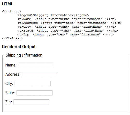
When creating forms, it is sometimes necessary to group sets of form elements together. This logical grouping can be done using the "fieldset" element. The UA will draw a box around the group elements and by using the "legend" element, you can provide a caption for the group (see figure 7).

Figure 7
The LABEL Element
The "label" element does not actually render anything on the screen. So why use it? Well, it provides two functions. One, it allows people who are using a mouse to click on the field label to select the form element. The other function is provided by screen readers. We will discuss this in more depth in a later article.
Syntax: <label for="<name of the form element>">Text to display</label>

Example: <label for="name">Name:</label> <input type="text" name="name" />
Conclusion
If you read the last article about the input element, you now have enough information to collect information using an HTML form. You also have an idea of how to group form elements together. In the next article, we will discuss form layout options for ease of use and accessibility.

