What Is jQuery Mobile?
jQuery Mobile is a cross platform mobile framework designed to simplify and enhance the development of mobile web applications by integrating HTML5, CSS3, jQuery and jQuery UI into one framework that is not only robust, but maintainable and organized.
jQuery Mobile is built upon the existing jQuery core, meaning that if you understand the jQuery syntax, then you will have no problems getting JM to work. The framework is compatible with all major mobile and desktop applications including iOS, Android, Blackberry, Palm WebOS, Nokia/Symbian, Windows Mobile, Opera Mobile/Mini, Firefox Mobile and all modern desktop browsers.
Its lightweight size (about 20K compressed) makes it a speed freak and the fact that it uses minimal image dependencies also speeds it up ridiculously. Its Progressive enhancement approach brings core content and functionality to all mobile, tablet and desktop platforms and a rich, installed application-like experience on newer mobile platforms.
As if that is not enough, automatic initialization by using HTML5 data-role attributes in the HTML markup to act as the trigger to automatically initialize all jQuery Mobile widgets found on a page and accessibility features such as WAI-ARIA are also included to ensure that the pages work for screen readers (e.g. VoiceOver in iOS) and other assistive technologies.
jQuery Mobile’s API supports not only Touch events, but also the usual Mouse events usually associated with jQuery, making it completely cross-browser and platform compatible. Built in controls are not only themable by the built in UI, but the Touch Optimized interface is completely supported by the UI. As an extra measure, jQuery Themeroller can also build custom widget designs for you to use.
How To Use jQuery Mobile
To get started with jQuery mobile, simply head over to jQuery Mobile OR CLICK HERE TO DOWNLOAD DIRECTLY. Another alternative would be to use the jQuery CDN hosted files, as in the example below.
Once you have the jQuery code downloaded, we can start to set up our jQuery page. Using the jQuery CDN, we can do the following:

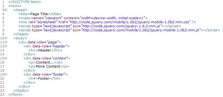
Figure 1 – Anatomy Of A Page
As we can see in Figure 1, the document is a simple HTML5 document that is simply including the jQuery JavaScript and CSS files from the CDN. If we had downloaded the files from the aforementioned locations, we would obviously just change the paths of the JavaScript and CSS files relative to our uploaded files.
Be sure to take note of the “viewport” META TAG on line 5 of Figure 1. This tag tells our mobile device that the width of the page should be the same width as the device screen (width=device-width), and that the browser should zoom in to 100%(scale=1). Changing the scale to 2, for example, will zoom the page in by 50%.
Now that we have a simple document, what can we do with it? The first thing we could do is to start setting up the basic layout of our pages. In jQuery Mobile, pages are seperated on the same document by divs that have a data-role attribute of “page”. Therefore, to add a page that has a header, content, and a footer, we would say:

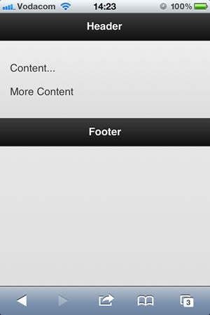
Figure 2 – Document With A Single Page
Viewing this through my iPhone Browser, I get the following result:

Figure 3 – iPhone Rendering
Not bad, considering we have not added any of our own styles or actually done any coding really. But that’s just the beginning!
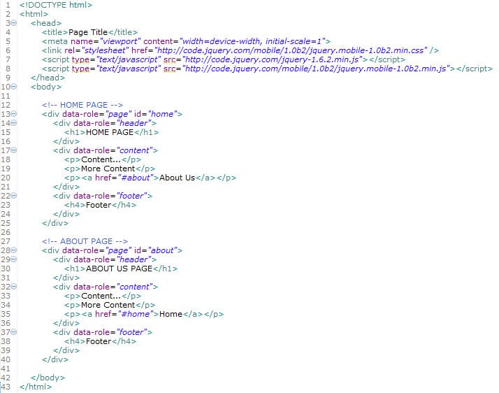
I mentioned earlier that multiple pages could be incorporated into the same document. How would we do this? Let’s look at the code below:

Figure 4 – Two Pages In One Document
As I’m sure you have noticed, what is making all the difference here are the “id” attributes being added to the data-role=”page”. What then happens is that jQuery Mobile will render the first page by default, and show us the following on an iPhone:

Figure 5 – iPhone Home Page
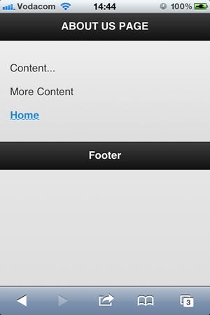
Note the link in the content section to the “About Us” page. This link simply links to the div with the ID of “about”, and renders the about page as follows:

Figure 6 – iPhone About Page
And of course the “Home” link simply points to the “home” div as an anchor, in other words, we say ”href=”#home”‘. The nice little twist here, if you try it on your mobile device, you should find that the pages transition nicely by sliding from one page to another. Of course, we can change these effects and do a lot more, all of which we will be exploring in the next few articles in this series.
What do you think about jQuery Mobile so far? Feel free to discuss in the comments.


