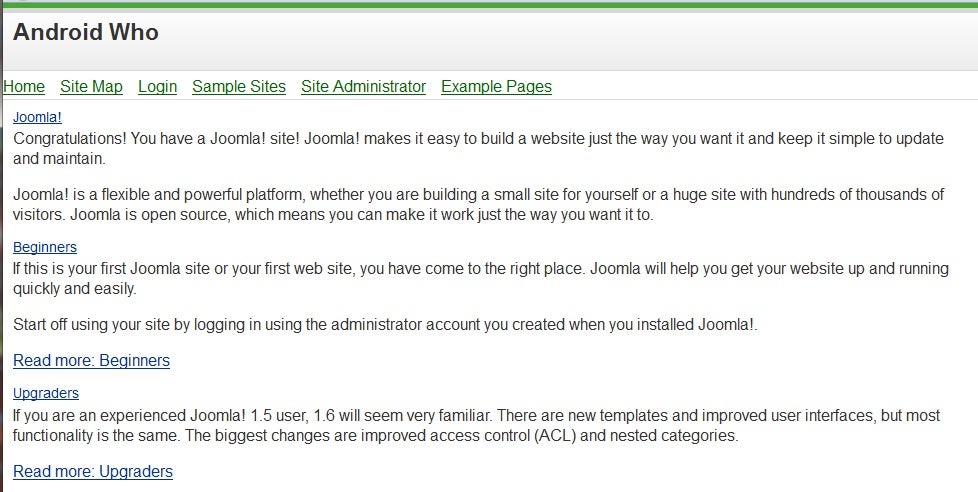
While many developers are actively working on an Android app for their client or business, others are going the web app route by creating websites that look and act like apps when viewed on mobile clients. If you’re already using the Joomla! CMS, the Mobile Joomla extension will do most of the work for you, as we will show you in this tutorial.
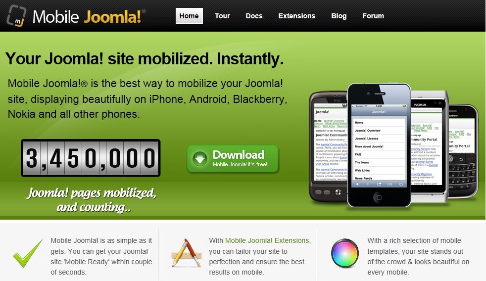
Now we get to the installation of Mobile Joomla itself. Mobile Joomla is free to download, and the Mobile Joomla website includes ample documentation:
As I mentioned before, I installed Joomla! 1.6, rather than the 1.7 release candidate, because the folks at Mobile Joomla are still working out the issues of upgrading to support the new Joomla! release. They have their own release candidate coming out with support for 1.7, but we’ll leave that for a future article.
Mobile Joomla Installation
Before you begin the installation, make sure that your webhost has the following features or configurations:
- PHP 5.0 (but you need PHP 5.2.4 or higher to run Joomla! 1.6)
- MySQL 5.0
- Joomla! 1.5 or 1.6
- GD2, a PHP image library for image scaling
- Zip PHP extension
- bzip2 (PHP bz extension for TeraWURFL device database, explained below)
- mysqli (also for TeraWURFL)
- 100 MB of database disk space
- at least a 64 MB PHP memory limit
Also, one part of Mobile Joomla, TeraWURFL, takes up around 25Mb in the MySQL database, so you’ll need enough space for it to be installed. TeraWURFL is where the information (the user agent data from just about every mobile device out there) is stored, and it’s required for Mobile Joomla to function.
While Mobile Joomla works on most web hosts, GoDaddy is known to have issues, so be forewarned. Now, let’s begin.
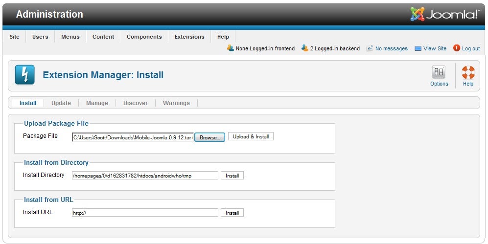
Once you’ve downloaded the Mobile Joomla file itself, you just need to un-compress it (the actual file you’ll be using is a .tar file), and Joomla! enables you to simply upload it as is by using the Extension Manager, as shown here:
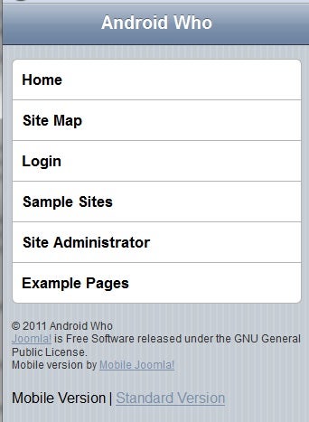
Once it’s installed, you can either leave it as it is, or further customize it. Here’s how that same page we showed you above appears now when viewed by someone using an iPhone:
And here it is on a WAP device, such as a Nokia 6630:
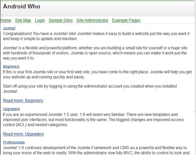
Here’s what it looks like on a 7 inch Android tablet, through the default browser:
Changing the Mobile Joomla Configuration
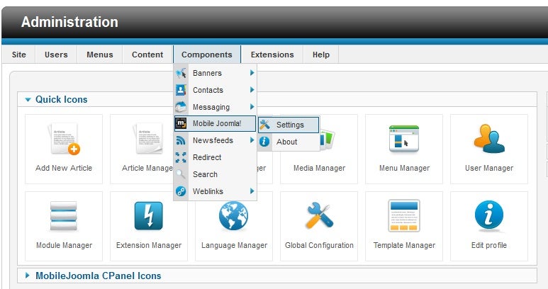
To really dig into the Mobile Joomla settings, just to to the Joomla! Administration page, Components, Mobile Joomla!, Settings, as shown below:
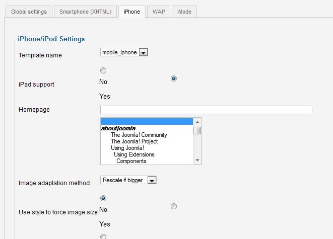
Once you’re in the Mobile Joomla! settings, you will see an interface with 5 tabs: Global settings, Smartphone (XHTML), iPhone, WAP and iMode. On the General settings tab, you can enable or disable caching, browser caching, and subdomain support (you can point each type of mobile device to a device specific subdomain, such as iphone.androidwho.com). On the iPhone tab, you can choose to select iPad support, image scaling, and the modules that are used for the iPhone display. You can see the iPhone tab below:
There are too many options to list in this article, but suffice it to say, you can style the display for each device however you want, and completely customize your website’s appearance by changing the settings. By default it works very, very well, and I am looking forward to seeing the next version of Mobile Joomla!, as it promises to support the Joomla! 1.7, with updated mobile functionality.


