Media queries, added in CSS3, were borne out of the need for tailoring a web page’s appearance to the device without having to reproduce the content and markup for every device type. That took care of the visual, but what about behaviors? There was still no easy way to execute JavaScript (JS) code based on the viewport size (more on that in the next section). That was until the matchMedia API came along. As we’ll learn here today, the matchMedia API provides an easy way to react to CSS @media queries using the exact same CSS expressions, thereby eliminating the need to duplicate them across your stylesheets and JavaScript files.
Prior to the matchMedia API, developing responsive behavior for a site’s front-end required the developer to write something like this:
jQuery(window).resize(function() {
    if (jQuery(window).width() < 980) {

      ...
    }
});
Some of the drawbacks of this approach were:
- The threshold value is hard coded in a bunch of code snippets so that, if it needs to be changed, you’d have to search for it throughout your code;
- You’d have to duplicate the same test in the onload();
- The resize event occurs a lot, which can take up a lot of resources;
- The if statements could get quite complex
The matchMedia API takes a JS approach that combines the power of CSS3 media queries to define the layout mode and thereafter using custom events instead of conditions to modify layouts.
The matchMedia() function accepts any valid CSS @media query and returns a mediaList object. It exposes a several useful methods and attributes as follows:
- matches (boolean attribute): Declares whether the media query currently matches.
- media (string attribute): The media query string that was originally passed.
- addListener(callback function): A method to attach a callback to fire when the matches state changes.
- removeListener(callback function): A method to remove a previously registered callback. Does nothing if the specified listener is not already in the list of registered functions.
Now let’s examine some of these in more detail.
The Matches Attribute
After invoking the matchMedia() function, you can check the returned mediaList’s matches attribute to see if the CSS @media query matched:
if (window.matchMedia("(max-width: 700px)").matches) {
    /* The viewport is less than, or equal to, 700 pixels wide */
} else {
    /* The viewport is greater than 700 pixels wide */
}
Listening for Changes
The addListener() function provides a means to run code when the browser window enters or leaves declared breakpoints. This is useful to construct pages that not only look different at different screen resolutions, but also need to behave differently:
var media = window.matchMedia('(min-width: 500px)'),
myMediaCallback = function(data) {
alert('matches: ' + data.matches);
};
media.addListener(myMediaCallback);
media.removeListener(myMediaCallback);
A Responsive Image Sizing Demo
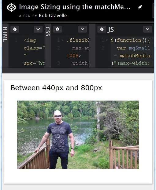
Here’s a demo that illustrates how to employ both matchMedia() and addListener() – the former to set an image’s initial source and the latter to make it responsive to browser resizing. It loads three different images for small (up to 440px), medium (between 441px and 800px), and large (801px or greater) viewports. The URLs are stored in data-* attributes:
<img class="flexible"
     src="http://robgravelle.com/news/@/Storage/_files/91/file.jpg"
     alt="Rob G"
     data-image-small="https://lh6.googleusercontent.com/-TsXKfdqFFYE/AAAAAAAAAAI/AAAAAAAAABQ/Y3JQpBQdLSo/photo.jpg?sz=328"
     data-image-medium="http://www.robgravelle.com/@/Photos/_entries/28/photo-full.jpg"
     data-image-large="http://robgravelle.com/news/@/Storage/_files/91/file.jpg" />
Having separate a mediaList for each image size would lend itself well to binding callbacks to individual mediaLists. However, in our case, this would lead to redundant coding as each function would basically set the image src attribute to the appropriate URL for that size. My solution was to pass the size as a string argument so that it could be easily appended to the data-* attribute rather than use an if/else if/else statement:
$(function(){
var mqSmall = matchMedia("(max-width: 440px)"),
mqMedium = matchMedia("(min-width: 441px) and (max-width: 800px)"),
mqLarge = matchMedia("(min-width: 801px)");
mqSmall.addListener( $.proxy(changeImageSize, this, 'small') );
mqMedium.addListener( $.proxy(changeImageSize, this, 'medium') );
mqLarge.addListener( $.proxy(changeImageSize, this, 'large') );
if (mqSmall .matches) changeImageSize('small')
else if (mqMedium.matches) changeImageSize('medium')
});
function changeImageSize(size, mediaList){
var img = $(".flexible");
if (!mediaList || mediaList.matches) {
img.attr("src", img.attr("data-image-"+size));
}
}
Here’s a screenshot showing the medium-sized image:

Browser Support
You’ll be happy to know that the matchMedia API enjoys a high level of support in all modern browsers. The problem is with slightly older browsers such as IE 10. For those browsers, you might consider using the matchMedia() Polyfill by Scott Jehl, Paul Irish, and Nicholas Zakas. It even supports transition events with a callback in some browsers. It’s really easy to use because it basically adds the matchMedia() function if it is not found within the global window namespace:
if (matchMedia('only screen and (max-width: 480px)').matches) {
  // do something...
}
Conclusion
In today’s tutorial, we learned how to react to CSS @media queries using the matchMedia API. While it offers us more options for generating responsive content, some purists have expressed concern about the use of @media queries outside of stylesheets. One way to minimize duplication and mixing of @media queries is to read them directly from the stylesheet(s). We’ll address how that might be accomplished in a future article.


