


Through responsive design, you can create an optimal user/viewer experiences across multiple devices. This involves creating a website that can be viewed, easily navigated and read on various devices — such as tablets, desktops, mobile phones. This practice consists of a mixing flexible grids and layouts, images and a clever use of CSS media queries.
The responsive design concept is based on three fundamental elements:
- fluid grids through which we can adjust for a wide range of resolutions. As the resolution changes, the elements of the site are resized directly proportionally. Using a grid-view is very helpful when designing web pages. It makes it easier to place elements on the page.
- flexible images that can change their height or width according to the grid coordinates.
- media queries are useful when you want to apply CSS styles depending on the device or specific characteristics.
Fluid Grids
The fluid grids replaced the classic ones, because of the many resolutions that have appeared today. Dimensions are now measured mostly in percentages and relative units. The proportions are first calculated and after that, the height and the width are set according to the resolution. Flexible images change their size depending on the device’s resolution and the size of the grid. It is recommended to upload multiple sizes for each picture, so that the corresponded size of the picture to be loaded according to the resolution.
Flexible Images
Web page text is fluid by default, but the images are not naturally fluid: they remain the same size and orientation at all configurations of the viewport, and will be cropped if they become too large for their container. The most common relative solution is to set the max-width of the image at 100%, if the width property is set to 100%, the image will be responsive and scale up and down:
img {
    width: 100%;
    height: auto;
}
An example of using the flexible image, test.png, is listed bellow:
<!DOCTYPE html>
<html>
<head>
<meta name="viewport" content="width=device-width, initial-scale=1.0">
<style>
img {
    width: 100%;
    height: auto;
}
</style>
</head>
<body>

<img src="test.png" width="400" height="300">
<p>Resize the browser window to see how the image will scale.</p>

</body>
</html>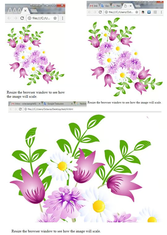
Media Queries
Media queries are very useful when you want to apply CSS styles depending on the device or specific characteristics (like screen resolution). With the big variety of the internet-connected devices available today, media queries are a vital tool for building websites and apps that are robust enough to work on whatever hardware your users have. A media type can be declared in the head of an HTML document using the “media” attribute:
@media screen and (max-width: 400px) {
    body {
        background-color: yellow;
    }
A simple example of using media queries that changes the background-color form pink to yellow depending on the width of the screen, is listed below:
<!DOCTYPE html>
<html>
<head>
<meta name="viewport" content="width=device-width, initial-scale=1.0">
<style>
body {
    background-color: red;
}

@media screen and (max-width: 400px) {
    body {
        background-color: green;
    }
}
</style>
</head>
<body>

<p><b><i>Resize the browser window. When the width of this document is less than 400 pixels, the background-color is "red", otherwise it is "green".</i></b></p>

</body>
</html>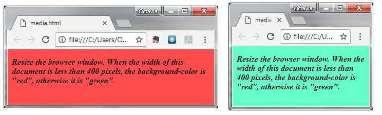
Whenever you decide to build a responsive website, you should keep in mind the following simple and effective practices:
- For greater efficiency in building a professional website, you need to systematize your ideas. It is necessary and it should be the number one priority in the development of any website.
- Using the printing software, Adobe Edge Reflow, that helps you to make media queries using the fluid grid, modify the layout size to be viewed on any type of device.
- Start to design your responsive website using the mobile-first approach, so you will be able to make the hard decisions about the content. The great thing about this approach is that it forces you into a content hierarchy.
- Create the look of your site before implementing the code to make sure the text is visible and the icons are large enough to be accessed with your finger on the phone.
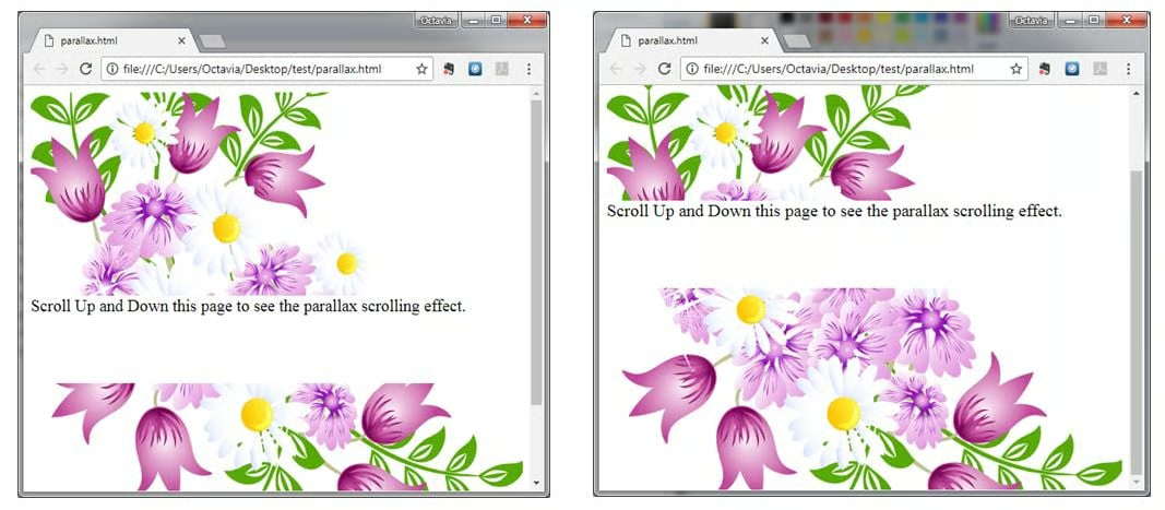
- Use parallax scroll for your responsible website. Parallax scrolling is a web site trend where the background content (like an image) is moved at a different speed than the foreground content while scrolling.
- Limit the text so that important information appears on the main page and do not show any kind of insignificant details, which can lead to long pages of scrolling.
- Use optimized images to eliminate possible scaling or bandwidth problems. Look for images of very good quality with .JEPG or .TIF extension. Unfortunately, the .GIF extension is no longer used because it distorts the image, its default quality. Now, PNG-8 is used, because the extension is more stable on the web formats than the PNGs in the past.
- Use the exact dimensions of the images to avoid changing the resolution and image quality.
- Make sure that the site user can make easy updates. If the site is under your administration, it will be very easy to update if it has worked properly.
- Make sure you create a clean, airy design so you can easily remove or modify the non-essential aspects.
- Make sure that you know how to use multiple types of software. If you need to build a complex design, be prepared to make use of different web development software (Dreamweaver – for computers; GoMobi – for phones mobile).
<!DOCTYPE html>
<html>
<head>
<style>
body, html {
    height: 100%;
}

.parallax {
    /* The image used */
    background-image: url('test.png');

    /* Full height */
    height: 50%;

    /* Create the parallax scrolling effect */
    background-attachment: fixed;
    background-position: center;
    background-repeat: no-repeat;
    background-size: cover;
}
</style>
</head>
<body>

<div class="parallax"></div>

<div style="height:100px;background-color:white;font-size:20px">
Scroll Up and Down this page to see the parallax scrolling effect.
</div>

<div class="parallax"></div>

</body>
</html>
The output of the above listing is:
Conclusion
The design of your Web site is becoming more and more important because of the fact that mobile traffic volume is now more than half of total Internet traffic.
