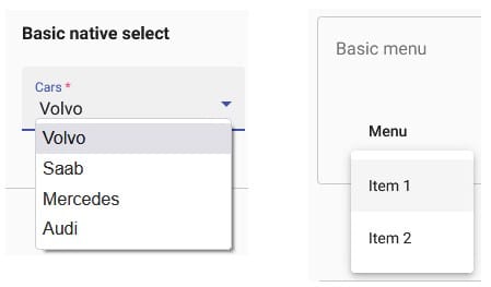
The Angular Material MatMenu is a floating panel containing list of options. It’s like the drop-down part of Select list, but without the textbox or label portion that shows the selected item:

Also absent is the arrow button that opens the list. For that reason, the menu is typically attached to an HTMLElement that includes matMenuTriggerFor directive, such a button, link, or any other interactive HTML element:
<button mat-button [matMenuTriggerFor]="menu">Menu</button>
The mat-menu comes packed with all sorts of useful properties, methods, and event hooks, making it a highly versatile control. The Angular Material Menu docs feature a few possible variations; you’ll find many more on various websites and featured in tutorials just like this one.
Recently, I tried to find a suitable prototype for a menu that contained checkboxes. The closest thing I could find was ironically a custom control that was part of one of my organization’s applications. It wasn’t perfect; the expected keyboard accessibility was missing, but otherwise, it was perfectly serviceable. After restoring the lost keyboard functionality, I had a just what I wanted: a MatMenu that contained checkboxes. In this tutorial, I’ll cover everything you need to know to make your own.
Read: How to Optimize Angular Applications.
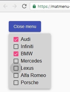
Our menu will contain a list of premium automobiles. It will be triggered via a button that reads “Select a vehicle”. The button text then changes to “Close menu” when the menu is open, as seen in the following image:

We’ll store the vehicles in the public premiumAutomobilesList class member variable as an array of objects. A second variable – selectedVehicles – will store the selected vehicle names:
public premiumAutomobilesList = [
  { title: 'Audi', activated: false, value: 'audi' },
  { title: 'Infiniti', activated: false, value: 'infiniti' },
  { title: 'BMW', activated: false, value: 'bmw' },
  { title: 'Mercedes', activated: false, value: 'mercedes' },
  { title: 'Lexus', activated: false, value: 'lexus' },
  { title: 'Alfa Romeo', activated: false, value: 'alfa romeo' },
  { title: 'Porsche', activated: false, value: 'porsche' },
];
private selectedVehicles: string[] = [];
public formattedSelectedVehicles: string = '';
In the above vehicle objects, the title corresponds to the checkbox label, activated describes the checkbox state, i.e. true for checked and false for unchecked, and the value is what is returned by a checkbox when checked.
Let’s add three elements to the template:
- the matMenuTrigger button that opens and closes the menu:
<button #matMenuTrigger mat-raised-button color="primary"
  [matMenuTriggerFor]="menu"
  (menuOpened)="onMenuOpened()"
  (menuClosed)="onMenuClosed()">{{triggerButtonText}}</button>
- the menu panel:
<mat-menu #menu="matMenu">
  <mat-checkbox #menuItems
    *ngFor="let item of premiumAutomobilesList; let i = index;"
    [(ngModel)]="item.activated"
    (click)="$event.stopPropagation()"
    (change)="onVehicleSelect()"
    (keydown)="onMenuKeyDown($event, i)"
    >{{ item.title }}</mat-checkbox
  >
</mat-menu>
- a paragraph (<p>) element that displays the selected vehicles:
<p>{{ formattedSelectedVehicles }}</p>
In terms of styling, the most important thing is that checkboxes are ordered vertically as a column:
.mat-menu-panel {
  background: lightgray;
  margin-top: .3rem;

  .mat-menu-content {
    display: flex;
    flex-direction: column;
    padding: 0.5rem 1rem;
  }
}
Tracking User Selections in MatMenus
You can see in the HTML markup for the mat-menu that the change event is bound to the onVehicleSelect() class method. It maps checked vehicles to an array of vehicle names, the very same ones used for the checkbox labels:
public onVehicleSelect() {
  this.selectedVehicles = this.premiumAutomobilesList
    .filter(menuitem => menuitem.activated)
    .map(menuitem => menuitem.title);
}
As mentioned previously, the activated property acts as our model, so activated items are those that are checked.
Perhaps one of the reasons that we don’t see a lot of MatMenus that employ checkboxes is that they break the built-in keyboard navigation. According to the docs, these are the supported keys and their effects:
- DOWN_ARROW: Focuses the next menu item
- UP_ARROW: Focuses previous menu item
- RIGHT_ARROW: Opens the menu item’s sub-menu
- LEFT_ARROW: Closes the current menu, if it is a sub-menu
- ENTER/SPACE: Activates the focused menu item
- ESCAPE: Closes the menu
That’s easy enough to restore by binding the keydown event to a handler. Here’s what we’ll need:
@ViewChild('matMenuTrigger', { read: MatMenuTrigger })
private matMenuTriggerRef: MatMenuTrigger;
@ViewChildren('menuItems')
private menuItemsRef: QueryList<MatCheckbox>;

public onMenuKeyDown(event: KeyboardEvent, index: number) {
  switch (event.key) {
    case 'ArrowUp':
      if (index > 0) {
        this.setCheckboxFocus(index - 1);
      } else {
        this.menuItemsRef.last.focus();
      }
      break;
    case 'ArrowDown':
      if (index !== this.menuItemsRef.length - 1) {
        this.setCheckboxFocus(index + 1);
      } else {
        this.setFocusOnFirstItem();
      }
      break;
    case 'Enter':
      event.preventDefault();
      this.premiumAutomobilesList[index].activated
        = !this.premiumAutomobilesList[index].activated;
      this.onVehicleSelect();
      setTimeout(() => this.matMenuTriggerRef.closeMenu(), 200);
      break;
  }
}
The only difference between the default behaviour and ours is that, in our app, the Enter key closes the menu in addition to selecting the currently focused item. A slight delay gives the user just enough time to see that the item has been toggled.
MatMenu menuOpened and menuClosed Events
The bookend menuOpened and menuClosed event handlers take care of setting the focus as well as the formatted output string of selected vehicles:
@ViewChild('matMenuTrigger', { read: MatButton })
private matButtonRef: MatButton;

public onMenuOpened() {
  this.setFocusOnFirstItem();
  this.triggerButtonText = 'Close menu';
  this.formattedSelectedVehicles = '';
}

public onMenuClosed() {
  this.matButtonRef.focus();
  this.triggerButtonText = 'Select a vehicle';

  this.formattedSelectedVehicles =
    (this.selectedVehicles.length === 0
      ? 'No vehicles selected'
      : 'You selected ' + this.selectedVehicles.join(', ')) + '.';
}
We need a second reference to the matMenuTrigger button because the first one reads it as a MatMenuTrigger type. This is so that we can invoke its closeMenu() method in response to the Enter keydown event. This time, we need to access the MatButton’s focus() method, which is not available to the MatMenuTrigger.
The Demo
You’ll find the premium vehicles menu on stackblitz.com.
Creating a MatMenu with checkboxes is not much more difficult than your basic garden-variety, as long as you’re willing to put in a bit of extra effort to handle the keyboard navigation. In fact, unless you’re implementing a multi-level drop-down, it’s really quite a simple process.
Read: Common Causes of JavaScript Errors and How to Avoid Them.


