
Directives are classes that add additional behavior to elements in your Angular applications. Angular directives can help manage many aspects of the DOM, including forms, lists, styles, and many more. Angular includes several built-in directives, and you can define your own to attach custom behavior to elements in the DOM. In this tutorial, we’ll learn how to create and use an Attribute Directive to make DIV elements behave like a button or link.
The World of Directives
At their core, directives are functions that execute whenever the Angular compiler finds them in the DOM. Their purpose is to extend the power of HTML by giving it new syntax and functionality. Angular utilizes three types of directives as follows:
- Components are actually directives with templates. Under the covers, they use the directive API and give us a cleaner way to define them.
The other two directive types don’t have templates. Instead, they’re specifically tailored to DOM manipulation.
- Attribute directives manipulate the DOM by changing its behavior and appearance. We can use attribute directives to apply conditional style to elements, show or hide elements or dynamically change the behavior of a component according to a changing property. Built-in Attribute directives include NgClass, NgStyle, and NgModel.
- Structural directives are specifically tailored to create and destroy DOM elements. Some attribute directives, such as hidden, which shows or hides an element, don’t alter the DOM but govern an element’s appearance. Structural Angular directives tend to be far less DOM friendly, as they add or completely remove elements from the DOM. Due to their potentially destructive nature, you have to be extra careful when using them.
Generating a New Directive
The Angular CLI has a command for creating a directive as follows:
ng g directive buttonizeThe above statement will generate two files: button.directive.ts and the button.directive.spec.ts test file. It will add our new directive to app.module.ts as well:
import { ButtonizeDirective } from './buttonize.directive';

@NgModule({
  imports: [ BrowserModule ],
  declarations: [
    AppComponent,
    ButtonizeDirective
  ],
  bootstrap: [ AppComponent ]
})
export class AppModule { }
Coding the Buttonize Directive
At a minimum, the directive .ts file will contain the @Directive() decorator that defines the selector property as it will appear in template files, as well as an empty constructor:
import { Directive } from '@angular/core';

@Directive({
  selector: '[buttonize]'
})

export class ButtonizeDirective {

  constructor() { }

}Adding our Custom Logic
Our directive will require two default options: the tabindex and role, which are set to 0 and ‘button’ respectively:
const DEFAULT_OPTIONS = {
    tabindex: 0,
    role: 'button'
};
These may be overridden by supplying options to our directive. To do that, we’ll ad an input property named the same as our directive. That way, we can provide options by assigning an object directly to our directive within the template like so:
[buttonize]="{tabindex: -1}"Options will be set via the @HostBinding decorator. It marks a DOM property as a host-binding property and supplies configuration metadata. Angular automatically checks host property bindings during change detection, and if a binding changes it updates the host element of the directive.
In the ngOnInit event, we’ll use the static Object.assign() method to set the options on our directive. The Object.assign() method copies all enumerable own properties from one or more source objects to a target object and returns the modified target object. Here’s the code for that part:
export class ButtonizeDirective implements OnInit {
@Input('buttonize')
public options: any = {};
@HostBinding('tabindex')
public tabindex: number;
@HostBinding('attr.role')
public role: string;
constructor() { }
public ngOnInit(): void {
this.options = Object.assign({}, DEFAULT_OPTIONS, this.options);
this.tabindex = this.options.tabindex;
this.role = this.options.role;
}
//...
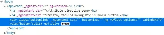
}You can see the default tabindex and role in the browser’s Element Inspector:
Handling Key Presses in Angular
All that’s left now is to capture key presses and convert Enter keys into clicks. To do that, we can use the @HostListener decorator and listen specifically for the ‘keyup.enter’ event. We should also pass in the KeyboardEvent so that we can prevent it from bubbling up to parent elements. Finally, we invoke the click() method on the ElementRef that was injected via the constructor:
constructor(protected eleRef: ElementRef) { }

@HostListener('keyup.enter', ["$event"])
public onEnterKeyUp(event: KeyboardEvent): void {
    event.stopPropagation();
    //trigger a mouse click event on a specific HTML element
    this.eleRef.nativeElement.click();
}Overriding the Default Options
Although we’ve already alluded to the default options, we haven’t really seen an example of option overriding in action. Here’s one that sets the tabindex to -1 and assigns a role of ‘link’:
<span [buttonize]="{tabindex: -1, role: 'link'}" (click)="goToComponent(element)">That would have the effect of making the SPAN element unreachable via the TAB key, which would be useful if we wanted to substitute a different navigation key. The link role is used to identify an element that creates a hyperlink to a resource that could be within the application or external. Screen readers and other assistive technology rely on the role attribute to identify an element’s purpose and usage.
The Demo
You’ll find the demo of today’s lesson on stackblitz.com. It contains two uses of the buttonize directive: turning one DIV into a button and another into a link. In both cases, pressing the Enter key triggers the click handler. The “link” also has a tabindex of -1 so that it is not focusable via keyboard navigation. Here’s the HTML markup:
<h2>Attribute Directive Demo</h2>

<h4>Presto, the following DIV is now a button!</h4>
<div buttonize class="buttonlink" (click)="onClick()">Click Me!</div>

<br/>

<h4>Presto, the following DIV is now a link!</h4>
<div class="link" [buttonize]="{tabindex: -1, role: 'link'}" (click)="onClick()">Click Me!</div>
<p>(Notice that you cannot TAB to it.)</p>
Invoked by both click and Enter KeyUP events, the onClick() handler simply displays and alert box:
import { Component } from '@angular/core';

@Component({
  selector: 'app-root',
  templateUrl: './app.component.html',
  styleUrls: ['app.component.css']
})
export class AppComponent {

  onClick() {
    alert("Thanks for clicking!");
  }
}Conclusion
In today’s article, we saw how Angular directives are functions extend the power of HTML by giving it new syntax and functionality. Now that you know how to create an Attribute Directive, I have no doubt that you’ll find many uses for them in your own applications.
