


Many modern programming languages, such as Java and Python, are Object-Oriented (OO). Others are event-driven. Angular, on the other hand, being a Framework, follows its own model, employing a Component based architecture. By that, we mean that an Angular application is composed of many reusable blocks called Components. Each one is made up of several files, which include a .ts class file, .html template, and perhaps a .css and spec.ts test file. The idea behind Angular’s Component based architecture is a sound one; by building reusable pieces, our applications can greatly reduce the amount of duplication throughout.
In many cases, we can plan which pieces to make into components. Other times, we realize that we will need similar functionality in a few places throughout our application. And that is the subject of the tutorial: how to extract the TypeScript, HTML, and CSS that we need to replicate and how to compartmentalize all of it into a new component. Due to scoping rules imposed by Angular, what to leave in and what to take out can be a challenging question to answer. As a case study, we’ll be taking the custom drop-down menu that we implemented in the Toggling Element Visibility in Angular 11 with NgClass article and making it into a component so that we could reuse it later.
Swapping the Existing Drop-down Menu with Our New Component
It’s usually best to avoid doing everything at once; doing so will likely produce a lot of bugs that will be hard to track down. Instead, tackle the task using baby steps by creating your new component and replacing the existing element(s) with it.
Using the Angular CLI, the command would be:
ng g c shared/components/dropdown-menu
The “c g” is short for “Generate Component”, so, as long as you know what you’re typing, it’s fine to use the short form. The above command will place our new dropdown-menu component under “src\app\shared\components\
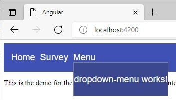
With our component in place, we’re ready to insert it into our template. To do that, we’ll simply comment out the markup in question, and add in the dropdown-menu component:
<mat-toolbar color="primary">
  <a [routerLink]="['/']">Home</a>
  <a [routerLink]="['/survey']">Survey</a>
  <div class="menu-container"
    (click)="menuOpened = true" (mouseenter)="menuOpened = true" (mouseleave)="menuOpened = false">
    <span>Menu</span>
    <dropdown-menu [ngClass]="{ 'menu-opened': menuOpened }" class="dropdown-menu"></dropdown-menu>
    <!--
    <div [ngClass]="{ 'menu-opened': menuOpened }" class="dropdown-menu">
        <a *ngFor="let ic of investmentClasses" (click)="onClick($event)">
            <mat-icon mat-list-icon>{{ ic.icon }}</mat-icon>
            <span class="dropdown-menu-item">{{ ic.text }}</span>
        </a>
    </div>
    -->
  </div>
</mat-toolbar>

<div class="container">
  <router-outlet></router-outlet>
</div>
To style our new component like the element(s) that we are replacing, we can copy over the the “dropdown-menu” class. By default, the dropdown-menu has a display of “none”, so we should also move over the ngClass. That will change the display property to “flex” on the hover event of the menu-container DIV:
Communicating with Our New Component
The greatest challenge when introducing a new component to a template is the passing of data between the parent and child component. In our case, data needs to travel bi-directionally: the dropdown-menu needs to know what items to show, and the parent needs to be notified of the user’s selection.
Let’s start by setting the dropdown-menu items.
In Angular, the way to pass data directly to a component is to employ an @Input() decorator. By adding [menuItems]=" to the dropdown-menu tag, our component’s menuItems Input variable will be set to the AppComponent’s investmentClasses.
In the DropdownMenuComponent, we now need to add the menuItems variable:
export class DropdownMenuComponent {
  @Input() public menuItems: Array<MenuItem> = [];
  //...
}
We want the menuItems to have a very specific format so that properties are not missing in the template. To do that, we can define the MenuItem interface:
export interface MenuItem {
  icon: string;
  id: string;
  value: string,
}
The MenuItem interface is exported from the DropdownMenuComponent so that it may be utilized by the AppComponent (although this isn’t strictly necessary, as long as the element properties match):
import { MenuItem } from "./shared/components/dropdown-menu/dropdown-menu.component";

export class AppComponent {
  public menuOpened = false;
  public investmentClasses: MenuItem[] = [
     {
       icon: "euro_symbol",
       value: "currencies",
       id: "currency"
     },
     //...
  ];
}
Notifying the Parent of the User’s Selection
Just as the @Input() decorator accepts data from the parent component, the analogous @Output() emits data to the parent. For that reason, it must be instantiated to a new EventEmitter instance:
export class DropdownMenuComponent {
  @Input()  public menuItems: Array<MenuItem> = [];
  @Output() public itemSelected = new EventEmitter<number>();
  //...
}
What you choose to emit to the parent depends on the data format. Since we are using an Array, the easiest way to access an element is via its numeric index. An easy way to do that is to add it to the ngFor loop. That allows us to pass it to the onClick event handler:
<a *ngFor="let mi of menuItems;let i = index" (click)="onClick($event, i)">
Now we can emit the index to the parent:
public onClick(event: MouseEvent, index: number) {
  event.stopPropagation();
  this.itemSelected.emit(index);
}
Meanwhile in the parent’s template, we can add a handler for the itemSelected as follows:
(itemSelected)="onItemSelected($event)"
Here is the code for the onItemSelected() method that shows how to retrieve the relevant investmentClasses element:
public onItemSelected(index: number) {
  this.menuOpened = false;
  alert('Selected item: ' + this.investmentClasses[index].value);
}
Styling the dropdown-menu Component
To maintain proper component encapsulation, any class that is defined within the dropdown-menu’s template should be moved into its .css file:
a {
  text-decoration: none;
  display: inline-flex;
  cursor: pointer;
  align-items: center;
  padding: 0 0.8rem;
}

a:not(:last-child) {
  border-bottom: 2px solid gray;
}

a:hover {
  background-color: #a12f42;
}

.dropdown-menu-item {
  display: block;
  margin: 1.33rem 0rem;
  font-weight: bold;
}
The Demo
On codesandbox.io, you’ll find the demo with all of the code that was presented in this article.
Conclusion
Any time that you need to reuse HTML elements in different pages, or even within the same page, that’s the time to encapsulate its functionality within a custom component. As we saw here today, it’s not all that difficult; you just need to take a piecemeal approach.
