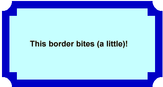
In the early days of the World Wide Web, there were only two kinds of boxes: square and rectangular, and a square is really just a rectangle with even sides! For the modern Web designer, that just won’t cut it. First, it began with the rounded corner. Then, even that wasn’t enough to stand out from the crowd. Thus the introduction of beveled corners, notched corners, dog-ears corners, and even frayed corners.
Until about five years ago, designers had to rely on techniques that used extra markup, images, and/or JavaScript code whose only function was to support the decoration. Sometimes you had to wonder if all that overhead was really worth it for a bit of visual flair. Then Dave Methvin created his excellent jQuery corner plugin. A little while later, Mike Alsup updated the plugin to include many additional corner options while also improveing the plugin’s speed and memory usage. This article explains how to use the jQuery corner plugin within your own web pages.
How it Works
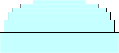
The original plugin worked by adding several 1-pixel height elements (called “strips”) to the top and bottom or the affected element. The body of each was transparent and had left and right borders that were the same color as the background color of the parent element. Mike Methvin’s optimized version combined adjacent strips that had the same border widths so as to reduce the number of elements required.

Now, the native border-radius CSS property is used in browsers that support it (Opera 10.5+, Firefox, Safari, and Chrome). The strips are used as a fallback technique for browsers that do not support the border-radius property.
How to Use It
The first step is to download jQuery from the Downloading jQuery page. You’ll also need to get the jQuery corner plugin.
In your Web page, add references to both scripts in relation to the host document (the js folder is assumed to be a subfolder under the one which contains the HTML document):
<script src="js/jquery-1.2.6.pack.js" type="text/javascript">
</script>
<script src="js/jquery.corner.js" type="text/javascript">
</script>
Controlling the Appearance of the Corner Adornments
The corner function takes one string argument: $(elementid).corner("effect corners width"). The effect is the name of the effect to apply, such as "round” or "bevel“. If you don’t specify an effect, rounding is used by default. The corners can be one or more of top, bottom, tr (top-right), tl (top-left), br (bottom-right), or bl (bottom-left). By default, all four corners are adorned. The width specifies the width of the effect in pixels; in the case of rounded corners this will be the radius of the width. Specify this value using the px suffix such as 10px. Keep in mind that the greater the pixel number, the more pronounced the effect.
Here are a few examples:
$(this).corner("30px");
$(this).corner("bite 20px");
$(this).corner("cool top 15px");
Border Effects Using Nested Cornered Elements
Some interesting border and corner adornments can be achieved by using nested elements. The idea is to set the corner type on the inner element, set the border thickness on its parent using the CSS padding property, and then apply the corner function on it. This type of function chaining is possible because all of the functions return the object on which they are applied. Here’s how to set the “cool” corner style with a border of 10 pixels. Also notice how the inner corner is larger than the outer one:
Code:
$(this).corner("cool 20px").parent().css('padding', '10px').corner("cool 10px");
Result:

There’s no reason why both the inner and outer elements must use the same corner adornment. Here’s on that has notched corners on the inner element and bite style on the outer one:
Code:
$(this).corner("notch 15px").parent().css('padding', '15px').corner("bite 20px");
Result:

Using Markup Instead of Function Arguments
Since size arguments are applied to the element’s data-corner attribute, you can set it directly on the element by including the data-corner in the opening tag:
>Metadata Example
// script - no options passed to corner function
$('.myCorner').corner();
Some Caveats Worth Heeding
For best results:
- Don’t use a background image in the parent. The adorned element effect sets pixels on the corners to the same color as the parent element. Those pixels are not transparent and will not show any background image that is used in the parent element.
- Define an explicit background color in a parent element. Safari requires that an ancestor of the element being adorned has a background color set. Just set the body to “background: #fff” if you don’t need some other color.
Conclusion
You can come up with some pretty cool effects with the jQuery Corner Plugin. Don’t be afraid to experiment and try new things. For instance, the same technique can be applied to images as well as other element types. If you really want to go for broke, you can even improve upon the existing design and submit your own enhancements. That’s what open source is all about!


