Web Design Goodies Critique #5
Published October 11, 2000 By Joe Burns, Ph.D.
Greetings, Fellow Designers
How do your eyes move across a page in a book? Left to right and top to bottom, correct? When you were putting together your Web page, did you take that into account? One design flaw I see often is that the page layout does not allow the eye to do what it wants to do. Today’s site is a wonderful site. In fact, it’ll help me make a point.
Welcome to The Spirit Quest.
Now the obligatory release statement
>>>>The critique below represents the opinions of Joe Burns, Ph.D. Feel free to disagree, argue, forget, or accept anything he writes. The purpose of the critique is to offer examples that you may use to revise or forget about when it comes to your own Web site. As always, remember that there are simply no hard and fast rules to Web design. Any choice is the correct choice as long as that choice aids the user and fulfills the site’s purpose.<<<<
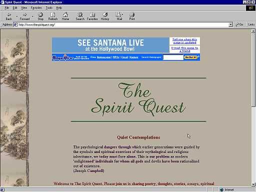
Title: The Spirit Quest
http://www.thespiritquest.org
Author: Roger (I never did get a last name)
Load Time: 18 Seconds, 57Kbps modem, cleared cache, 9/10/00 4:03 PM
My Screen Size: 1024X768
Browsers Used: Internet Explorer 5.5 and Netscape Navigator
4.5
One load note–the main page loaded very quickly. Maybe it was just a server burp, but when I tried to go deeper it took forever.
Concept: The Web page itself says it best. Here’s a quote: “Welcome to The Spirit Quest. Please join us in sharing poetry, thoughts, stories, essays, spiritual reflection, words of inspiration, Native American lore, mythology, and much more.”
Praise: The pages want to convey a sense of calm and peace, a place where someone can come, read, and just become knowledgeable and calm. They do. I especially like the background. The author found a beautiful earth-tone brown with a (I believe) Japanese art-piece repeating down the left-hand border. The site and its content are unpretentious, and I find that refreshing. The text and the style are inviting. I didn’t get the feeling that I needed to be a certain way or that I needed to have certain beliefs to read what was contained within. I felt comfortable in the site. That’s a hard thing to achieve. I think this site has done it, though.


