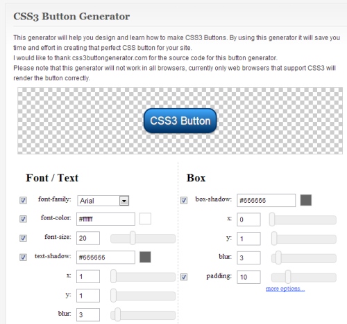
In this article we’re going to make use of a web-based tool to create on-the-fly CSS3 buttons for your web site. Be aware that these buttons will only work with browsers that support CSS3, otherwish the buttons might not render correctly.
The CSS3 Button Generator consists of several sections: Font/Text, Box, Border, Background, Hover and CSS Code. When you visit this site you’ll see a button in place at the top of the screen. and several settings are already enabled. We’ll look at each one of these sections and display a corresponding screen shot.
Font/Text
The first thing you’ll want to do is to set the font and it’s here that I encountered several disappointments. You only have three font choices: Arial, Georgia and Courier New. For this demo I’ll use Arial. Note also, that there aren’t any controls such as underline, left, right, center, italic, bold, etc. The text defaults to the center position.
Changing the font color is straigh-forward. Clicking on either the font colors parameters box or the color swatch to the right brings up the color picker, which is easy to use.
Here are the font text settings I used:
font-family:Arial
font-color: #00fbff
font-size: 30
text-shadow: #2e2e2e x: 5 y: 5
blur: 3
The result of the text manipulations. Note the the text shadow which is a subtle effect. I amplified the color and positioning so it would be easy to see.
Box
Here are the settings I used:
box-shadow: #141266 x: 4 y: 4
blur: 10
padding: 10
This produces the above box shadow result. Note that these are the default controls. The padding defines the space between the box and the text. To create more control, click on the more options link at the bottom right of the Box section. This opens a panel with four more options: padding-top, padding-right, padding-bottom and padding-left. Enabling any of these turns off the padding option.
Here are some settings that show an exaggerated positioning of the padding and text for illustration.
padding-top: 5
padding-right: 15
padding-bottom: 20
padding-left: 30
Border
This section controls the border around the button. At the moment, the border radius is set at: 45.
If you set it to zero, the button looks like the above.
Here’s what it looks like with a setting of 25.
Here are some new border settings:
border-radius: 15
border: #663acf
border-width: 3
Here’s the button with the edited border. Like the Box section, the more options link at the bottom of the Border section offers some additional controls. And like the Box section, enabling any of these options turns off the default border option. In the more options panel, your options are: border-top, border-top-width, border-right, border-right-width, border-bottom, border-bottom-width, border-left and border-left-width.
Here are the settings in actual practice:
border-top: #fa0000
border-top-width: 5
border-right: #00ffff
border-right-width: 5
border-bottom: #00ff09
border-bottom-width: 5
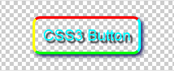
border-left: #ffff00
border-left-width: 5
And here’s our button with these new settings. Background This section controls the background of the button. The settings are: Background and the option of gradient or solid. There is also a Start Color and End Color for the gradient option.
If we turn the background off, this is what you’ll see. For something different, I’ll use a solid color with the setting of: #1156ab solidbackground
Notice that it tends to flatten the perceived depth of the button. Hover This is the last section we’ll look at. Like the Background section, there are only a few options: Background (gradient or solid) and color. In this case I’m going to choose the gradient option. This brings up some default settings for the starting and ending colors. These are: start color: #999999 end color: #000000
This is what the button looks like when you move your mouse over it.
.button {
  font-family: Arial;
  color: #00fbff;
  font-size: 30px;
  padding: 15px;
  text-decoration: none;
  -webkit-border-radius: 15px;
  -moz-border-radius: 15px;
  -webkit-box-shadow: 4px 4px 10px #141266;
  -moz-box-shadow: 4px 4px 10px #141266;
  text-shadow: 5px 5px 3px #2e2e2e;
  border-top: solid #fa0000 5px;
  border-right: solid #00ffff 5px;
  border-bottom: solid #00ff09 5px;
  border-left: solid #ffff00 5px;
  background: #1156ab;
}
.button:hover {
  background: -webkit-gradient(linear, 0 0, 0 100%, from(#999999), to(#000000));
  background: -moz-linear-gradient(top, #999999, #000000)
  filter: progid:DXImageTransform.Microsoft.gradient(startColorstr=undefined, endColorstr=undefined);

}
 include IE styles
Notes and Observations
One of the things I noticed was that there’s no reset button in case you want to start over. The only way to accomplish this is to reload the page. Note that you cannot change the text of the button. That’s there for demonstration purposes only. You’ll have to enter the text you want on your web pages.
Alternate Methods
If you have an image creation program, such as Adobe Illustrator or CorelDRAW, you can obtain plug-ins (free and commercial) that will allow you to quickly generate buttons that you can use for your layouts. And unlike this online tool, you can save your buttons for reuse/editing later. As an alternative to buying a graphics program, keep a notepad handy and write down all the step you used to create the buttons that you like. That way it will be easy to recreate them again and you won’t have to relearn the process.
Plug-in Websites
• 200+ Ultimate Collection of Photoshop Plug-Ins


