Introduction
Even though CSS3 is not supported on all browsers yet, many web developer have started to use some of the techniques that it provides. CSS3 has evolved into a technology which, when combined with HTML5 and JavaScript, may end up being a Flash-killer. In this series of articles, we will cover the key additions to CSS3. In the previous article, we learned about layouts with CSS3; and today we will cover the border properties in CSS3.
Border Radius
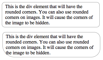
First, lets look at the most useful border property: border-radius. As the name suggests, it allows you to make sexy looking rounded cornered rectangles in your browser. No images, no sliding-doors, no hassles. All in CSS. Since this is a CSS3 feature, it will work on modern browsers, that is, Internet Explorer 8 upward. The webkit and mozilla browsers have been supporting it for a while. However, if you are particular that the rounded corners render on Internet Explorer 6 and 7 too, you will have to resort to using images. No wait, you can still use the CSS3 property; although you will have to include some additional files that come with CSS3Pie. The syntax for the border radius is simple:
border-radius: 10px;
-webkit-border-radius: 10px;
-moz-border-radius: 10px;
}
The above code will give a 10 pixel rounded corner the the element. If you want to specify a different radius for each of the corners you can do so too. Although most webkit and mozilla based browsers interpret the border-radius property, it is just safer to add the engine-specific syntax. Click here to see a working example.

Rounded Corners
Border Image
Border radius works for rounded corners, but sometimes we want a fancier way to box content – beveled borders, a drop shadow or even simply a double colored borer. With CSS3’s border-image property, you don’t need to worry about slicing the image, inserting additional divs for the right and left edges nor do you need to break your head aligning them across all browsers. The syntax might scare you a little at first, but once you get your head around it, you can achieve remarkable results with very little code and simple graphics.
path_to_border_image: image to be used for the border.
A,B,C,D: where to slice the image, dividing it into 9 portions.
A: height of top strip.
B: width of the right strip.
C: height of bottom strip.
D: width of left strip.
type: how the browser should apply border to the edges of the element.
Let us look at a concrete example to make the concept clearer.

Border Image
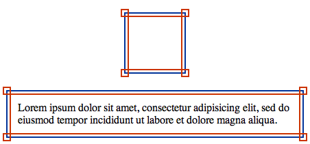
The first image is the graphic that we will use to display the border. Notice that we create just one image and in CSS we will specify the portions that represent the corners and those that represent the edges. The second screenshot is of border-image in action. Click here to see a working example.
And here is the CSS used to achieve the above.
border-width:12px;
-webkit-border-image:url(images/double_line.png) 12 repeat;
-moz-border-image:url(images/double_line.png) 12 repeat;
border-image:url(images/double_line.png) 12 repeat;
padding: 10px;
}
For a more detailed article on border-images, read How to Create Border Images Using CSS3.
Border Gradient
Another interesting border property is border-colors. Unfortunately it isn’t supported by all browsers, in fact, as of now only Mozilla browsers support it. Where could you use it? Well, if you want to box your content with a gradient border or a double colored border, this would be perfect.
The syntax is quite simple.
border: 8px solid #000;
-moz-border-bottom-colors: #555 #666 #777 #888 #999 #aaa #bbb #ccc;
-moz-border-top-colors: #555 #666 #777 #888 #999 #aaa #bbb #ccc;
-moz-border-left-colors: #555 #666 #777 #888 #999 #aaa #bbb #ccc;
-moz-border-right-colors: #555 #666 #777 #888 #999 #aaa #bbb #ccc;
padding: 10px;
}
The keyword here is ‘-moz-border-XXXX-colors’. So first you specify the border with and color of the border and then you have to specify the color of each of the pixel rows of the border width. In the example above, we are using an 8 pixel wide border, so we need to specify 8 color values. If we don’t, the default color will be used. Unfortunately we don’t have a short form for this. We have to specify each color and repeat it for each edge of the box.
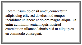
Here is what we achieve with the above code.

Border Gradient
Click here to see a working example. Note, this will only work on Mozilla browsers. On other browsers you will not see the gradient.
Conclusion
So that covers the exciting border properties that have been introduced in CSS3. I have cited a few instances that you could you them. I am sure that you will find more use of them. If you want to share your thoughts with me and other readers, feel free to elucidate in the comments section below.


