Introduction
Border images are one of the trickier CSS3 techniques, but after you figure out how they work, you can achieve quite remarkable results. It’s the best way to box content that is wrapped in a div. If your thing is drop shadows, or bevelled edges, with CSS3 you can now achieve this with just a single image. You won’t need to bother with slicing the image, inserting additional divs for the left and right edge of the box, nor will you have to deal with their alignment across browsers.
Which browsers support border image?
As with many CSS3 features, Firefox, Safari, Chrome and Opera have been providing support since the last two versions of their respective browsers. Internet Explorer however, doesn’t seem to want to support it. The current version, Internet Explorer 9, doesn’t support it and we haven’t heard of version 10.0 supporting it either. Internet Explorer, being the most popular browser even today, is a bit of a let down for most web developers, but the growing percentage of Chrome and Firefox users–which is eating into Internet Explorer’s dominance–is giving us developers an option where we can build out a site using CSS3 features that are compatible with Chrome and Firefox, but with functional compliance on Internet Explorer. So let’s say we use border image to give a drop shadow to a div, on Internet Explorer, the shadow just won’t show up.
How border images work
The syntax is quite straight forward:
border-image: url(path_to_border_image) A [B C D] [type]
path_to_border_image: image to be used for the border.
A,B,C,D: where to slice the image, dividing it into 9 portions:
A: height of top strip
B: width of the right strip
C: height of bottom strip
D: width of left strip
type: how the browser should apply border to the edges of the element
A few border image examples
A bit confusing eh? Don’t worry, we will see a few examples of image borders and you will get a hang of how it works. Let’s start with a simple example. We are using the following image to create the image border in the screenshot below:


Here is the CSS3 style to achieve the above output:
.dots {
border-width: 30px;
-webkit-border-image:url(images/dots.png) 30 repeat stretch;
-moz-border-image:url(images/dots.png) 30 repeat stretch;
border-image:url(images/dots.png) 30 repeat stretch;
padding: 30px;
}
As with most of the CSS3 properties, you have to define the same property multiple times for different browsers. Fortunately the syntax for all of them is the same, so you only need to understand one syntax. To use border images, there are 2 properties that you need to define. border-width and border-image. I know it seems stupid to have to define the border widths twice, but that’s how the cookie crumbles.
The syntax for border-radius is quite self explanatory. You specify the path to the image, the widths and then how the image should cover the area. In the above example, we are using both types. Horizontally we are repeating the image while vertically we want it to stretch. Usually you won’t be combining the two, but in the interest of full explanation, I wanted to show you that it is possible to do this.
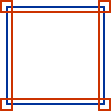
Next up, let’s look at a more complicated example. You will probably never need to set different border widths for each side of the element, but it is still important to understand how it works. We are using the following image to create the image border in the screenshot below:


Here is the CSS3 style used to achieve the above:
.lines {
border-width: 15px 20px 30px 30px;
-webkit-border-image:url(images/lines.png) 15 20 30 30 repeat;
-moz-border-image:url(images/dots.png) 15 20 30 30 repeat;
border-image:url(images/dots.png) 15 20 30 30 repeat;
padding: 10px;
color: #fff;
}
The key difference between this example and the previous one is the border widths. We have specified different border widths for each of the edges here. The order is top, right, bottom and finally left. In case you’re wondering, it is the same order as all other CSS properties like margin or padding. If you just define one value (like in the first example), the value applies to all 4 edges. If you define 2, then the first value applies to the top and bottom, while the second one applies to the left and right edges. If you notice, the center part of the image is stretched across as the background of the element. In case you don’t want that to happen, you will have to give the image a transparent background.
A more realistic border image example
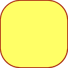
Having looked at a couple of examples that we won’t really use, (but which help in understanding how border images work), let’s look at more realistic examples that you might actually use:


Here is the CSS3 style used to achieve the above:
.rounded {
border-width:30px;
-webkit-border-image:url(images/rounded30.png) 30 repeat;
-moz-border-image:url(images/rounded30.png) 30 repeat;
border-image:url(images/rounded30.png) 30 repeat;
}
.double {
border-width:12px;
-webkit-border-image:url(images/double_line.png) 12 repeat;
-moz-border-image:url(images/double_line.png) 12 repeat;
border-image:url(images/double_line.png) 12 repeat;
padding: 10px;
}
Conclusion
That’s it! Once you understand how it works, it doesn’t seem that complicated, does it? One extremely useful occasion to use border image is when you want to give a drop shadow or rounded corners to a box. However, in CSS3, they have introduced box-shadow and border-radius which are better options than using border images. Sometimes however, you want to give a ‘designer’ border to a box and you can’t do that just with CSS3 properties. That is when you could use this property.


