How to Use Multiple Backgrounds with CSS3
The page header is often one of the most graphics intensive parts of your site, often comprised of several graphical elements. CSS positioning gives us the ability to organize our header graphics in a way that is visually pleasing at various resolutions. However, element positioning can only take you so far. For example, displaying text over top of the graphics can get complicated. Now, thanks to CSS3, we can define all of an element’s background properties using CSS3. In this tutorial, we’ll create a header using several of the updated CSS3 properties.
I thought it might be fun to replicate my music website’s header using the new CSS3 properties. My host employs templates and a CMS to manage sites, so I don’t have direct access to the source code. I’ll put up the demos on Codepen that highlights both the source code and results.
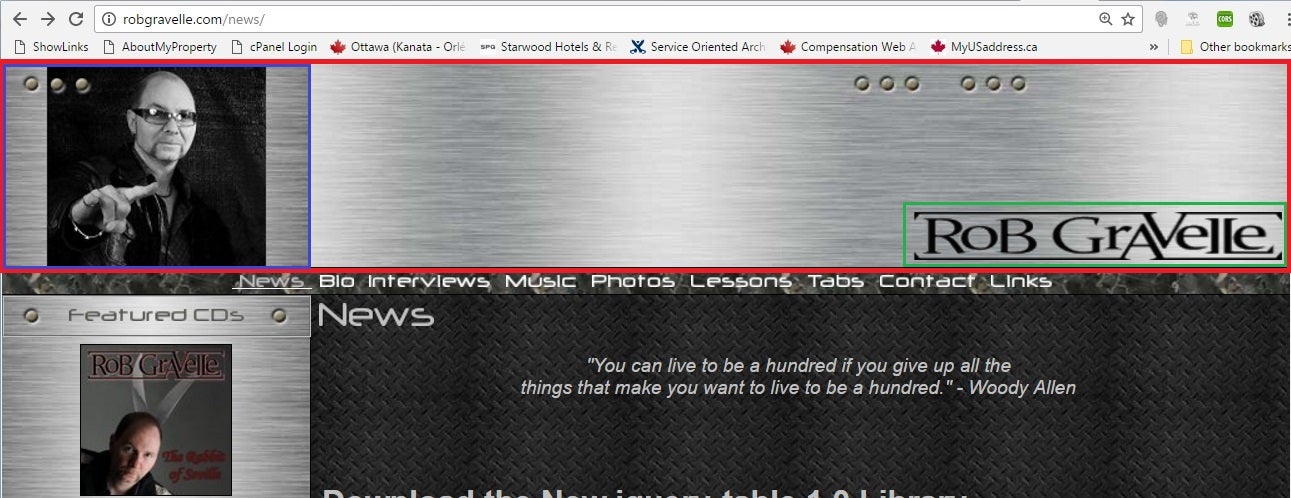
The robgravelle.com header contains three graphic elements:
- The steel textured background
- My photo
- The Rob Gravelle Logo
Here is a screenshot of the landing page, with the above components outlined in red, blue, and green respectively:
This may be the shortest tutorial section ever, but it’s kind of important! The above graphics will be positioned within a DIV element with an ID of “header”. Normally, there would be more markup for the rest of the page, but we’re only going to focus on the header.
<div id="header"></div>
The New background-* Properties
The oft-used background-image, background-repeat, and background-position properties now accept a comma-separated list. These are layered atop one another with the first background you provide in front and the last background listed in the back. No need to specify a z-order!
Step 1: Set the Container’s Appearance
DIVs don’t expand to the size of their contents, so you have to set their width and height. A width of 100% will stretch the header across the viewport no matter what size it’s set to. Ideally, the height value should be that of the main background image. Having said that, you can employ some flexible cropping by setting it to a different value. For instance, I set my header’s height to slightly more than that of the background image so that the rivets will appear on the bottom as well as the top. You can include all sorts of other properties such as the border and background color:
#header {
  width: 100%;
  height: 200px;
  border: 3px solid #ccc;
  background-color: #ccc;
}
That will produce an empty rectangle.
Step 2: Assign the Images
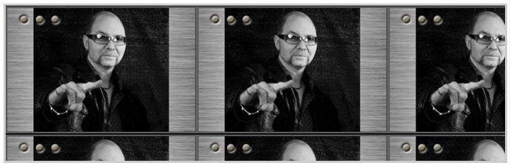
The next step is to set the images via the background-image property:
background-image: url(http://robgravelle.com/@/SiteBuilder/_skins/5/.custom/photos/MAIN.jpg),
                  url(http://robgravelle.com/@/Storage/_files/62/file.gif),
                  url(http://robgravelle.com/@/SiteBuilder/_skins/5/images/bg/~~header);
That will include all three images with repeat turned on. As such, we can only see the first image in our list because it’s on top of the stack:
Step 3: Set the Repeat Values
The background-repeat can also be overloaded to set the repeat values of each image, as defined above. Typically, you only want the bottom image to be repeated.
background-repeat: no-repeat, no-repeat, repeat;
Now we can see all three images:
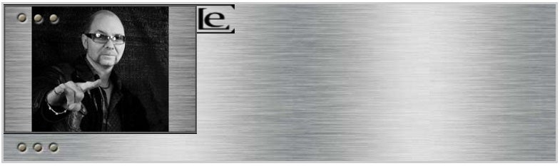
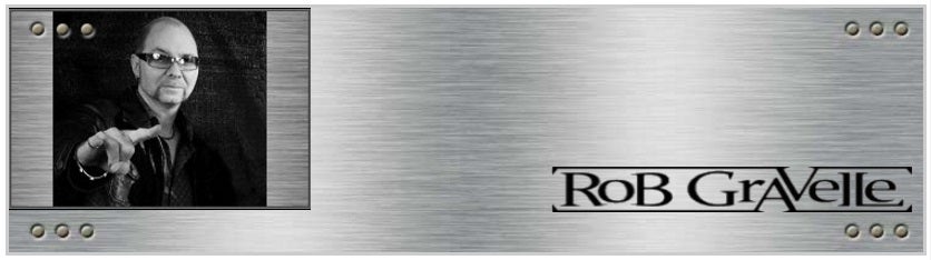
Image Positioning
Positioning of the images is accomplished using the background-position property. It accepts two values where the first value is the horizontal position and the second value is the vertical one. Those values can be a mix of:
- named values: i.e. left top, right center, center bottom
- percentages where the top left corner is 0% 0% and the right bottom corner is 100% 100%: i.e. 0% 0%, 50% 50%, 25% 75%
- any valid CSS unit: i.e. 10px 10px
Values may be mixed and matched.
Both the bottom (backdrop) image and photo should be placed in the left top corner. The logo should be in the vicinity of the right bottom corner. I found that percentages of 98% 80% did the trick:
background-position: left top, 98% 80%, left top;
Here’s the header again, with everything in its proper place:
The demo is available on Codepen.
The Shorthand Version
All of the properties that we defined above can be combined using the shorthand background property. Moreover it also accepts an optional background color that will fill in the bottom image’s real estate while it loads. Here is the code that does that:
background: url(http://robgravelle.com/@/SiteBuilder/_skins/5/.custom/photos/MAIN.jpg) no-repeat left top,
url(http://robgravelle.com/@/Storage/_files/62/file.gif) no-repeat 98% 80%,
url(http://robgravelle.com/@/SiteBuilder/_skins/5/images/bg/~~header) repeat left top
The above CSS can be viewed in its own demo.
Conclusion
From here on in, when you’re considering whether or not to position images in the background, think about how you want them to relate to other page elements. For instance, if you want text to scroll over the images, use the background(-*) properties. Otherwise, position them in the foreground with other page elements.