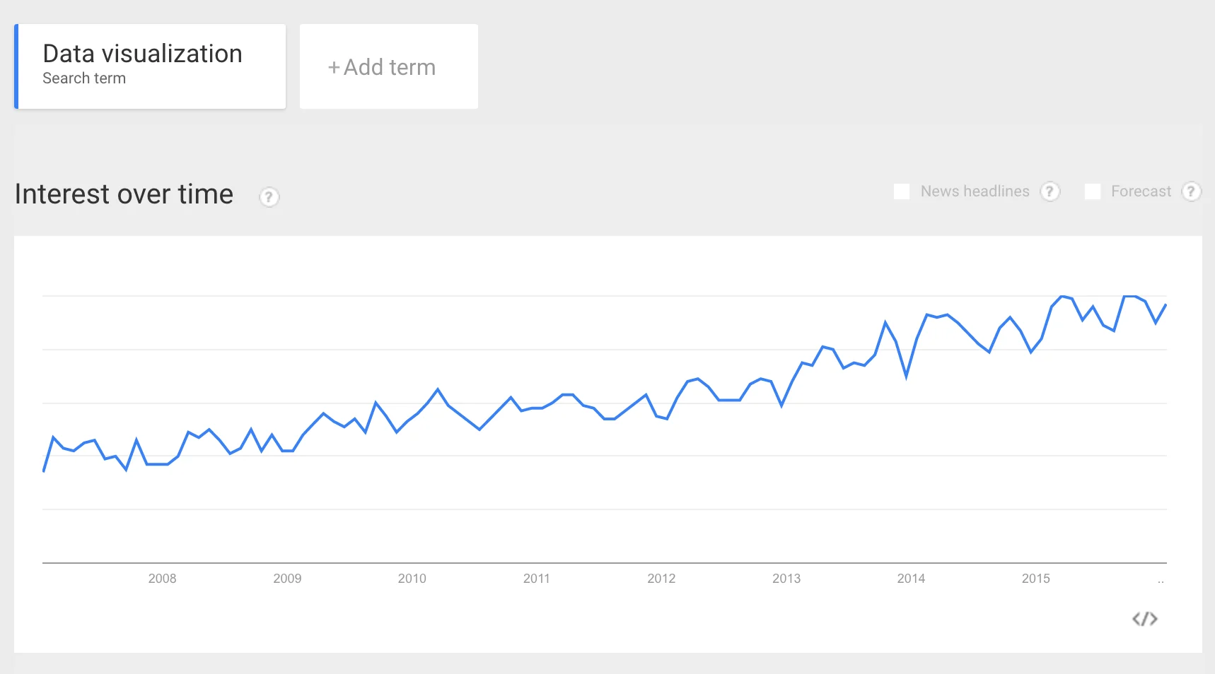
Data visualization is a hot topic nowadays. Just look at the Google Trends graph below to understand its steady rise in popularity over the years.

As the data that we have with us increases, so does the need to make sense of it. And what better way to do it than visualizing it? Plotting a chart from the raw data let you see patterns that were never visible before. So, if you design or build websites then sooner or later you are going to feel the need to have interactive charts on your website. And that’s the reason I decided to write a detailed tutorial on this topic.
For this tutorial I am going to use FusionCharts™ JavaScript charts library. Although the package offers more than 90 different chart types, there is a unique pattern that is followed across the charts. If you understand that pattern, you can make any chart for your website. I am going to pick 2 charts from different sub-categories to explain the process. Even if you have never made any chart before, you will be able to follow this step-by-step tutorial to make some stunning charts today.
One quick note before we dive in: don’t worry if you don’t follow everything in this article. I have included live samples with full source code for both the examples I use (and one extra for practice at the end). So you can browse through those to have a better understanding.
Now, without further ado, let’s get started!
5 Steps to Making a Chart in HTML5
Like with everything else in life, there’s a set process behind creating HTML5 charts. To make it easier to digest, I have divided the complete process into 5 steps:
- Step 1 – Preparing the data
- Step 2 – Including JavaScript files
- Step 3 – Creating a chart container
- Step 4 – Creating chart instance and rendering the chart
- Step 5 – Customising the design
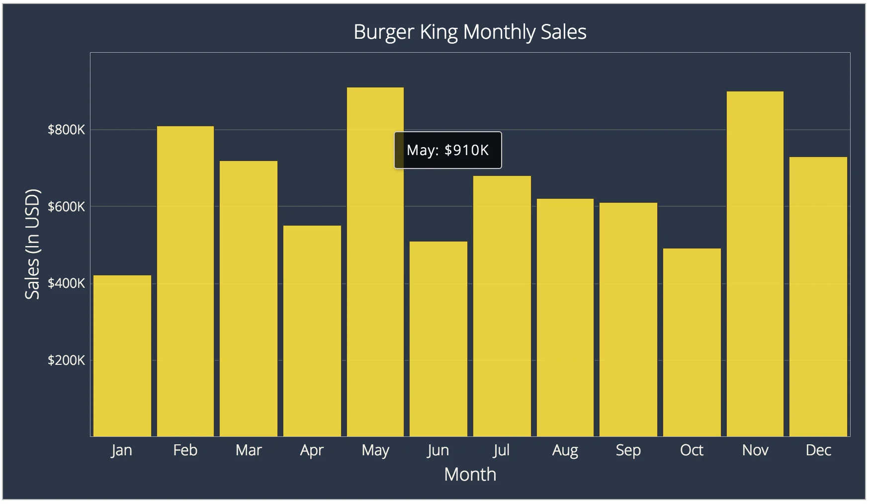
You can make any chart with FusionCharts if you follow above 5 steps. Now I am going to take an example of simple column chart to explain all the steps in detail. This is what we are going to make (live version here):

Note: Before you start reading below tutorial make sure you have downloaded FusionCharts trial license (commercial use) or personal license (non-commercial use).
Step 1 – Preparing the Data
We can use data in either JSON or XML format. For this demo I am going to use JSON as it has become the default format in web apps. FusionCharts accepts JSON data as an array of objects containing label and value.
Suppose you have data in two columns. Then content in the first column will become “label”and content in the second column will become value. This is how the first two objects inside the data array will look like:
[{
“labelâ€: “Januaryâ€,
“valueâ€: “420000â€
}, {
“labelâ€: “Februaryâ€,
“valueâ€: “810000â€
}...]Thats all the formatting we need to plot a column chart. In fact this is good enough for many chart types. If you are unsure about the data format required for a chart, search for that particular chart in the charts gallery. Here you have live samples of 800+ charts. Find what you need and see the formatting required.
Step 2 – Including JavaScript Files
Once you have the data ready, its time to include all the JavaScript dependencies. For a column chart we just need the core library – fusioncharts.js. For other charts there are other files that are required, but fusioncharts.js will take care of those for you.
fusioncharts.js will go inside HTML using tag. Heres how we do it:
<html>
<head>
<!-- FusionCharts core library -->
<script type="text/javascript" src="/path/to/fusioncharts.js"></script>
</head>
</html>Step 3 – Creating Chart Container
A chart needs a container to sit inside the HTML page. HTML Heres how we define an HTML Note: you will need separate Now we need to create an instance of the chart type as Heres the code to do that: Here is the explanation for above code: After you have followed above four steps, you will get a simple chart. But you don’t want a chart that looks just okay. Do you? I always like to have the ability to customize my charts the way I want. And FusionCharts provides this ability right out of the box. Its as easy as adding a key-value pair. For example, if you dont like the background of your chart, you can change it by assigning Changing background color is a macroscopic thing, but you can go at microscopic levels as well. For example, if you dont like the distance between your tool-tip text and tool-tip boundary, you can change it by adjusting I have just given you two examples, but there are hundreds of different configurations you can play with. To learn more about it, explore chart attributes section and search the chart type you want. If you faced any difficulty above, feel free to head over to this live demo which contains source-code for this chart: http://codepen.io/lalwanivikas/pen/LGXGyN?editors=1010 Now with a column chart under our belt, lets make something little fancy: a funnel chart. It is a very popular chart type and is used in all kinds of crazy analysis. In my example below I have tried to create a marketing funnel. This is what we will be making (live version here): I am not going to go into detail for making this chart. It follows the same steps with just one difference in step 4. Since funnel chart follows the same data format as column chart, we just need to change chart Since funnel chart is part of FusionWidgets package, in the earlier versions it was required to include a separate JS file called This is how it used to be done earlier: Rest all steps remain same. Now go out and actually try making one! If you get stuck somewhere, feel free to head over to this live demo which contains source-code: http://codepen.io/lalwanivikas/pen/PZxZxa?editors=1010 I hope you enjoyed my article! Feel free to post any comment below or catch me on Twitter if you have any questions. Always happy to help! Author bio: Vikas is a budding programmer who likes to have fun with front-end technologies. You can see some of his tiny experiments on his website. He used to work at FusionCharts and is always available for a quick chat on Twitter.<body>
<div id="chart-container">Your awesome chart will render here!</div>
</body>Step 4 – Creating Chart Instance and Rendering the Chart
column2d, set the width and height, and finally specify the JSON data for the chart.FusionCharts.ready(function() {
var salesChart = new FusionCharts({
type: "column2d",
renderAt: "chart-container",
width: "100%",
height: "500",
dataFormat: "json",
dataSource: {
"chart": {
"caption": "Burger King Monthly Sales",
"captionFontColor": "#fff",
// more chart configuration options
},
"data": [{
"label": "Jan",
"value": "420000"
},
// more data
]
}
});
salesChart.render();
});FusionCharts object in the salesChart variable. Each chart in your HTML page needs to have a separate variable. The initialization code is wrapped within FusionCharts.ready method.column2d chart. Each chart type has a unique name/alias, using which you can create instance of that chart. In our example, we are creating an instance of column2d chart with width 100%, height 500px, and providing JSON data as a string.dataFormat parameter to json.dataSource parameter.render method to draw the chart in chart-container Step 5 – Customising the Design
bgcolor the color of your choice (hex code).toolTipPadding property. Cool, Right?Making a Funnel Chart

type to funnel. (of course you will have to make sure that the data you are feeding is actually fit for a funnel!)fusioncharts.widgets.js using script tag. But now FusionCharts loads all dependencies automatically provided the required JavaScript files are placed in the same folder.<html>
<head>
<!-- FusionCharts core library -->
<script type="text/javascript" src="/path/to/fusioncharts.js"></script>
<!-- FusionWidgets library (needed for funnel chart)-->
<script type="text/javascript" src="/path/to/fusioncharts.widgets.js"></script>
</head>
</html>What’s Next?
