


One of the key features of HTML5 is the introduction of new markup elements intended for better UX for web users. In earlier articles on HTMLGoodies.com, we have discussed the new markup elements for use in forms, but there are two attributes on form elements that are intended to ease the interaction of users.
Placeholders
When an empty input box is presented in a form to the users, there is a good chance that users can get confused (especially if this is the first time they have interacted with your web page). A good way to reduce such confusion is to provide a hint to the user as to the type of content that is suitable for the input field.
HTML5 supports hinting on the input control via the placeholder attribute. The value of the placeholder attribute, also called the watermark, appears typically in light gray color. This visual different from a typed in value allows user to understand if the value they are seeing is something they have typed in vs something that was created by the web server.
Here is a simple example of the placeholder attribute in action.
//placeholder.html
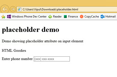
placeholder demo
Demo showing placeholder attribute on input element
Enter phone number
When the above HTML is rendered in a modern browser, we can see that we get “hinted” about the format of phone number that is expected.
While it might seem that placeholders can be used anywhere, it is a good web programming practice to only include them where there is ambiguity for the user. Placeholders aren’t meant to describe the field or instructions.
Autofocus
Another attribute which helps make forms easier to use in HTML5 is the autofocus attribute.
In the most typical scenario, users want to start interacting on a form by typing. However, because of no built in capability in HTML4 and below, users were expected to select the field where they want to type or web developers had to write JavaScript to get the focus on the proper element on page load event so that users can being typing as soon as the form loads.
This attribute “autofocus” can be added to a single ‘input’ or ‘textarea’ element.
For example, when the example used previously was loaded, we can see that we cannot directly type in the text field when the form was loaded. Instead, we had to click in the “input” field and only then could we type.
Here is the earlier example updated with “autofocus” attribute added.
// autofocus.html
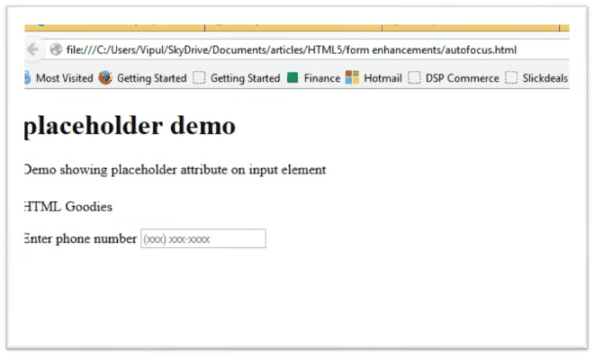
placeholder demo
Demo showing placeholder attribute on input element
Enter phone number
When we load the page in a browser, we can see that the focus is directly on the “phone” field.
In Firefox, the page is rendered as under, with the focus in front of the placeholder text.
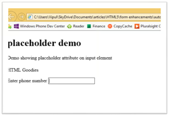
In Internet Explorer 11, the page is rendered but the placeholder text is not shown (which seems like a bug).
Summary
In this article, we learned about a couple of form enhancements that improve the user experience. I hope you have found this information useful.
About the author
Vipul Patel is a technology geek based in Seattle. He can be reached at vipul.patel@hotmail.com . You can visit his LinkedIn profile at https://www.linkedin.com/pub/vipul-patel/6/675/508
