Bootstrap is a framework to help you design websites faster and easier. It includes HTML and CSS based design templates for typography, forms, buttons, tables, navigation, modals, image carousels, etc. It also gives you support for JavaScript plugins.
To learn about the inner workings of Bootstrap, I contacted Stas Demchuk, Senior Software Engineer at: 8sph.com.
Here’s what you need to know:
1. First of all, Bootstrap is the most popular framework for creating layouts. Here are some additional reasons to use Bootstrap:
- Bootstrap’s responsive CSS adjusts to phones, tablets, and desktops
- Mobile-first styles are part of the framework
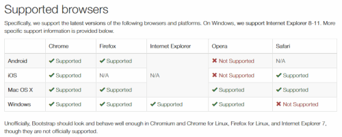
- Bootstrap is compatible with all modern browsers (Chrome, Firefox, Internet Explorer, Safari, and Opera)
2. Bootstrap has a big community and friendly support. For resources visit:
- Check out the Bootstrap Blog.
- You can chat with Bootstrappers with IRC in the irc.freenode.net server, in the ##bootstrap channel.
- Have a look at what people are doing with Bootstrap at the Bootstrap Expo.
3. Bootstrap is easy to set up and create a working layout in less than an hour
They have a basic template available at http://getbootstrap.com/getting-started/#template and also a set of examples for different needs (http://getbootstrap.com/getting-started/#examples). You can just download the bootstrap repository, go to docs/examples folder, copy/paste the example you need and work on it.
4. You don’t need to know HTML and CSS well to use bootstrap, it’s a plus if you’re a backend developer and need to do some UI changes.
5. It’s fully customizable, I can choose which components I’d like to use and use variables file to get do even more color and behavior customization.
All you need to do is visit http://getbootstrap.com/customize/ , choose the plugins you need and click download. Bootstrap also provides a way to override its internal variables for advanced users, but they provide pretty decent defaults, so you shouldn’t worry about this unless you need to.
6. When you update the version of Bootstrap, you won’t see tons of errors because their core team cares about backwards compatibility.
7. Their documentation is great! Here are some resources to check out:
8. Bootstrap offers a lot of helper classes that make development of a responsive website easy and fast.
You can turn any fixed-width layout into a fluid one by simply changing your parent .container class to .container-fluid.
Bootstrap also has .visible-*-* classes to help you control the way your sections are displayed on tablets and mobile devices. Example:
<div class=”visible-xs-block visible-sm-block”></div>
In this case, the div will be displayed as a section with display: block only on phones and tablets. It will be hidden on desktop.
9. Bootstrap’s components are well-adopted to the ecosystem of popular JS MVC Frameworks like Angular. Bootstrap provides several ways to include it into your project:
Using bower:
bower install bootstrap
Using npm:
npm install bootstrap
And just simply adding a script tag with the url to bootstrap source on CDN.
We also have ui-bootstrap for Angular.js and react-bootstrap for React. You can also install them via Bower and npm. And then, for example, to create a collapse element, you just need to create similar markup:
<div uib-collapse=”isCollapsed”>
<div class=”well well-lg”>
Content of the collapse
</div>
</div>
Instead of doing a lot of jquery configuration like you would normally.
10. Bootstrap resolves a lot of cross-browser issues and you don’t need to worry about that most of the time.
Note: Bootstrap is designed to work with latest desktop and mobile browsers. This means that displays might be different in older browsers and might render differently, though according to the documentation, the displays should be fully functional.
Here are a couple of screen shots about browser compatibility.

This is a link to list of the browser bugs Bootstrap has to deal with.
This is a link to a list of browser support of CSS3 and HTML5 features.
Additional Notes
From time-to-time you’ll probably want to print your layouts but you should know that printing can be tricky. Here are a couple of things to watch out for:
“As of Chrome v32 and regardless of margin settings, Chrome uses a viewport width significantly narrower than the physical paper size when resolving media queries while printing a webpage. This can result in Bootstrap’s extra-small grid being unexpectedly activated when printing. See #12078 for some details.”
For more information, check out this section on printing.
The Android Stock Browser: “Android 4.1 (and some newer releases apparently) ship with the Browser app as the default web browser of choice (as opposed to Chrome). Unfortunately, the Browser app has lots of bugs and inconsistencies with CSS in general.”
Box Sizing: Some 3rd party programs such as Google Maps and Google Custom Search Engine, create conflicts with Bootstrap. this is due to { box-sizing: border-box; }. For an in-depth read, check out the Getting Started page at GetBootStrap.com.
Thanks once again to Stas Demchuk, Senior Software Engineer at: 8sph.com.


