CSS3 Multi-column Layouts
The CSS multi-column layout uses new CSS properties which allow designers to break a layout into blocks. The two main properties which control the number of columns are: column-count and column-width.
Related Properties
- column-width
- column-count
- column-gap
- column-rule
- column-rule-width
- column-rule-style
- column-rule-color
- column-span
- column-fill
- columns
Degradation
Column properties are ignored by browsers which don
’
t support them. To deal with that issue, create a single column layout for unsupported browsers and multiple columns with browsers that support them.
Note: To make sure you can use multiple columns, each property needs to be written three times: Once with the -moz prefix, once with the -webkit prefix, and once without the prefix.
Syntax
Here are some examples of how you would use the multi-column properties:
Here
’
s how to use column-count:
<
style
>
.columns2 {
-webkit-column-count: 2; /* Chrome, Safari, Opera */
-moz-column-count: 2; /* Firefox */
column-count: 2;
}
<
/style
>
<
/head
>
<
body
>
<
div class=
”
columns2
″
>
Lorem ipsum dolor sit amet, consectetur adipiscing elit. Ut eu augue orci. Morbi tristique a felis et varius. Sed augue nunc, cursus sed congue sit amet, mollis sed risus. Aliquam sit amet fringilla nisl. Vivamus ullamcorper odio magna, ut sagittis justo accumsan at. Donec turpis turpis, sagittis vel nisl eget, sodales ullamcorper eros. Etiam ut velit non sapien tincidunt ultrices in et nisi.
<
/div
>
And the result.
You use the column-width property to set the smallest column width. If you don
’
t set the column-count, the browser will take over and create as many columns as necessary to fit the width. Here
’
s the code:
<
style
>
.columns2 {
-webkit-column-width:20em; /* Chrome, Safari, Opera */
-moz-column-width:20em; /* Firefox */
column-width:20em;
}
<
/style
>
<
/head
>
<
body
>
<
div class=
”
columns2
″
>
Lorem ipsum dolor sit amet, consectetur adipiscing elit. Ut eu augue orci. Morbi tristique a felis et varius. Sed augue nunc, cursus sed congue sit amet, mollis sed risus. Aliquam sit amet fringilla nisl. Vivamus ullamcorper odio magna, ut sagittis justo accumsan at. Donec turpis turpis, sagittis vel nisl eget, sodales ullamcorper eros. Etiam ut velit non sapien tincidunt ultrices in et nisi.
<
/div
>
And the result.
Here is an example which makes use of column-count, column-gap, and column-rule:
<
style
>
.columns3 {
-webkit-column-count: 3; /* Chrome, Safari, Opera */
-moz-column-count: 3; /* Firefox */
column-count: 3;
-webkit-column-gap: 50px; /* Chrome, Safari, Opera */
-moz-column-gap: 50px; /* Firefox */
column-gap: 50px;
-webkit-column-rule: 15px outset #00ffff; /* Chrome, Safari, Opera */
-moz-column-rule: 15px outset #00ffff; /* Firefox */
column-rule: 15px outset #00ffff;
}
<
/style
>
<
/head
>
<
body
>
<
div class=
”
columns3
″
>
Lorem ipsum dolor sit amet, consectetur adipiscing elit. Ut eu augue orci. Morbi tristique a felis et varius. Sed augue nunc, cursus sed congue sit amet, mollis sed risus. Aliquam sit amet fringilla nisl. Vivamus ullamcorper odio magna, ut sagittis justo accumsan at. Donec turpis turpis, sagittis vel nisl eget, sodales ullamcorper eros. Etiam ut velit non sapien tincidunt ultrices in et nisi. Phasellus fringilla quam rutrum, semper neque pretium, fermentum justo. Suspendisse convallis, purus vitae mollis semper, est justo pretium neque, sit amet convallis nisi justo vel justo. Integer vestibulum, felis vel ultricies ornare, diam risus viverra odio, at tempus elit tellus quis purus. Sed porta, eros vel vehicula sollicitudin, nisi orci maximus magna, vitae commodo dui magna nec libero.
<
/div
>
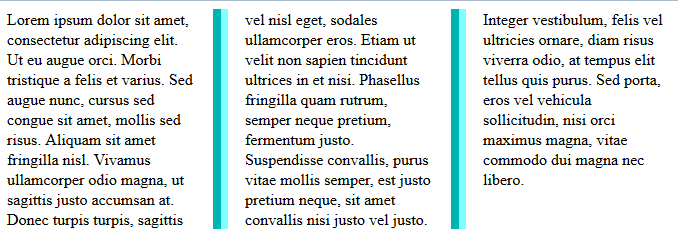
And the result.
Height Balancing
With the CSS3 Column specification the browser automatically sets the column height so the content in each column are similar. That said, you might want to set the height manually using the CSS height or max-height properties and then build your layout accordingly.
Resources


