written by Charlie Morris
No, this is not the same as my previous article, How to Build Lame Web Sites. That one was about general Web site-building mistakes, which are made by highly-paid professionals as often as by clueless newbies. This article focuses on design gaffes made innocently by beginners who simply don’t know any better. I’ve included various resources that can help you learn to do things correctly.
Busy Backgrounds
Want a great-looking background for your Web pages? Just use the following BODY tag at the top of each page:
<BODY bgcolor=white>
This will give you a plain white background, suitable for all occasions. If you really want a different look, substitute black for white. End of lesson.
Okay, in certain special cases, you might conceivably get away with something other than black or white. I even know of one site that uses tan for sidebars. Just make sure the background colors you choose fit your site’s image (bright colors for a children’s site, subdued ones for business, etc.).
Don’t use a background image, folks. I know you can, but don’t. Do books and magazines have background images? Do you want people to read the material on your site, or to be distracted (and slowed down) by cute graphics?
Okay, if you still insist on a background image, be sure to make it very, very light, so that it doesn’t obscure the text in front. Test it on every single page to make sure it doesn’t interfere with the text, but remember that not all visitors will see the text in the same place in relation to the image.
A background image can be a small one that repeats over and over to fill the page (that is to say, it “tiles”), or a large one that fills a whole page or frame. The latter kind are problematic, especially when used with frames. If a visitor has a different screen resolution than the one you designed the background for, the page won’t look right. Often high-resolution visitors will see the edge of another copy of the graphic to the right and below, as it automatically begins to tile. Such a graphic in a frame can also cause unwanted scrolling.
Whatever you do, do not use a sunset, or a picture of the Earth from space, as a background image.
Busy Graphics in General
Use graphics only when they really add something necessary to the presentation. Keep them simple, and keep their file sizes small. Resist the temptation to use a graphic instead of plain HTML text for things like headings and navbars. True, HTML text will not look exactly the same in all browsers, but if you use Cascading Style Sheets, you can get a full range of attractive effects. Text has several other advantages: It loads faster, is visible to people who surf with images off (and to disabled surfers), and is far easier to change.
Make sure your graphics are properly prepared for the Web. There are a number of little tricks you need to know, such as optimizing your graphic files, and using the right attributes in your image tags, all of which are described in the previous column on The ABCs of Web Graphics.
Crummy-looking Navbars
Bad:

A pretty lame-looking banner, don’t you think?
Perfect:

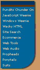
side nav bar
As the old beboppers used to say, if you have to ask, you’ll never understand it. But it has something to do with subdued colors, a neutral font, and the discreet use of an attractive (but simple) effect, in this case a drop shadow.
Awkward Frames
Many sites use frames to improve navigation, usually by creating a side or top navigational section that stays fixed while the main body text scrolls. Frames can be useful, but they can also get you in a lot of trouble if used carelessly. Nothing looks more amateurish than a page that opens in the wrong frame. Unless it’s a site with a bunch of claustrophobic, pointless little frames cluttering up the screen. Read my previous article on Web site navigation to learn how to use frames properly.
The Linear Look
In the early days of the Web, pages were laid out in a straight line. Images, paragraphs of text, headings – all came one after another in a vertical line down the page. Looooong pages were the order of the day, and you often had to scroll down a screen or two just to see what the heck was on a page. It wasn’t that early designers had no imagination – they had no choice, as early versions of HTML provided no way to create the side-by-side columns that are the basis of page layouts in newspapers and magazines. Fortunately, HTML 2.0 introduced the TABLE family of tags.
Tables are one of the most important design elements in HTML. Columns make pages easier to read, and allow much more information to be presented at one time, so they are used on most sites nowadays. Although tables are not a perfect way to create columns, they are the only way at the moment, so take your time and learn them thoroughly. HTML In Action is one of several HTML books that include a thorough tutorial on tables. Another great Web design book is Creating Killer Web Sites, which explains how to avoid the linear look of “first generation” Web sites.
Hit Counters
Monitoring and analysing your Web site’s traffic is important. Serious sites analyse their server logs to glean a wealth of information about who’s visiting. There are plenty of fine tools for doing this available free, so there is never any need to rely on such a crude and imprecise measurement as the so-called “hit counter.” It’s another piece of visual clutter that serves no purpose, and is considered one of the classic signs of a tyro’s site.
“Under Construction” Signs
Where did anyone ever get the idea that it was acceptable to have a link leading to a page that says “under construction” or “coming soon”? Some newbies get pretty elaborate with this nonsense, even including cute animated graphics of a highway barrier with a flashing light, like a little klaxon bleating “…amateur! amateur! amateur!…”
Have you ever seen a magazine, or a TV show, with an “under construction” segment? Web surfers have short attention spans, and very few have the slightest interest in anything that’s “coming soon.” The number of Web surfers who have ever returned to a link where they found a “coming soon” blurb is probably on the order of one in ten trillion. It’s okay to mention upcoming site features in body copy, but not to have a link to a section that doesn’t yet exist.
Also note that some search engines will refuse to list sites that contain “under construction” links.
Endorsements of Particular Browsers
Professional Web sites are designed to look acceptable in all major browsers. It is not possible to ensure that a page looks exactly the way you want it to, so you have no choice but to split the difference. Even if a visitor has the same browser as you do, they may have a different screen resolution, different browser preferences, or simply a different window size.
Some sites have a tiny blurb saying, “This site is designed for such-and-such a browser, such-and-such a screen resolution, etc. etc.” Do you really think anyone is going to read this little blurb and then open a different browser and change their screen resolution? Then why clutter your pages with this sort of nonsense?
Free Ads and Other Visual Clutter
Amateurs’ sites always seem to have a bunch of junk cluttering up the pages – banners for this, buttons for that, little icons, blurbs and whatnot. Remember that everything you include on your page increases your visitors’ load time, and that a clean, streamlined design looks best.
Sure, some of these doodads may make you a small amount of cash (Amazon), and some are useful for building traffic (LinkExchange and other similar programs). But what’s the point of the little Netscape and Explorer icons? Or the banners for obscure search engines that they make you put up in exchange for getting listed? Space on your pages (and on your server) is valuable. If a link, or especially a graphic, isn’t earning you real, measurable money or traffic, show the freeloaders the door.
Of course, links are what make the Web go round, and some links are well worth having, especially links to business associates and other related sites, awards you’ve won, and so forth. But arrange them neatly in appropriate places, perhaps on a separate links page. Don’t just strew them randomly around the bottom of your home page.
Getting Ripped Off by your Hosting Service
Don’t know anything about servers, or how sites are hosted? You don’t need to. There are plenty of hosting services, or ISPs, that will walk you step by step through the process of getting a Web presence set up. Unfortunately, you will pay for this sort of hand-holding, and many outfits will rip you off with some sort of pricey pay-as-you-go arrangement. These ISPs cater to beginners who don’t know how to edit HTML files – when you want to make changes to your site, you send the raw material to them, and they make the changes for you. Typically, you get to make a couple of changes per month free, after which you have to pay a healthy fee per change. They’re taking advantage of your ignorance by charging you an exorbitant fee to do something that you can easily learn to do yourself.
Folks, basic HTML is not difficult, and the process of transferring files to and from a Web server is simplicity itself. A previous ABCs column spells it out for you. For somewhere in the neighborhood of 50 bucks a month, you ought to be able to get plenty of Web space for a small site, and unlimited access to your Web server. One of the great things about the Web is the ability to update content quickly and easily, so learn how to make simple changes to your site yourself, and you’ll get a lot more out of your Web presence, as well as saving some money.
This article originally appeared on WebDevelopersJournal.com.


