
When you think about mobile devices, the idea of creating images would seem to be a straightforward process. Unfortunately, it’s not and one of the reasons is that there are so many phones available, each with different configuration and resolution requirements.
While there are many users who love graphics, heavy use of images on a web page that is designed for a cell phone is a bad idea, largely because of the load times. You’ll want to use images sparingly and only use ones that emphasize the most important points of your website. Two things to avoid are images that involve zooming or large files.
The reality is that image files need to be quite small–according to one source, no larger than 20KB, so compression is a must. In my experience, the best file formats to use are JPEG and GIF, and with GIF on a mobile device, I recommend making use of a smaller palette when possible. Bear in mind that many users get charged for bandwidth, so that’s another good reason to keep file sizes small. Be aware that some users might choose to use their mobile devices with the images turned off, so make sure you use ALT tags.
When building or adapting a current website for use with mobile devices, here are few things to observe:
- Put the most important information at the top of the page, including the company logo.
- Use a single column layout.
- Keep table usage to a minimum.
- Make the site easy to use. Keep any clutter to a minimum.
- If using CSS, keep the coding light. With HTML, the same rule applies.
- Get rid of comment tags in HTML, CSS and JavaScript files.
- Use back buttons in your layout.
- Build your site with the the .mobi extension
- Test your layout using an emulator. Examples include: emulator | dotMobi or iPhone Emulator for Windows.
- Be aware that some graphics applications like Flash might not work on a mobile device. According to one report, as late as August 2010, Flash on the Android was “shockingly bad.” To learn more, check out this articlewritten by Steve Jobs, in April, 2010.
- Another option is to make use of plugins or sites that either create a mobile site or convert your existing site into a mobile version.
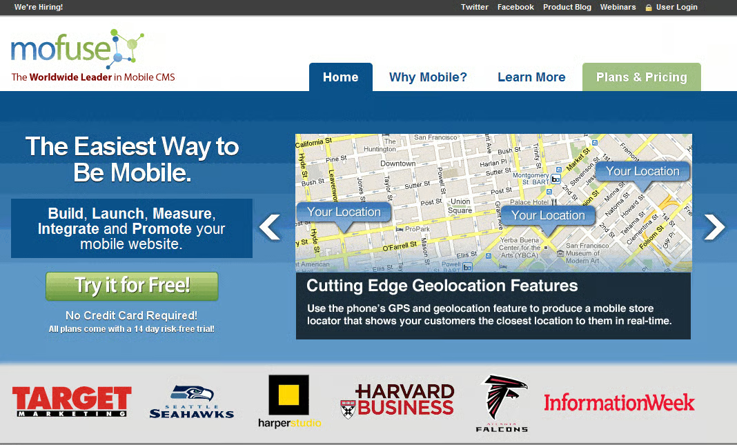
One of these options is a site called mofuse, which allows you to easily build a mobile site. Here are some compelling reasons to use their service:
- The loading time is about four seconds, compared with up to 40 seconds for a desktop site.
- You only have to build it once and it will optimize for the 5,000+ devices that access the mobile web. You don’t have to choose which devices to use.
- You can build it yourself or have mofuse build it for you.
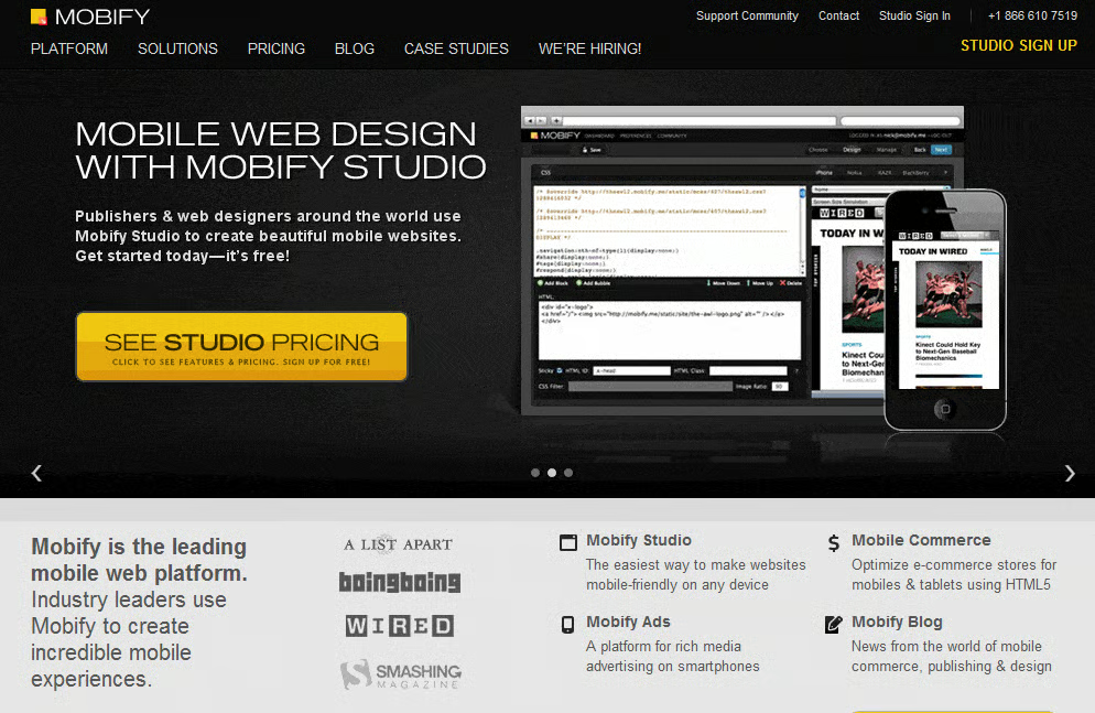
Another service to check out is MOBIFY. Like mofuse, it creates a site that is constantly updated with new device profiles and the latest HTML 5 features. Both sites give you the option of trying their services for free.
Another option is if you have a WordPress site and wish to optimize it for mobile devices. Below are a couple of resource options that you can check out:
