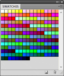
Web Safe colors, also known as browser safe colors, were introduced many years ago, when the web was in its infancy. And despite the advances in graphics cards, monitors and browsers, you can still find the web safe palette in many graphics programs.
A question that comes up every now and then is whether modern web designers should be using this type of palette – or not?

Before we answer this question, let’s look at some background information. Essentially, the web safe palette is made up of 216 colors with 40 left over. These 40 colors vary on both PCs and Macs. The 216 colors were designed to work cross-platform.
When this palette came into usage, most computer users had a graphics card that would only allow them to view 256 colors at a time. Today, hardly anyone–if anyone at all–has a computer of this type, so if you do use the web safe palette, you’re doing so for a minority of users, who still view the web in 256 colors. This, in my opinion, is a waste of time. The only other reason would be if you want a nostalgic effect.
Otherwise, I recommend that you avoid its usage and stick with a modern 256 color palette, such an adaptive palette for GIF files.
The Changing Color Landscape
Color and monitors have come a long way since then. Now users can view web images in 16.7 million colors. Still, the issue of color balancing is with us, now more than ever, partly because of the way that monitors are manufactured, the different graphics cards that are available and the environments in which a computer is used.
If color is important to you, and especially if you’re a photographer or serious image maker, you’ll need to make use of color balancing for your images, not just because it will give you a standard to work from; it will also increase the chances of your web images displaying the best possible quality on a wide variety of monitors. Unfortunately, everyone won’t see your images in the best possible light, despite your best efforts.
Many people think than when you create web images that they look more or less the same on different monitors, but that’s not the case. Here are few reasons why they don’t: different monitor manufacturers, how the monitor is viewed, aspect ratio, screen coating and more.
Then there’s the issue of where the monitor is located. Is the user at the beach? In an office? Does the lighting in the room change because of windows or is the monitor in an office where the lighting is constant? Are the walls painted a neutral gray or are there colors? Is the monitor protected by a shield that filters out stray light? Does the operator wear neutrally colored clothes?
And as for the monitor itself, is the screen background a neutral gray? All of these conditions affect color. And color calibration definitely helps, but it can only do so much. If the environment keeps changing, your color work will be unreliable.
If You’re Serious About Color
If accurate color is important to you, then you need to calibrate your monitor. This is your only way of ensuring accurate color. You cannot control the systems of other users, though you can control your own. Here are a couple of solutions that will help you with your color needs: Spyder3DPro and GretagMacbeth.
In addition to color calibration, here are some things to observe:
- Keep the computer in a room where the lighting is constant.
- Make sure that the lighting is filtered or muted in some way, to prevent glare on the monitor.
- Wear clothes that are a neutral gray in color (bright colors will cause reflection on the screen and interfere with your color perception).
- Use a high resolution CRT monitor. These are the best for accurate color. Check out Super Warehousefor options. While it can be tempting to use an LCD monitor, the viewing angle can play havoc with your perception of color, so I recommend that you avoid using them.
- If necessary, to prevent stray light from falling on the monitor screen, create a hood which covers the monitor on the top and sides.
- For the monitor itself, get rid of all wallpaper and use a background of a solid neutral gray color (RGB 127, 127, 127).
Assuming you make use of the above, your color perception and results will improve considerably.


