
In this article, we take a brief look at grids and how you can use them to create web pages. There are many aspects to CSS grid layouts. The grid terms will be listed here, along with a brief description and a sample of a grid at the end of this article, along with the code to create it.
Here are the various components of a grid:
grid: The grid layout is an intersecting set of horizontal and vertical grid lines that divides the grid container’s space into grid areas. These comprise grid items. There are two sets of grid lines. One set is the column axis; the other is for rows, defining the inline axis.
Here’s a drawing of what this looks like (from CSS Snapshot 2017)
Figure 1. The Grid Layout
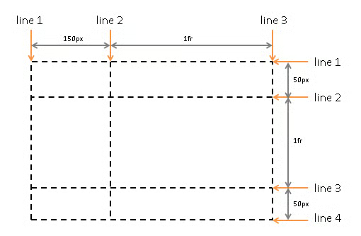
grid area: A grid area is used to lay out the grid items. It consists of grid cells and is bound by four grid lines, each one on a side of the grid area.
grid cell: Grid cells are formed where a grid row and column intersect. It is the smallest unit of a grid.
grid column: The columns run along the block axis of the grid.
grid container: A grid container contains formatting for its contents. Grid lines form the boundaries of each grid items’ containing block.
grid formatting context: A grid container creates a new grid formatting context.
grid item: These are boxes representing its in-flow contents.
grid item placement algorithm: The grid item placement algorithm place automatic positions of grid items into definite positions. This ensures each grid item is laid out into a well-defined grid area.
grid layout: In a grid, there are two sets of grid lines, made up of columns that run along the block axis and a set of rows that run along the inline axis.
grid-level: Grid items are grid-level boxes. these are part of the container’s grid formatting context.
grid order: The grid order is how grid items are encountered when moving through a grid’s cells. If two items are encountered at once, they are seen in the order that they appear.
grid placement: The location of a grid item’s area is the placement. The is defined by the grid position and span.
grid-placement property: Written in longhand, these are: grid-row-start, grid-row-end, grid-column-start, grid-column-end. the shorthand version is: grid-row, grid-column, and grid-area—allow. These allow the developer to specify a grid item’s placement.
grid position: This can be definite (explicitly specified) or automatic (determined by auto-placement).
grid row: This is the placement along the inline axis.
grid row line: Grid lines are the horizontal and vertical lines in a grid and is on either side of a column or row. You can use numbers to refer to them, or by an author-specified name.
grid sizing algorithm: The grid sizing algorithm, determines the size of all grid tracks and the entire grid. Each track has specified minimum and maximum sizing functions. Each sizing function is:
- A fixed sizing function (
or resolvable ). - An intrinsic sizing function (min-content, max-content, auto, fit-content()).
- A flexible sizing function (
).
grid span: This is how many tracks in a grid item. The span is always definite and it defaults to 1 if it can’t be determined.
grid track: This is a generic term for a grid column or grid row. It is the space between two adjacent grid lines. Each grid track contains a sizing function which controls the width and height of a column or row and how far apart the bounding lines are.
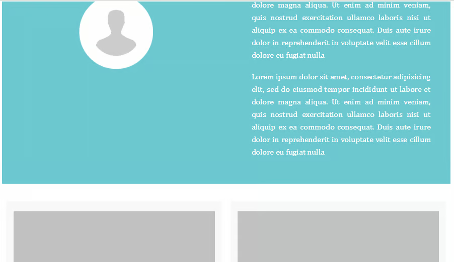
Below is an example of the code used to create a simple grid. This was created using Adobe Dreamweaver and is one of the templates they offer.
Listing 1. Code used to create a simple grid
<!doctype html>
<html>
<head>
<meta charset="utf-8">
<meta http-equiv="X-UA-Compatible" content="IE=edge">
<meta name="viewport" content="width=device-width, initial-scale=1">
<title>Light Theme</title>
<link href="file:///C|/Users/mexic/AppData/Roaming/Adobe/Dreamweaver CC 2017/en_US/Configuration/Temp/Assets/eamD3F6.tmp/css/simpleGridTemplate.css" rel="stylesheet" type="text/css">
</head>
<body>
<!-- Main Container -->
<div class="container">
  <!-- Header -->
  <header class="header">
    <h4 class="logo">GRID</h4>
  </header>
  <!-- Hero Section -->
  <section class="intro">
    <div class="column">
      <h3>JOHN DOE</h3>
      <img src="file:///C|/Users/mexic/AppData/Roaming/Adobe/Dreamweaver CC 2017/en_US/Configuration/Temp/Assets/eamD3F6.tmp/images/profile.png" alt="" class="profile"> </div>
    <div class="column">
      <p>Lorem ipsum dolor sit amet, consectetur adipisicing elit, sed do eiusmod tempor incididunt ut labore et dolore magna aliqua. Ut enim ad minim veniam, quis nostrud exercitation ullamco laboris nisi ut aliquip ex ea commodo consequat. Duis aute irure dolor in reprehenderit in voluptate velit esse cillum dolore eu fugiat nulla </p>
      <p>Lorem ipsum dolor sit amet, consectetur adipisicing elit, sed do eiusmod tempor incididunt ut labore et dolore magna aliqua. Ut enim ad minim veniam, quis nostrud exercitation ullamco laboris nisi ut aliquip ex ea commodo consequat. Duis aute irure dolor in reprehenderit in voluptate velit esse cillum dolore eu fugiat nulla</p>
    </div>
  </section>
  <!-- Stats Gallery Section -->
  <div class="gallery">
    <div class="thumbnail"> <a href="#"><img src="file:///C|/Users/mexic/AppData/Roaming/Adobe/Dreamweaver CC 2017/en_US/Configuration/Temp/Assets/eamD3F6.tmp/images/bkg_06.jpg" alt="" width="2000" class="cards"/></a>
      <h4>TITLE</h4>
      <p class="tag">HTML, CSS, JS, WordPress</p>
      <p class="text_column">Lorem ipsum dolor sit amet, consectetur adipisicing elit, sed do eiusmod tempor incididunt ut labore et dolore magna aliqua.</p>
    </div>
  </div>
  <!-- Footer Section -->
  <footer id="contact">
    <p class="hero_header">GET IN TOUCH WITH ME</p>
    <div class="button">EMAIL ME </div>
  </footer>
  <!-- Copyrights Section -->
  <div class="copyright">©2015 - <strong>GRID</strong></div>
</div>
<!-- Main Container Ends -->
</body>
</html>
Figure 2. Partial example of what the grid looks like
In this example, Adobe Dreamweaver was used. Another option is Bootstrap, which offers a lot of flexibility.
As you can see, grids are one of the most important building blocks of a CSS layout as they offer a lot of control over the look and feel of a layout. Fluid grids will give you the best results because they can scale proportionately.
About the Author
Nathan Segal has been working as a freelance writer for 18 years. In that time, he has published more than 1,000 articles and has written 9 books. You can learn more about him at http://NathanSegal.org.
