


The CSS clip property is used exclusively for those elements that are positioned absolutely, meaning positional elements: position: absolute or position: fixed. This property, namely the CSS clip, allows us to define which part of a particular element will be visible. The clips are vector paths and outside the path is transparent while the insides are opaque.
The clip property allows you to indicate a rectangle to fix a certain element in the absolute position, the rectangle being specified by 4 coordinates, all in the top left corner of the item to be clipped.
CSS syntax :
- Auto: when it is set to auto, it uses the default and no clipping will be applied
- Shape: when it is set to shape, the only valid value is: rect (top, right, bottom, left); clips an element
- Inherit: when it is set as inherited, the property of the parent element will be inherited. The inherited key indicates that the property should master its value from the parent element. In fact, the inherited key word can be used for any HTML element and for any CSS property
- Initial: when it is set to initial, it will set this property to the default value. This word, initially, is used to set a CSS property to its default value and can be used for any HTML element and for any CSS property.
the clip property is actually deprecated in CSS, and this highlights the fact that the use of this property is not recommended, as there are is a more standardized and newer version, on which the most-used browsers will focus their efforts. There are some strengths of the clip such as the fact that the clip is sent to browsers and will probably always work (browser support for it is extremely powerful). However, there are two quite significant weaknesses of the clip which makes its use hard to swallow: the clip function can only make rectangles and the clip function works only if the item used is absolute.
The New Clip-Path
This new version recommended for clipping CSS elements, is clip-path
.element {
  /* NOPE */
  clip-path: rect(10px, 20px, 30px, 40px);
}
The rect() function also accepts the keyword autoauto means that a given edge of the clipping region will be the same as the edge of the element’s border box (auto means the same as ‘0’ for
The new way to do this is with inset():
.element {
  clip-path: inset(10px 20px 30px 40px);
  /* Note, they can get unique values to make all sides the same, or 2 values (vert/horz), or 3 values (top/horz/bottom). */
}
Note that there is no comma, and the syntax is different, but ultimately they are the same thing.
Clip-path values:
: a URL referencing a clipping path element : a shape whose position and size are defined by , and if no geometry box is specified, the edge box will be used as the reference box : if it is specified in combination with then this value defines the reference box for the base shape. And if it is mentioned by itself, it causes the edges of the specified box, including any corner shaping (such as a border-radius), to be the clipping path. The geometry box can be one of the following values: - margin-box: uses the margin box as the reference box
- border-box: uses the border box as the reference box
- padding-box: uses the padding box as the reference box
- content-box: uses the content box as the reference box
- fill-box: uses the object bounding box as the reference box
- stroke-box: uses the stroke bounding box as the reference box
- view-box: uses the nearest SVG viewport as the reference box. If a viewBox attribute is specified for the element that creates the Svg viewport, then the reference box is positioned at the origin of the coordinate system set by the viewBox attribute and the dimension of the size of the reference box is set to the width and height values of the viewBox attribute.
By clip-path, we can define a cut shape and any part of the element that falls outside the cut shape is a transparent, empty space.
Clip shapes — we can use clip shapes like: inset(), circle(), ellipse(), polygon()
Example:
.clip-circle {
  clip-path: circle(50px at center);
  /* OLD VALUE example: circle(225px, 120px, 30px); */
}

.clip-ellipse {
  clip-path: ellipse(50px 30px at 65px 20px);
  /* OLD VALUE example: ellipse(225px, 60px, 65px, 20px); */
}

.clip-polygon {
  clip-path: polygon(5% 5%, 100% 0%, 100% 75%, 75% 75%, 75% 100%, 50% 75%, 0% 75%);
}
CSS has the ability to do both cutting and masking, besides filtering and blending. With these methods, we can show whichever portions we want from an element using different shapes, as well as SVG elements or complete images.
Note that it is not mandatory to define the value of the clip path directly in CSS because it can send a
<svg width="0" height="0">
  <clipPath id="clipPolygon">
    <polygon points="130 113,129 116,23 29,228 12,396 84,567 14,828 41,614 247,126 111">
    </polygon>
  </clipPath>
</svg>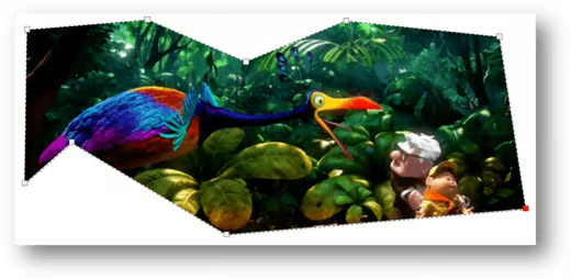
Another example creates a clipped image created by a rectangle shape:
<html>
<head>
<style>
img {
    position: absolute;
    clip: rect(50px,600px,450px,100px);
}
</style>
</head>
<body>
<img src="http://www.kinyu-z.net/data/wallpapers/4/714745.jpg">
</body>
</html>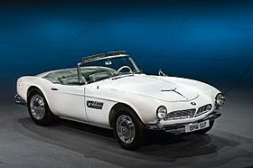
The initial image
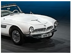
The clipped image created using a rectangle shape
Browser Support
Clipping is compatible with most browsers, such as Opera, Google Chrome, Mozilla Firefox, Internet Explorer, Safari and so on…
Conclusion
Cascading Style Sheets offer a way to create an expressive structure for your site. Of course, using clipped images is fun, but when the properties are applied with taste and with good judgment, shapes can improve the presentation of the content. I hope this will inspire you to use this CSS feature and experience new design flexibility.
