When we talk about Cascading Style Sheets (CSS), we associate it with styling an HTML page in a browser. But CSS is capable of handling more that just that. Since CSS2 was introduced, we could specify stylesheets for specific media types such as screen or print. Now with ‘media queries’ in CSS3, we are able to target specific screen sizes.
We can have different blocks of CSS code for different screen and device sizes. If this idea doesn’t make you jump from your seat, then you’re probably missing the point. In today’s world, users view web pages on a wide range of screens. Screens can range from the large displays on their work stations, to their laptops on the air plane, to their iPad or other tablets while sitting in the park and finally on their small mobile phone screens on the go.
Imagine, as a web developer, if you had to build and maintain multiple version of each page to cater to each screen. I, for one, would certainly have switch careers and probably worked at a bakery. Anyway, thankfully for me and all my happy clients, I didn’t join a bakery. CSS3 introduced media queries and made life for web developers exciting once again.
If you’ve styled print documents with CSS, then you are already familiar with defining different styles for different devices. With media queries, we’ll take this to a new level. Rather than looking at what device it is, we will look at what capabilities the device has. More specifically, we will look at the following:
- height and width of the device
- height and width of the browser
- screen resolution
- orientation of the device (for mobile phones and tablets; portrait or landscape)
If your browser supports media queries, then you’re good to go. Before we jump into seeing how it works, click here to see if a working example. If you have a mobile phone that allows you to browser, open the link on it and see the difference. As an alternative, reduce the width of the window to 480 pixels and you will immediately see the difference.
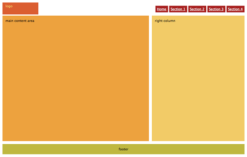
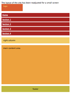
Here are screenshots of the page at different widths.

Page layout of desktop screen.

Page layout of mobile phone.
Different Styles for Different Screens: How it Works
You must be thinking that to achieve this, you will have to learn a whole new chapter of CSS. Fortunately you don’t have to. All it takes is a few extra lines of code, or sometimes just a few words. The simplest way to use media queries is to have a block of CSS code in the same stylesheet file. So all the CSS that is specific to mobile phones, would be defined in the following block:
@media only screen and (max-device-width: 480px) {
/* define mobile specific styles come here */
}
Usually we would define this at the end of the file in order to leverage the cascading property of CSS. The background color, the borders and other common attributes would typically be defined above and wont be changed here. The following properties are the ones that we would replace most often:
- width
- height
- float
- margins
For example, let’s say the logo of the company is 600 pixel wide on the desktop version of the website. Now on a device with a width of 480 pixels, the scroller will appear and that is not desirable. So we should have a smaller version of the logo and the CSS file would look like this:
#logo { background: url(images/logo.png); width: 600px; border: 1px #ccc solid; }
@media only screen and (max-device-width: 480px) {
#logo { background: url(images/logo_mobile.png); width: 440px; }
}
If you notice, we have not over-written the border property for the logo, so the border will continue to show on mobile devices. Simple isn’t it?
Linking to Different Stylesheets Using Media Queries
Adding all the styles in the same CSS file is acceptable for the above example, but for a full-fledged website, it will become a pain to manage the code. That is why I prefer to link a new stylesheet for specific screen sizes. The way to do that is to use the media attribute of the link tag.
<
link rel=
”
stylesheet
”
type=
”
text/css
”
media=
”
only screen and (max-device-width: 480px)
”
href=
”
mobile-device.css
”
/
>
Now you can define all the mobile specific styles in the mobile-devices.css file.
How to Test Multiple Devices?
Being able to style your website for various devices is one part of the problem. You need to be able to test too. If you are a proud owner of an iPhone, an android device, an iPad etc, then you’re can test it on each of these devices directly. For the rest of us, there is a brilliant site called ProtoFluid. It allows you to enter a URL (which can be a local URL too) and it renders the page as if it were being viewed on the browser of an iPhone, iPad and a wide variety of devices. Another huge advantage of using ProtoFluid is that it allows you to use Firebug on your site. Being able to use Firebug will hugely speed up the development process.
Conclusion
Media query is a powerful tool in a world where websites are viewed on a huge range of devices. With very little change, you can make an existing website mobile and tablet compliant. Today, when building a new website, many developers build it for the desktop screen and then use media queries to retro-fit it for the mobile and tablet. While this will work, its not the optimal way to do it. Media queries are meant for design presentation, not optimization. To optimize for the mobile, you have to optimize pictures and the markup.

