


This article will teach you how to add multiple background images, along with how to create CSS gradients.
With the background-image property, CCS3 lets you add more wallpapers on a single element. The images are placed one over the other, where the first image is closest to the viewer. The syntax is simple, all the background images are separated by commas:
background-image: url(…), url(…);For setting the position of the overlaid images you can use the background-position property, as you will see in the first example of this article. And, you can also set the repeat option for the background images, to do this you can use the background-repeat property.
Getting Started
You can insert multiple background elements, which are layered one above the other, with the first background embedded at the top and the last background displayed at the back.
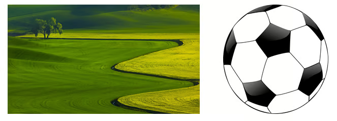
The two images used in the first section of this article, land.gif and ball.gif, are:
In the first example, you can see two background images overlaid, the first one being aligned to the bottom right, and the second image is a background aligned on the top left:
<!DOCTYPE html>
<html>
<head>
<style>
#background_example_1 {
    background-image: url(ball.gif), url(land.gif);
    background-position: right bottom, left top;
    background-repeat: no-repeat, repeat;
    padding: 15px;
}
body {
  color: white;
}
</style>
</head>
<body>

<div id="background_example_1" align="left">
<h1>Multiple backgrounds</h1>
<p> You can insert multiple background elements, these being layered one above the other, with the first background </p>
<p> embedded at the top and the last backdrop on the back. The last background is the only one that can include a background color.</p>
</div>
</body>
</html>
The output of the above code looks like this:

Another property that is embedded in browsers is the frame for background size. When the background is declared for multiple backgrounds, the statements are separated by commas, similar to the background image:
- background-size: 15px 150px, 10px 10px;
- background-repeat: no-repeat;
In browsers like Google Chrome and Opera, the prefix is not needed, but for Mozilla, Safari, and Opera browsers, you have to declare the prefixes of the vendors as follows:
- moz-background-size: 10px 100px, 5px 5px;
- webkit-background-size: 10px 100px, 5px 5px;
- o-background-size: 10px 100px;
Step 2
The second example of this article contains different sized images overlaid and aligned differently:
<!DOCTYPE html>
<html>
<head>
<style>
#background_example_2 {
    background: url(ball.gif) left top no-repeat, url(ball.gif) right bottom no-repeat, url(land.gif) left top repeat;
    background-size: 50px, 130px, auto;
    padding: 15px;
}
body {
  color: white;
}

</style>
</head>
<body>

<div id="background_example_2" align="center">
<h1>Multiple backgrounds</h1>
<p>this example contains two different sizes of the ball.gif image (70px and 150px) aligned diffrently and one of land.gif image (500px) which is repeated. </p>
</div>

</body>
</html>
The output of the above code is:

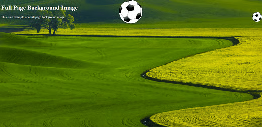
Another example of using the background-size property, set the land.gif image as a cover:
<!DOCTYPE html>
<html>
<head>
<style>
	html {
  		background: url(ball.gif) center top no-repeat, url(land.gif) no-repeat center fixed;
 		background-size: 200px, cover;
		}

	body {
  		color: white;
	          }
</style>
</head>
<body>

<h1>Full Page Background Image</h1>
<p>This is an example of a full page background image</p>

</body>
</html>
The output of the above code is:
CSS Gradients
Thanks to the CSS3 gradients, you can make fine transitions between certain colors at good quality, because the browser will generate the gradient. There are two gradient types:
- Radial gradients
- Liniar gradients
These two values indicate the start and stop points of the gradient. Each of these parameters takes values: x = percentage or value between 0-1 and y = color value.
Whenever you want to use browsers like Opera, Safari, and Mozilla, you will need to declare the prefixes of your vendors, like this:
- moz-background-size: 10px 100px, 5px 5px;
- webkit-background-size: 10px 100px, 5px 5px;
- o-background-size: 10px 100px;
Using Radial Gradients
Radial gradients are similar to linear gradients, with the difference that they radiate from its center. These may be elliptical or circular. To create a radial gradient, you need at least two colors.
Syntax
background: radial-gradient(shape size at position, start-color, ..., last-color);By default, shape is ellipse, position is in center and size is farthest-corner
 div {
  width: 100vw;
  height: 100vh;
}.simple-radial {
  background: radial-gradient(yellow, blue);
}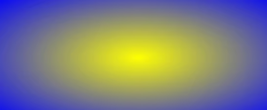
The shape parameter defines the shape. Can take circular or elliptical value. In our case, the default value of the radial gradient takes the form of a circle:
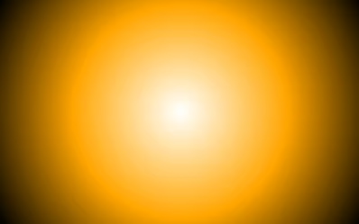
<!DOCTYPE html>
<html>
<head>
<style>
#grad1 {
    height: 250px;
    width: 400px;
    background: radial-gradient(circle, white, orange, black);
}
</style>
</head>
<body>
 <h1>Radial Gradient  </h1>
 <div id="grad1"></div>
</body>
</html>
The output of the above code is:
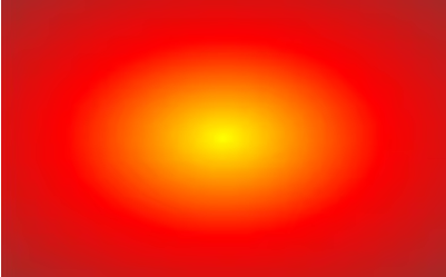
In the other case, the implicit value of the radial gradient takes the form of the ellipse:
<!DOCTYPE html>
<html>
<head>
<style>
#grad2 {
    height: 250px;
    width: 400px;
    background: radial-gradient(yellow, red, brown);
}
</style>
</head>
<body>
 <h1>Radial Gradient  </h1>
  <div id="grad2"></div>

</body>
</html>
The output of the above code is:
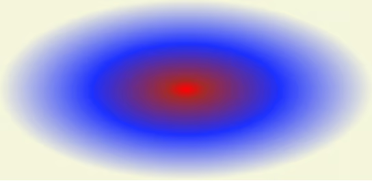
The dimension of the parameter defines the size of the gradient, having four values, listed next:
- closest-side
- farthest-side
- closest-corner
- farthest-corner
Eloquent example:
<!DOCTYPE html>
<html>
<head>
<style>
#grad3 {
  width: 50vw;
  height: 50vh;
  background: radial-gradient(ellipse closest-side, red, brown 10%, #1e30ff 50%, beige);
}

</style>
</head>
<body>
 <h1>Radial Gradient  </h1>
  <div id="grad3"></div>

</body>
</html>
The output of the above code is:
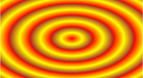
Using Repeating Gradients
To repeat the radial gradients, the repeat-gradient function () is used. This will progress repeatedly in a straight line, the colors repeating directly proportional to the number of gradient reps.
<!DOCTYPE html>
<html>
<head>
<style>
#grad4 {
    height: 170px;
    width: 230px;
    background: -webkit-repeating-radial-gradient(yellow , red 10%, brown 20%);
    background: -o- repeating-radial-gradient (yellow , red 10%, brown 20%);
    background: -moz- repeating-radial-gradient (yellow , red 10%, brown 20%);
    background: repeating-radial-gradient (yellow , red 10%, brown 20%);
}
</style>
</head>
<body>
 <h1>Repeating Gradients </h1>
 <div id="grad4"></div>
</body>
</html>
The output of the code above would be:
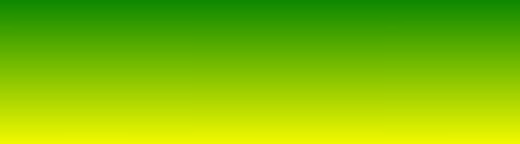
Using Linear Gradients
To create a linear gradient, you have to go from two colors and use color stops.
It will create a band of colors that progresses in the right line. Asynchronous, you can set a starting point and an angle or directives along with the gradient effect
Syntax: background: linear-gradient( color-stopA, color-stopB, color-stopC, direction …);
<!DOCTYPE html>
<html>
<head>
<style>
#grad5 {
    height: 180px;
    width: 380px;
    background: -webkit-linear-gradient(green, yellow);
    background: -o- linear -gradient(green, yellow);
    background: -moz- linear -gradient(green, yellow);
    background: linear -gradient(green, yellow);
}
</style>
</head>
<body>
 <h1>Linear Gradient  </h1>
 <div id="grad5"></div>
</body>
</html>
The output of the above code is:
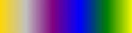
In the image below, you will see an example of making a vertical linear gradient using several colors:
<!DOCTYPE html>
<html>
<head>
<style>
#grad6 {
    height: 75px;
    background: -webkit-linear-gradient(right, yellow,green, blue, purple, silver, gold );
    background: -o- linear -gradient(right, yellow,green, blue, purple, silver, gold);
    background: -moz- linear -gradient(right, yellow,green, blue, purple, silver, gold);
    background: linear -gradient(to left, yellow,green, blue, purple, silver, gold);
}
</style>
</head>
<body>
 <h1>Linear Gradient  </h1>
 <div id="grad6"></div>
</body>
</html>
The output of the above code is:
Thanks to this tutorial, you will now know how to use every aspect of CSS gradients and you will know how to use images to achieve the expected result.
