Introduction
Although CSS3 has only been partially implemented in modern-day browsers, web developers have started using its features on the Internet. One of the issues that developers are faced with is that different browsers have chosen to implement a different set of features. This leaves the developers at bay as to which features they should use and which ones they still can’t. In this and the next few articles, we will see various CSS3 features that work on most of the popular browsers today: Google Chrome 10+, Safari 3.2+, Firefox 4+ and Internet Explorer 9+.
Box Shadow
In the recent web design trends, the box shadow seems to be one of the favorite styles applied to an image or to a the entire web page even. Prior to the introduction of CSS3, there were several methods people used to implement a box shadow. If you wanted a sharp edge shadow, then you could add a div with the color of the shadow behind the main div and offset it vertically and horizontally by a few pixels. For diffused shadows, you had to use images and some CSS to position the images correctly. Thankfully, CSS3 introduced the most elegant way to implement box shadows.
Here is the markup and CSS that is used to give a box shadow to a div:
.shadow {
-moz-box-shadow: 3px 3px 4px #999; /* Netscape */
-webkit-box-shadow: 3px 3px 4px #999; /* Safari */
box-shadow: 3px 3px 4px #999; /* Good browsers */
-ms-filter: “progid:DXImageTransform.Microsoft.Shadow(Strength=4, Direction=135, Color=’#999999′)”; /* IE 8 */
filter: progid:DXImageTransform.Microsoft.Shadow(Strength=4, Direction=135, Color=’#999999′); /* IE 5-7 */
}
The basic construct of the shadow is quite simple:
Ideally, if all browsers handled CSS in the same way, we would just need 1 line to define the CSS. But alas! We are cursed with multiple browsers (and the most popular of them being Internet Explorer). So, we need to define the box shadow multiple times to that it works on all popular browsers.
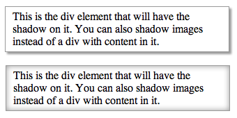
In the designer parlance, this style is known as drop shadow. The other style that is often used is the inner shadow. Fortunately for us, the W3C decided to include that as part of the CSS3 box shadow specifications too. Here is the syntax to have an inner shadow display instead of the drop shadow:
Note: The inset keyword can be applied to -moz-box-shadow, -webkit-box-shadow and box-shadow. Internet Explorer 9 onwards interprets box-shadow, which means that IE8 and below don’t support inner shadow.
The following screenshot shows how the drop shadows look. You can see it in action here.
Rounded Corners
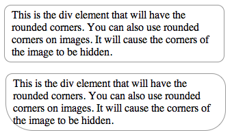
A circle is said to be the ‘perfect’ shape. While that may be true, everything can’t fit into a circle. On the web, divs are rectangular and we can’t really change that. What we can do to make the boring rectangles more appealing is give them rounded corners. This is a practice that has been used on the Internet quite a bit. However, the only way to achieve this was by using images at the corners. If the dimensions of the box are fixed, then it was quite easy to implement this by using an image with the rounded border as the background of the div. Otherwise, you have to use multiple images that are pushed to the corners. With CSS3, we get rid of all that mess. All we need to do is define the border radius for the element and we are done. For example:
moz-border-radius: 10px 20px 30px 40px; /* Netscape */
border-radius: 10px 20px 30px 40px; /* Good browsers */
}
Below is the screenshot of with the CSS above. You can see it in action here. The border-radius is defined clockwise starting from the top left corner. As with all CSS properties, if you define just one value, that value is applied for all 4 corners. If you define 2, then the first one is applied for the top left and bottom right corner and the second value, for the other two.

Conclusion
This wraps up the first part of a series of articles about exciting features in CSS3. In the next week’s article, we will learn how 2D transformations are done using CSS3 as well as some basic animation techniques in 2D.


