In this article we’re going to look at the process of creating a horizontal menu with CSS. At its core, a CSS menu is made up of lists, so creating one is our first step.
Here is the code for that manually:
<div id=”menu”>
<ul>
<li><a href=”index.html”>Home</a></li>
<ul><li><a href=”aboutus.html”>About Us</a></li>
<li><a href=”services.html”>Services</a></li>
<li><a href=”contactus.html”>Contact Us</a></li>
</ul>
</div>
Looking at the list (above) you’ll see that it’s vertical and unadorned. We’re going to fix that with CSS and detail each step.
#menu {
width: 550px;
height: 35px;
font-size: 16px;
font-family: Tahoma, Geneva, sans-serif;
font-weight: bold;
text-align: center;
text-shadow: 3px 2px 3px #333333;
background-color: #8AD9FF;
border-radius: 8px;
}
Here’s the first step of setting up the CSS menu code, by creating a wrapper for the text and defining a background color. Two CSS3 effects have been applied: text-shadow and border-radius.

This is what our menu looks like so far.
This next bit of code removes the default padding from the list.
#menu ul {
height: auto;
padding: 8px 0px;
margin: 0px;
}

And here’s a screenshot of the result so far. Note the bullet points have been removed from the list. The padding has been set to 8px and this will control the vertical positioning of the text in the next section.
In the step below we’re going to change the positioning of the text so it fits into the menu and runs horizontally (inline). We’re also going to add some padding to the text for the horizontal positioning. Here’s the code:
#menu li {
display: inline;
padding: 20px;
}

Here’s what our menu looks like so far.
In the next step, we remove the text underline and change the color of the text to something reminiscent of the text underline color. In addition, the padding is set to 8px in all areas. This will control the position and size of the hover in the next section. Here’s the code:
#menu a {
text-decoration: none;
color: #00F;
padding: 8px 8px 8px 8px;
}

And here’s the result.
The last step sets the hover effect for the text. Here’s the code:
#menu a:hover {
color: #F90;
background-color: #FFF;
}

And here’s the final result with one of the menu items activated by mousing over it. This finishes our simple horizonal menu, but it doesn’t end here. There are many more things that you can do, such as drop down navigation and using textures. If you want to use textures, you can download free textures online or create them from scratch.

One of my favorite programs for texture creation is Corel PHOTO-PAINT, which has an awesome texture creation component. You can work with photographic or computer created textures to use in your layouts.
Below is an example of how a texture can quickly change the look and feel of your layout. In this case I quickly created a fractal texture in Corel PHOTO-PAINT To use the texture, I had to make some changes to the code.
#menu {
width: 550px;
height: 35px;
font-size: 16px;
font-family: Tahoma, Geneva, sans-serif;
font-weight: bold;
text-align: center;
text-shadow: 3px 2px 3px #333333;
background-image: url(texture.jpg);
background-repeat: no-repeat;
border-radius: 8px;
}
Note the addition of the image to the code and the use of background-repeat: no-repeat; to stop the image from tiling.

Note the textured background. It’s not a perfect fit for this menu, but it gives you an idea of what can be done.
Another option is if you have Adobe Dreamweaver CS6. check out this tutorial: <a href=”http://helpx.adobe.com/dreamweaver/using/spry-menu-bar-widget.html” target=”_blank”>Working With the Spry Menu Bar Widget</a>. This is another way of creating menus – fast.

To get started, here’s a template that I’ve opened in Dreamweaver CS6.

To add a Spry Menu bar to the layout, activate the Spry tab and click on the Spry Menu icon, which brings up the dialog box you see above. Choose the horizontal option and click on OK.

This adds the Spry Menu bar to your layout.

As you can see, there are multiple menu options. Not only do you get a drop down list but another list creates even more menu options.

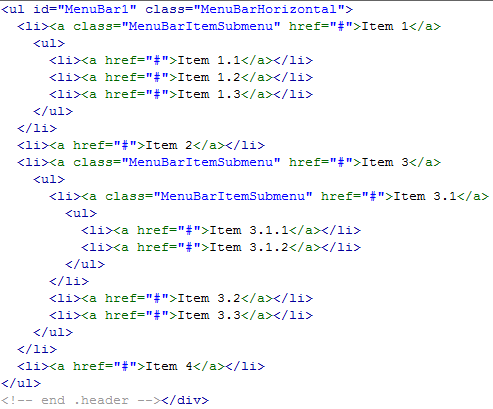
Here’s a shot of the Spry Menu code, which would be easy to edit. In addtion to this you can edit the layout
using a variety of methods, including advanced CSS techniques. The Spry widget offers a way to quickly build and customize CSS menus.
To see how this works, watch this <a href=”http://www.adobe.com/designcenter-archive/video_workshop/?id=vid0168″ target=”_blank”>Demonstration of Spry Menus</a>.
Notes
One very useful way of seeing how CSS elements work together is to reverse engineer the process, to use an already existing piece of code and take it apart, step-by-step, to see how the components work with each other. Sometimes, removing one piece of code from a layout can have dramatic results.
Another, non-destructive method is to make use of Firebug in the Firefox browser.
Resources
• 15 CSS3 Navigation and Menu Tutorials and Techniques
• 40 Free CSS3 Menu Tutorials


