


If you have been developing websites and working in the web industry for some time now, you’ll realize that most websites have a similar layout. Generally speaking, there is a similar 12-column grid pattern, boxed layouts and similar header and footer elements. Though there are a few arbitrary trends that come and go, for the most part, there is a monotonous cliché look to most sites.
However, a certain few break the stereotype and design a website with unique and interesting layout, with out-of-the-box elements also enhancing the functionality along with the aesthetics of the site. Taking inspiration from other mediums other than electronic, such as print, some very interesting and beautiful designs can be conjured.
CSS is being revolutionized, not only in the way it functions, but also in the way it is being used by developers around the globe. New CSS properties are opening up a completely different dimension of possibilities. CSS enhancements have allowed developers to set up a website with visual styles that are beyond the norm in the industry. Flexbox and CSS Grid are some tools that offer easy ways to build interesting layouts.
We shall go through some useful CSS tricks that will help you create professional looking, yet out-of-the-box layouts for your website.
1. Scout Out New CSS Blend Modes
CSS blend modes offer you a great way to work and experiment with duotones and colorizer effects that are some of the hottest web design trends. Traditionally, one had to create multiple colored versions of the same image, but with CSS you can directly apply the effects in your browser.
CSS blend modes can be used to deliver a cohesive look for the content across the site. It is a great tool to bring all the content under one umbrella of style and theme. It empowers the developers to curate multiple colored versions of the same image by changing just one value in the CSS code — the color. There are 15 possible blend mode values, including screen, overlay, lighten and darken.
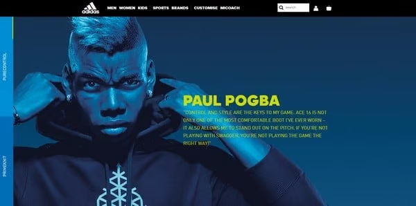
Figure 1: Duotone effect (ADIDAS)
The implementation methods differ based on the type of element upon which you want to apply the effect. Setting the Container Background-Blend-Mode: Darken on background-image and background-color to get a colorizing effect. You can also create an overlay with pseudo-elements (i.e. :before and :after) on the image wrapper to get the same effect.
It is best to use high contrast black and white images to achieve great duotone effects. CSS filters can be used to set the greyscale and high contrast level of the image.
CSS is home to another cool property called mix-blend mode. It allows you to blend in the contents of the element with the contents of its direct parent background. One use of this mode is overlapped lettering instead of adjusting the opacity, which often results in loss of color vividness

Figure 2: Mix-Blend Mode
2. CSS Masking
Masking is a great way to let your browser identify which elements to show and which to hide. This results in creating beautiful shapes and layouts. Raster elements, CSS gradients and SVG elements are three ways masking can be done. However, SVG has an advantage over raster images as it can be transformed and scaled without any significant loss of quality.
It is important to use an inline SVG mask element due to browser compatibility. However, using raster images with transparency level comes with its own limitations. The browser does not read the transparent aspects of the image, the opaque fragments are visible, therefore hiding other elements of the screen.
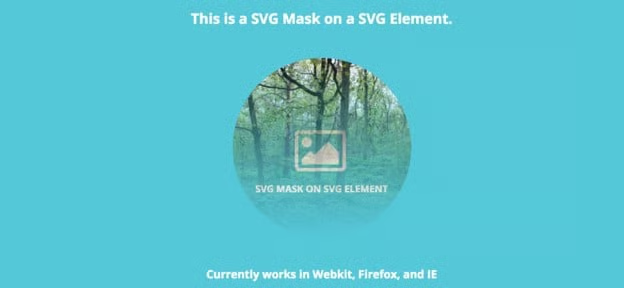
Figure 3: SVG mask on SVG element
Masking is particularly powerful because it enables you to apply the same properties to background images, defining their position, size and repetition.
Another way masking is creatively used is in articles that have both images and text. It is easy to use irregular images and text in print but becomes difficult to implement on the web. CSS makes it easier to do the job. Make sure to check the browser compatibility and vendor prefixes.
3. CSS Clipping
Clip-path is the shape’s boundary and defining areas of the image that shall be visible is known as clipping. It is a great CSS feature. Clipping works by hiding anything outside the clip-path and revealing anything that falls within the clip-path.
If we use a clipping circle function on top of an image then only parts of the image that falls within the circle will be visible. The difference between masking and clipping is that masking uses only images and clipping on the other hand is a vector path. Masking uses more memory because it is a full image worked upon pixel by pixel. Clipping uses vector paths consuming less memory, which makes it useful in order to keep the website light.
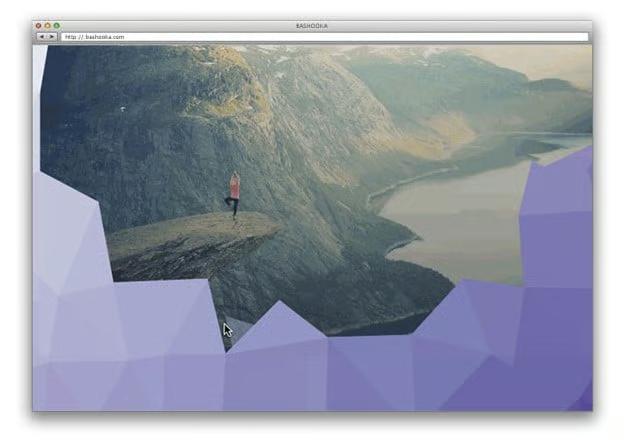
Figure 4: CSS Clipping
Masking gives you a transparency effect but if you want crisp edges then using clipping is a better option.
4. Creative Container Shapes
Most website use traditional box shaped text containers. However, CSS can be used to create interesting shaped text containers that break the monotony of the old traditions. Shape-outside and shape-inside are CSS properties that allow you to wrap your content around custom paths in CSS.
Applying the following code given to a floating image or container will do the job:
shape-outside: circle(50%); /* content will flow around the circle*/It is important to note that the float property and the dimensions of the element (height and width) have to be defined, otherwise this won’t work. For the shape you can go with circle(), polygon(), inset() or ellipse().
The url() function can also be used to create an element shape based on the image. It is best to use the url() function when dealing with sophisticated graphics with multiple curves and points, and you want to ensure that the text wraps around it smoothly.
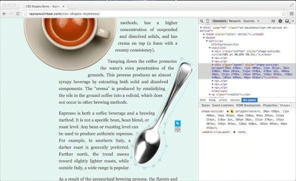
Figure 5: Shape-Out Function
5. SVG Animation
SVG stands for Scalable Vector Graphics. Since it is scalable, it is one stop solution for all your responsive web design concepts. SVG graphics are crisp, irrespective of the screen resolution of the device.
SVG codes can be manipulated using CSS animation to achieve amazing effect in no time. SVG has an advantage over raster images; they are kept under the
Animating SVG and CSS can be done using transitions, transformations and keyframe animations. The coolest thing about SVG is that you can grab whatever part you want and make it come alive with CSS animations. SVG has its own DOM API, so as a matter of fact the whole SVG code can be easily inspected using DevTools.
6. Transform & Skew
Elements can be transformed and skewed to play with perspective and make them visually more unpredictable. This is picking up in trend; the glitches and improperly styled elements are coming back from the 80s.
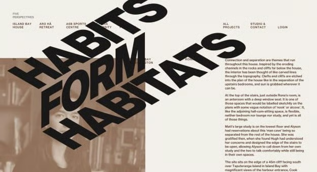
Figure 6: Skew & Transform
CSS offers a wide variety of tools such as masking, clipping, blending modes, CSS Shapes, etc., that can be combined to create stunning visual layouts. However, browser compatibility is an on-going issue, but not for long. Don’t hesitate to play with these properties. The more you play, the more you get good at using them.
About the Author
Madan Pariyar is a blogger at WebPrecious and a digital marketing strategist helping clients to resolve their website woes. When not busy with all these things, you may find Madan occasionally watching movies, traveling and spending time with family.
