


Cascading Style Sheets (CSS) offer many new and innovative ways to display the information on your web pages. Let’s explore seven of these new techniques.
1. Initial Letter
Initial letter is a CSS property that selects the first letter of the element and specifies the number of lines occupied by the letter. Most often it is used in print media and information sites, news sites, where the first letter of the paragraph is much larger or higher than the rest of the content.
The initial-letter property automatically adjusts both the number of lines needed to create the stylized drop cap and the font size. The Initial-letter property approves the following values:
- <number>: refers to how many lines the letter occupies in which negative values are not accepted
- normal: is useful if you want to reset the value if it could be inherited from the cascade and no scaling effect applied to the first letter
- <integer>: determines the number of lines in which the letter should sink when its size is preset. The values must be greater than zero, and if the value is not specified, the size value is duplicated, floored to the nearest positive whole number
The :: first-letter pseudo-element can be used to select characters that will be formatted as initial letters. The :: first-letter pseudo-element does not select the first letter of the element that has the display: inline, but only works on elements that have a display value of block, table-cell, table-caption, or list-item.
 <!DOCTYPE html>
<html>
<head>
<style>
p::first-letter {
  font-size: 30px;
  color: Black;
  font-family: Arial;
  font-weight: bold;
}
</style>
</head>
<body>
<h1>About initial letter</h1>
<p>"Only one who devotes himself to a cause with his whole strength and soul can be a true master. For this reason, mastery demands all of a person"</p>
<p>"Concern for man and his fate must always form the chief interest of all technical endeavors. Never forget this in the midst of your diagrams and equation"</p>
</body>
</html>

2. Variable Fonts
Variable fonts represent a new set of features defined as part of the OpenType specification and allow font files to contain multiple variations of a font in a single file, called variable font. In practice, it allows you to access the variables contained in the font file with only one @ font-face reference. Also, variable fonts allow functions such as transitioning font styles, custom font styles and animating. The benefit of using the variable font is that you have access to the full range of available styles, weights and widths, without being forced to use the few that you have loaded separately.
Variable fonts define their variations through axes of variation and there are 5 standard axes:
- Ital: italic axis works differently because it is enabled or disabled, there is no in-between. The value can be set using the font-style CSS property. Also, by introducing font-synthesis: none, will prevent browsers applying accidentally the variation axis and a synthesized italic.
- wght: controls the font’s weight and the value can be set using the font-weight CSS property.
- wdth: controls the font’s width and the value can be set using the font-width CSS property. In CSS, using the font-stretch property, we can set the font width with percentage values — and if we supply a value that is outside the font-encoded domain, the browser makes the font at the closest allowed value.
- opsz: optical sizing refers to the practice of changing the font’s optical size and the value can be set using the CSS font-optical-sizing. Optical size values are automatically applied depending on the font size, but it can be manipulated using the font-variation-settings. When using font-optical-sizing, the admitted values are auto or none, and when using font-variation-settings, a numeric value is provided.
- slnt: controls the slant of the font and the value can be set using the font-style CSS property. It is variable by being expressed as a numerical range, and this allows the font to be varied anywhere along that axis.
Using variable fonts with @font-face – when using variable fonts on the web, this involves defining @ font-face rules that indicate variable font files. Here are 2 tools that allow you to find variable fonts: https://www.axis-praxis.org/ and https://v-fonts.com/.
<!DOCTYPE html>
<html>
<head>
<title>About variable fonts</title>
</head>
<style>
@font-face {
font-family: 'Avenir Next Variable';
src: url('https://cdn.rawgit.com/Monotype/Monotype_prototype_variable_fonts/f8067a0e/AvenirNext/AvenirNext_Variable.ttf') format('truetype');
}
html {
font-family: 'Avenir Next Variable', sans-serif;
}
p {
font-variation-settings: 'wght' 630, 'wdth' 88;
}
</style>
<body>
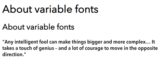
<h1>About variable fonts</h1>
<h2>About variable fonts</h2>
<p>
"Any intelligent fool can make things bigger and more complex… It takes a touch of genius – and a lot of courage to move in the opposite direction."
</p>
</body>
</html>
3. Logical Properties and Values
Logical Properties and Values is a CSS module that introduces logical properties and values that make it possible to control the appearance through logical directions and dimension mappings. Logical properties and values use terms such as “block” and “inline” to describe the direction in which they flow. The Logical Properties and Values specification characterizes mappings for physical values in their logical relations.
The inline dimension is the dimension along which a text line is written in the type of writing used. So, in a random English document, the text is horizontal, from left to right, in an Arabic document, writing is also horizontal but from right to left and if we take into account a Japanese document, the inline dimension is now vertical because the writing mode runs vertically.
The block dimension corresponds to the order in which the blocks are displayed on the page. In English and Arabic, they are executed vertically, while in any vertical writing mode they are executed horizontally.
<!DOCTYPE html>
<html>
<head>
<style>
html {
font: 20px Sans-serif;
}
body {
padding: 25px;
background-color: lightyellow;
color: black;
}
.box {
border: 4px solid black;
border-radius: 20px;
padding: 20px;
margin: 12px;
}
.one {
block-size: 100px;
inline-size: 200px;
}
.two {
height: 100px;
width: 200px;
}
</style>
</head>
<body>
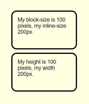
</div>
<div id="container">
<div class="box one">
My block-size is 100 pixels, my inline-size 200px.
</div>
<div class="box two">
My height is 100 pixels, my width 200px.
</div>
</div>
</body>
</html>
4. Scroll Snapping
The scroll-snap-type CSS property determines the rigidity with which attachment points are applied to the scroll container. In other words, it locks the viewport to certain elements or locations after the user has finished scrolling. It is an excellent way to display image galleries. Previously, it could be used with JavaScript, but thanks to the new CSS Scroll Snap module, the effect can be controlled in CSS. Scroll snapping is done by defining the parent / container element and children in the container that will snap according to the rules defined within the container. Scroll-snap-type property is the most important property that applies to the container element. Defines the scroll snap axis x, y, block, inline or both and the scroll snap strictness none, proximity or mandatory.
<!DOCTYPE html>
<html>
<head>
<style>
html, body, .C {
height: 50%;
}
.C {
display: flex;
align-items: center;
justify-content: space-between;
flex-flow: column nowrap;
font-family: arial;
}
.container {
display: flex;
flex: none;
overflow: auto
}
.container.x {
width: 70%;
height: 150px;
flex-flow: row nowrap;
}
.container.y {
width: 256px;
height: 256px;
flex-flow: column nowrap;
}
.y.mandatory-scroll-snapping {
scroll-snap-type: y mandatory;
}
.x.proximity-scroll-snapping {
scroll-snap-type: x proximity;
}
.container > div {
text-align: center;
scroll-snap-align: center;
flex: none;
}
.x.container > div {
line-height: 128px;
font-size: 64px;
width: 100%;
height: 128px;
}
.y.container > div {
line-height: 256px;
font-size: 128px;
width: 256px;
height: 256px;
}
.y.container > div:{
line-height: 1.4;
font-size: 80px;
}
.container > div:{
background-color: white;
}
.container > div:{
background-color: white;
}
</style>
</head>
<body>
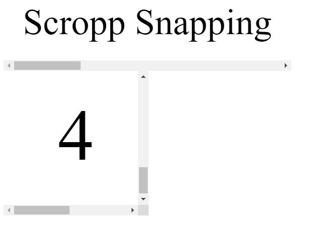
<div class=".C">
<div class="container x mandatory-scroll-snapping" dir="ltr">
<div>Scropp Snapping</div>
<div>2</div>
<div>3</div>
<div>4</div>
</div>
<div class="container y mandatory-scroll-snapping" dir="ltr">
<div>About Scropp Snapping</div>
<div>2</div>
<div>3</div>
<div>4</div>
</div>
</div>
</body>
</html>
5. Grid Level 2 and Subgrid
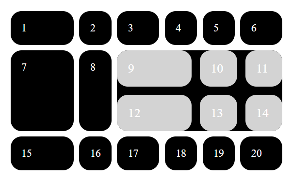
The level 2 specification contains everything in Level 1 plus some new features. Level 2 of the grid specification creates the subgrid feature of CSS Grid. In the following lines, we will look at the subgrid feature as it is currently detailed in the Editor’s Draft of Grid Level 2. So, you can make grids when you use the Grid layout option, a grid element can be transformed into a grid container by setting display: grid on it. In the example below, I have an item that includes 3 column tracks of the grid, is a container grid with 3 column tracks, and these do not do not line up with the tracks of the parent.
<!DOCTYPE html>
<html>
<head>
<title>CSS Grid Level 2 - subgrid</title>
</head>
<style>
body {
  margin: 20px;
}
.one {
  background-color: black;
  color: white;
  border-radius: 20px;
  padding: 20px;
  font-size: 120%;
}
.A .one {
  background-color: lightgrey;
}
.GRID {
  display: grid;
  grid-gap: 10px;
  grid-template-columns: 3fr 1.5fr 2fr 1fr 2fr;
  background-color: white;
  color: black;
  margin: 1.5em 0;
}
.A {
  padding: 0;
  grid-gap: 15px;
  grid-column: auto / span 4;
  display: grid;
  grid-template-columns: 3fr 1.5fr;
}
</style>
<body>
<div class="GRID">
  <div class="one 1">1</div>
  <div class="one 2">2</div>
  <div class="one 3">3</div>
  <div class="one 4">4</div>
  <div class="one 5">5</div>
  <div class="one 6">6</div>
  <div class="one 7">7</div>
  <div class="one 8">8</div>
  <div class="one A">
    <div class="one 9">9</div>
    <div class="one 10">10</div>
    <div class="one 11">11</div>
    <div class="one 12">12</div>
    <div class="one 13">13</div>
    <div class="one 14">14</div>
  </div>
  <div class="one 15">15</div>
  <div class="one 16">16</div>
  <div class="one 17">17</div>
  <div class="one 18">18</div>
  <div class="one 19">19</div>
  <div class="one 20">20</div>
</div>
</body>
</html>
Since it is an open source project, you can see on GitHub how the work is evolving in the CSS group. The development of browser specifications and implementation is a circular process. So you can watch how this subgrid feature is progressing and of emerging browser implementations.
6. Use CSS to Test Browser Support
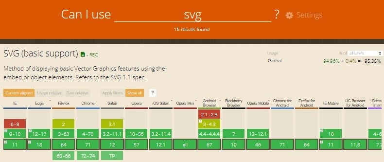
CSS has developed a way to test browser support for new features. Basically, ask a question to find out if the browser accepts a specific CSS feature. This way makes the new features use in a safe and concise way. When using any new CSS feature, you need to check if the browser supports that feature. On this line, it is recommended that you consult the data on https://caniuse.com/, where you can import the data for your location.
The @supports CSS allows you to specify declarations that depend on browser support for CSS features, this being called a feature query. This rule can be written at the top of the code or it may be nested inside any other conditional group at-rule.
@supports (display: grid) {
  div {
    display: grid;
  }
}
7. Syntax Improvements for Media Queries – Level 4
The Media Queries Level 4 specification contains some improvements to the syntax to make media queries using features that have a range type such as height and width.
To exemplify, we use max-functionality for width
@media (max-width: 20em)
We can try a width between two random values using min- and max-
@media (min-width: 20em) and (max-width: 35em)
This would convert to the Level 4 syntax as:
@media (20em <= width <=35em)
For a better understanding, in the example above, we want to say that the width is greater than or equal to 20em and smaller or equal to 35em.
