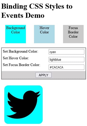
Angular lets you conditionally set both classes and styles via the ngClass and ngStyle directives respectively. Overall, these work very well. However, there are some instances where they cannot be utilized, i.e. for:
- the dynamic styling of elements using TypeScript variables that are not known until runtime, or
- the assignment of styles to pseudo-classes such as focus and hover.
Techniques will be demonstrated using an application that passes theme colors to a component via @Input parameters. These will be used to set the background, hover, and focus border colors.
The Demo App
Here’s a screen capture of the demo app that shows the three colors that may be set dynamically via input fields:
Each color is shown in a square above the form for reference. Below the form you’ll find an SVG of the well-known Twitter logo. We can see the selected Hover Color when the cursor is placed over the image:
Tabbing to the image changes the border to the color of the selected Focus Border Color:
Of the three colors, only the background may be set using an Angular directive; the other two require a different solution, such as those below.
Technique #1: CSS Variables
Perhaps you are familiar with Less and Sass variables which are compiled into pure CSS before use. Now, there are “pure” CSS variables. These are defined by prefixing a double dash (–) before the variable name. Then, to access the value of a CSS variable, we would pass it to the var() function. Our app declares three such variables – one for each color definition:
These are utilized to set the three preview squares in the AppComponent.
$backgroundColor: var(--background-color);
$hoverColor: var(--hover-color);
$focusBorderColor: var(--focus-border-color);
These variables are applied to CSS rules as follows:
.background {
  background-color: $backgroundColor;
}

.hover-background {
  background-color: $hoverColor;
}

.focus-border-background {
  background-color: $focusBorderColor;
}
If the var() function looks familiar, that’s by design. It is named after the JavaScript (JS) variable declaration keyword. That’s because we can reference (and modify!) CSS variables from our JS code, or, in the case of Angular applications, within the TypeScript .ts component files. Here is the function which assigns three JS variables to the above CSS variables we declared earlier:
public setColors(background: string, hover: string, focus: string) {
const docStyle = document.documentElement.
The setColors() function is bound to the click event of the APPLY button. Each input field’s ngModel variable is passed along as a function parameter:
<div class='content'> <input type="text" [(ngModel)]="backgroundColor"> </div> <div class='content'> <input type="text" [(ngModel)]="hoverColor"> </div> <div class='content'> <input type="text" [(ngModel)]="focusBorderColor"> </div> <button class="apply-button" (click)="setColors( backgroundColor, hoverColor, focusBorderColor)"> APPLY </button>
Although not part of the demo, it should be noted that CSS variables are equally applicable to pseudo-classes since the stylesheet has access to the variables:
.news-image: hover {
  background-color: $hoverColor;
}
Technique #2: Setting Styles Programmatically
All HTML Elements expose a style property, allowing us to set just about any style directly, without referencing the stylesheet at all. In the feed component, there are two similar methods for setting the SVG element styles: one for the background color and another for the focus border:
public setHoverColor(event: MouseEvent) {
const newsImage: HTMLDivElement = <HTMLDivElement>event.target;
if (event.type === 'mouseenter') {
newsImage.style.
public setFocusStyle(event: FocusEvent) {
  const newsImage: HTMLDivElement = <HTMLDivElement>event.target;

  if (event.type === 'focus') {
    newsImage.style.outline = "2px solid " + this.focusBorderColor;
  } else if (event.type === 'blur') {
    newsImage.style.outline = "none";
  }
}
The above class member variables may be set via @Input parameters; otherwise, they retain their default values:
export class FeedComponent {
@Input('background-color')
backgroundColor: string = 'rgb(82, 172, 240)';
@Input('hover-background-
Each event type checks in the two functions correspond to a bound event on the news-image element. In every case, the $event is passed to the function in order to obtain the event type and target:
<div tabindex="0" class="news-image" style="background-position: center; background-size: cover" [style.backgroundColor]="backgroundColor" (mouseenter)="setHoverColor($ event)" (mouseleave)="setHoverColor($ event)" (focus)="setFocusStyle($event) " (blur)="setFocusStyle($event)" > <svg xmlns="http://www.w3.org/2000/ svg" viewBox="0 0 720.18 585.15" style="padding: 0.5rem" > // ... </svg>
Passing Colors to the Feed Component
In order to trigger color updates on the APPLY button’s click event (as opposed to immediately), three additional variables are employed. These are set at the same time as the CSS variables in setColors():
backgroundColorInput: string = 'rgb(82, 172, 240)';
hoverColorInput: string = 'blue';
focusBorderColorInput: string = 'darkgray';
public setColors(background: string, hover: string, focus: string) {
const docStyle = document.documentElement.
That way, the feed component’s input variables are bound to the new variables and not those of the text fields’ ngModels:
<feed-component [background-color]="backgroundColorInput" [hover-background-color]=" hoverColorInput" [focus-border-color]=" focusBorderColorInput" > </feed-component>
Don’t forget to check out the demo on stackblitz.
Read more CSS and web design tutorials.
Conclusion
In this tutorial, we learned two techniques for dynamically styling elements where the ngClass and ngStyle directives won’t work. In the next article, we’ll learn how to apply CSS variables to specific elements.


