


Introduction
Even though CSS3 is not supported on all browsers yet, many web developer have started to use some of the techniques that it provides. CSS3 has evolved into a technology which, when combined with HTML5 and JavaScript, may end up being a Flash-killer. In this series of articles, we will cover the key additions to CSS3. In the previous article, we learned about 2D transformations in CSS3; and today we will take it to the next level and explore 3D transformations.
CSS3 Transforms
While 2D transforms are a cool feature to have, they don’t really provide much enhancement for us web folks. At best, they save us from writing a few lines of Javascript; but they don’t really provide a new experience for the user. Fortunately we can’t say the same for 3D transforms. 3D transforms allow us web developers to render objects on the page that appear to be 3 dimensional. Flash, your days are now numbered!
Browser support is always a concern in all our minds. Just as 2D transforms, 3D transforms were also pioneered by Apple and so Safari on the desktop as well as mobile (Mobile Safari for iOS) fully support it. Safari’s Webkit cousin, Chrome started to support it a while ago and so did Mozilla and Opera.
Perspective
Perspective is the probably the most important concept and property in CSS when it comes to the 3D space. When the human eye sees a scene, objects in the distance appear smaller than those close by – this is known as perspective. In order to represent 3D imagery in 2D, the trick used is to make parallel lines that go away from the user merge towards a point, known as the vanishing point. The lines that are actually not parallel give the user a sense of depth.
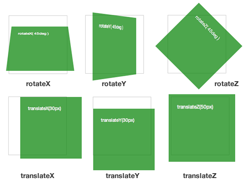
In CSS3, there are two ways to set the perspective of elements. Setting it with the perspective property sets it for the element in question as well as its children. Setting it as an attribute of the transform property will set it only for that specific transformation. Here is an example of both methods.

Perspective
The code for the above is as follows:
width: 150px;
height: 150px;
perspective: 600px;
}
#rotate-x .panel { transform: rotateX( 45deg ); }
#rotate-y .panel { transform: rotateY( 45deg ); }
#rotate-z .panel { transform: rotateZ( 45deg ); }
#translate-x .panel { transform: translateX(30px); }
#translate-y .panel { transform: translateY(30px); }
#translate-z .panel { transform: translateZ(50px); }
Note: In both the code samples above, I have only specified the main transform or perspective property to keep the code readable. In a real implementation, you will need to add the browser specific properties too (-webkit-transform, etc). You can get them by clicking on the working examples and viewing the source.
Conclusion
Three dimensional transitions are definitely a game changer and give us, web developers, a glimpse of a better world with the capability of doing smooth animations without resorting to Flash. In this article, I covered the transform properties. By themselves they can’t serve much, but when we are start to transform the elements around using the transition properties, then the fun begins.