SHARE
Facebook X Pinterest WhatsApp

How to Create a Hamburger Menu with HTML, CSS & jQuery

Written By
thumbnail
Diogo Souza
Diogo Souza
Nov 20, 2017

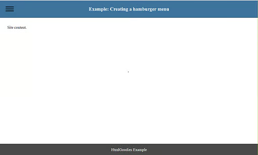
In this article, we will explain how to develop a burger-type menu that consists of a fixed button on the navigation bar that, when clicked, displays or hides the side menu containing a list of links, as we can see below:


Figure 1. Desktop browser view.

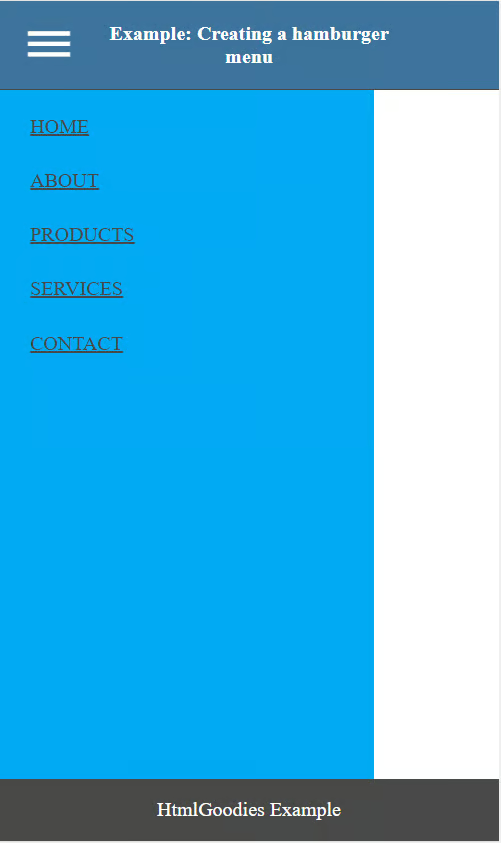
This menu is also responsive, so that on screens with width less than 360px it occupies the entire page, as follows:


Figure 2. Mobile browser view.

The Code

In the header of the page we refer to our stylesheet (style.css) and both stylesheet and Google file containing the fonts of Material Icons type. This fonts file is required for us to have the burger icon on the menu. This reference was made with the <link> tag as follows:

<link rel="stylesheet" type="text/css" href="css/style.css">
<link href="https://fonts.googleapis.com/icon?family=Material+Icons" rel="stylesheet">

In the body of the document, the main part is inside the <header> and <nav> tags, which contain the hamburger button and the menu links list, respectively, as we can see below:

<body>
	<header>
		<h1>Example: Creating a hamburger menu</h1>
		<div class="top">
			<a href="#" class="menu_icon"><i class="material-icons">dehaze</i></a>
		</div>
	</header>
	<nav class="menu">
		<a href="#" class="item_menu">home</a>
		<a href="#" class="item_menu">about</a>
		<a href="#" class="item_menu">products</a>
		<a href="#" class="item_menu">services</a>
		<a href="#" class="item_menu">contact</a>
	</nav>
	<main>
		Site content.
	</main>
	<footer>
		HtmlGoodies Example
	</footer>
	<script src="https://code.jquery.com/jquery-3.2.1.slim.min.js"></script>
	<script type="text/javascript" src="js/script.js"></script>

</body>

  • The button that contains the burger icon, that is used to display or hide the menu, is contained within lines 3 to 5. On line 4, we use the material-icons class of the Materialize and along with the code “dehaze” we indicate that the icon to be used is the burger one;
  • Between lines 5 and 10 we have the list of navigation links that will be displayed or hidden when the button is clicked.

In the style.css file, the most important section refers to the formatting of the navigation block, which is originally hidden. This is done by defining its horizontal position as negative (-300px), as we see below:

style* { margin: 0 auto; font-family: sans-serif; }

body { margin: 0 auto; }

header {
	height: 70px;
	background-color: #3e739d;
	border-bottom: 1px solid #494949;
	display: flex;
	align-items: center;
	justify-content: center;
}
header > h1 {
	width: calc(100% - 160px);
	text-align: center;
	font-size: 20px;
	color: white;
}
header > .top {
	position: absolute;
	left: 20px;
}
header > .top a.menu_icon i {
	color: #000;
	font-size: 40px;
	padding-top: 5px;
	transition: .2s ease;
}
header > .top a.menu_icon:hover i {
	color: #fff;
}
nav.menu {
	width: 300px;
	min-height: calc(100vh - 121px);
	background-color: #03a9f4;
	position: absolute;
	left: -300px;
	transition: .3s all;
}
nav.menu > a {
    display: block;
    padding: 5px;
    margin: 15px 0 0px 20px;
    color: #494949;
    text-transform: uppercase;
}
main {
	width: 100%;
	padding: 30px;
	box-sizing: border-box;
}
footer {
	height: 50px;
	background-color: #494949;
	color: #fff;
	display: flex;
	align-items: center;
	justify-content: center;
	bottom: 0;
	position: fixed;
	width: 100%;
}

.menu_show {
	left: 0!important;
}

@media screen and (max-width: 425px) {
	header h1 {
		font-size: 16px;
	}
}
@media screen and (max-width: 360px) {
	nav.menu {
		width: 100%;
		left: -100%; 
	}
}
  • In line 5 we define the position of the block as absolute, which allows us to fix it at a certain point that is defined in line 6 with the left property of value -300px;
  • In line 7 we define that when the properties of the element are changed, they will be animated for 3 seconds, causing the menu to smoothly appear.

Shortly after, we set the menu_show that causes the menu to appear when setting its horizontal position to 0. This class is added and removed via jQuery, and when this is done, the previously defined transition is triggered by doing the menu animation.

Finally, we have the media query that makes the menu occupy the whole page in screens up to 360px wide.

To activate the menu, displaying or hiding the navigation list when it is clicked, we use the jQuery library. Here is the click event of the button that contains the class top and jQuery’s “toggleClass” function, adding or removing the ” menu_show” class from the menu, making it visible or invisible, as follows:

$(document).ready(function() {
	$("body").on('click', '.top', function() {
		$("nav.menu").toggleClass("menu_show");
	});
});

And that’s it. Your menu is done in a few easy steps and working responsively.

About the Author

Diogo Souza works as Java Developer at Fulcrum Worldwide and has worked for companies such as Indra Company, Atlantic Institute and Ebix LA. He is also an Android trainer, speaker at events on Java and mobile world and a DevMedia consultant.

Recommended for you...

How to Make Your Site Voice Search Ready
Working with the CSS Image Gallery
HTML Geolocation: How to Find Someone’s Location
Octavia Anghel
Dec 10, 2018
Ten Basic Things Every Web Developer Should Know
Bradley Jones
Dec 3, 2018
HTML Goodies Logo

The original home of HTML tutorials. HTMLGoodies is a website dedicated to publishing tutorials that cover every aspect of being a web developer. We cover programming and web development tutorials on languages and technologies such as HTML, JavaScript, and CSS. In addition, our articles cover web frameworks like Angular and React.JS, as well as popular Content Management Systems (CMS) that include WordPress, Drupal, and Joomla. Website development platforms like Shopify, Squarespace, and Wix are also featured. Topics related to solid web design and Internet Marketing also find a home on HTMLGoodies, as we discuss UX/UI Design, Search Engine Optimization (SEO), and web dev best practices.

Property of TechnologyAdvice. © 2025 TechnologyAdvice. All Rights Reserved

Advertiser Disclosure: Some of the products that appear on this site are from companies from which TechnologyAdvice receives compensation. This compensation may impact how and where products appear on this site including, for example, the order in which they appear. TechnologyAdvice does not include all companies or all types of products available in the marketplace.