The CSS Image Gallery lets you create pure CSS images and slideshows with good image transition and fast, fluent navigation. So, through CSS, you can customize the design of your site. The gallery meets the latest web standards, meaning that images will always be displayed, even if users accessing the site do not use JavaScript.
An image gallery illustrates a very useful part of a website because it can present photos, art and different visual materials. This can work well for artists who want to display their photographic or art materials, for bloggers who want to share some of their photos, for those who travel around the world and want to share photos from a recent trip or other similar purposes. In this article, we’ll cover how to use CSS to create an image gallery for your site. It’s very simple, all you need is to use code snippets to set up the gallery. This can be done in two ways: regular and responsive. Thus, we can adjust the gallery according to the gadget that users use. For example, the gallery displays a four-column network when viewed on a computer or laptop, and when viewed on another device such as a mobile phone, the gallery will be placed on a single column. We also have a separate section for a responsive web design that includes sensitive size images and media queries.
There are some cases where you have one or two images on a page and maybe another image for the background, the photos representing an inseparable part of the web design. There are other cases where you have to create a site with a lot of images and create a gallery CSS image is the best solution for a great look for a full-sized image site. This Image Gallery CSS tutorial will teach you how to share your images using CSS. You will also effectively understand how to create a professional CSS image gallery.
Towards the end, we will explore the CSS gallery principles together. Therefore:
- Fundamentals: we can create a CSS image gallery to play a professional look at a multi-image site; along with HTML, CSS is an excellent tool for creating a crafted website gallery; we can do this by using our core CSS properties; a simple gallery can be used using width and height, CSS borders, padding, float and text-align properties, margins
- Creating a CSS Image Gallery: to shape a gallery of images, we must have the elements that we can apply style and use the HTML elements:
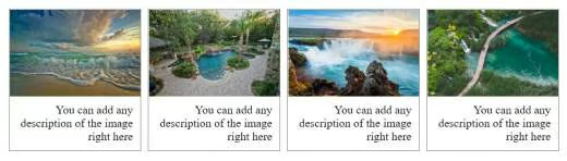
The example below, which contains an image gallery, is created with CSS. Therefore:
<html>
<head>
<style>
div.img {
    margin: 5px;
    border: 1px solid gray;
    float: left;
    width: 180px;
}
div.img:hover {
    border: 1px solid black;
}
div.img img {
    width: 100%;
    height: auto;
}
div.desc {
    padding: 10px;
    text-align: right;
}
</style>
</head>
<body>
<div class="img">
  <a target="_blank" href="https://cavenj.org/wp-content/uploads/2018/10/landscaping-panama-city-fl-inspirational-for-the-beauty-of-the-earth-mariannegreig-of-landscaping-panama-city-fl.jpg">
    <img src="https://cavenj.org/wp-content/uploads/2018/10/landscaping-panama-city-fl-inspirational-for-the-beauty-of-the-earth-mariannegreig-of-landscaping-panama-city-fl.jpg" alt="Ice cold" width="300" height="200">
  </a>
  <div class="desc">You can add any description of the image right here</div>
</div>
<div class="img">
  <a target="_blank" href="https://cavenj.org/wp-content/uploads/2018/10/small-landscape-ideas-inspirational-pools-and-landscaping-ideas-pool-landscaping-ideas-for-small-of-small-landscape-ideas.jpg">
    <img src="https://cavenj.org/wp-content/uploads/2018/10/small-landscape-ideas-inspirational-pools-and-landscaping-ideas-pool-landscaping-ideas-for-small-of-small-landscape-ideas.jpg" alt="Cold mountains" width="600" height="400">
  </a>
  <div class="desc">You can add any description of the image right here</div>
</div>
<div class="img">
  <a target="_blank" href="https://cavenj.org/wp-content/uploads/2018/10/next-to-nature-landscape-unique-most-beautiful-landscapes-in-europe-europe-s-best-destinations-of-next-to-nature-landscape.jpg">
    <img src="https://cavenj.org/wp-content/uploads/2018/10/next-to-nature-landscape-unique-most-beautiful-landscapes-in-europe-europe-s-best-destinations-of-next-to-nature-landscape.jpg" alt="Autumn lights" width="600" height="400">
  </a>
  <div class="desc">You can add any description of the image right here</div>
</div>
<div class="img">
  <a target="_blank" href="https://cavenj.org/wp-content/uploads/2018/10/master-of-landscape-architecture-fresh-master-of-landscape-architecture-new-in-2018-of-master-of-landscape-architecture.jpg">
    <img src="https://cavenj.org/wp-content/uploads/2018/10/master-of-landscape-architecture-fresh-master-of-landscape-architecture-new-in-2018-of-master-of-landscape-architecture.jpg" alt="Beautiful landscape" width="600" height="400">
  </a>
  <div class="desc">You can add any description of the image right here</div>
</div>
</body>
</html>