With the CSS multi-column layout, you can easily define multiple columns of text without too much effort. Newspapers, if they use long lines of text, would be hard to read. Just like with browser windows, windows that may be larger than certain books. That’s why I recommend you use CSS as it gives you the opportunity to display text in columns. Through the CSS3 columns, the browser decides when to close a column and start the next operation without any additional markup. Practically, you will retain the flexibility to change column width, height, and number without having to go back and Change the page mark.
For now, we summarize the division of the content into several columns, manipulating the gutters between them and the widths, as after, as the support widens, we can break the columns and include elements in several columns. In the following sections, we will explore together the properties that make up the CSS columns and learn how to create these effects on the website. Therefore, you will learn about the following multi-column properties: column-count, column-gap, column-rule-style, column-rule-width, column-rule-color, column-rule, column-span and column-width.
We’ll start with the first property, namely column-count. This property of the number of columns specifies the number of columns that an element should be divided. Here’s an example of how to divide the text into the <div> element into 5 columns.
<!DOCTYPE html>
<html>
<head>
<style>
.journal {
  column-count: 5;
  -webkit-column-count: 5;
  -moz-column-count: 5;
}
</style>
</head>
<body>
<p><b> Here's an example of how to divide the text into the element into 3 columns.</b></p>
<div class="journal">
Over the centuries, people have placed a wall around mastery. They have called it genius and have thought of it as inaccessible…But that wall is imaginary. This is the real secret: the brain that we possess… was designed to lead us to mastery. Robert Greene
</div>
</body>
</html>

The column-gap property shows the gap that is between the columns. We’ll give an example of a gap of 30 pixels between columns:
<!DOCTYPE html>
<html>
<head>
<style>
.journal {
  -moz-column-count: 3;
  -moz-column-gap: 30px;
  -webkit-column-count: 3;
  -webkit-column-gap: 30px;
  column-count: 3;
  column-gap: 30px;
}
</style>
</head>
<body>
<p><b>We'll give an example of a gap of 30 pixels between columns:</b> </p>
<div class="journal">
Everything passes away – suffering, pain, blood, hunger, pestilence. The sword will pass away too, but the stars will remain when the shadows of our presence and our deeds have vanished from the Earth. There is no man who does not know that. Why, then, will we not turn our eyes toward the stars? Why? Mikhail Bulgakov
</div>
</body>
</html>

The following property, the column-rule-style property specifies the style of the rule between columns. The column-rule-style property could have one of these values: none, hidden, dotted, dashed, solid, double, groove, ridge, inset, outset, initial, inherit.
Example:
<!DOCTYPE html>
<html>
<head>
<style>
.journal {
  -webkit-column-rule-style: solid;
  -webkit-column-count: 3;
  -webkit-column-gap: 30px;
  -moz-column-rule-style: solid;
  -moz-column-count: 3;
  -moz-column-gap: 30px;
  column-rule-style: solid;
  column-count: 3;
  column-gap: 30px;
}
</style>
</head>
<body>
<p><b>An example using the column-rule-style property.</b></p>
<div class="journal">
Part 1. Everybody needs beauty as well as bread, places to play in and pray in, where Nature may heal and cheer and give strength to body and soul alike. John Muir
Part 2. This natural beauty-hunger is made manifest in the little window-sill gardens of the poor, though perhaps only a geranium slip in a broken cup, as well as in the carefully tended rose and lily gardens of the rich, the thousands of spacious city parks and botanical gardens, and in our magnificent National parks – the Yellowstone, Yosemite, Sequoia, etc.
</div>
</body>
</html>


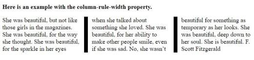
The column-rule-width property indicates the width of the rule between columns:
<!DOCTYPE html>
<html>
<head>
<style>
.journal {
  -webkit-column-count: 3;
  -webkit-column-gap: 30px;
  -webkit-column-rule-style: solid;
  -webkit-column-rule-width: 10px;
  -moz-column-count: 3;
  -moz-column-gap: 30px;
  -moz-column-rule-style: solid;
  -moz-column-rule-width: 10px;
  column-count: 3;
  column-gap: 30px;
  column-rule-style: solid;
  column-rule-width: 10px;
}
</style>
</head>
<body>
<p><b>Here is an example with the column-rule-width property.</b></p>
<div class="journal">
She was beautiful, but not like those girls in the magazines. She was beautiful, for the way she thought. She was beautiful, for the sparkle in her eyes when she talked about something she loved. She was beautiful, for her ability to make other people smile, even if she was sad. No, she wasn't beautiful for something as temporary as her looks. She was beautiful, deep down to her soul. She is beautiful. F. Scott Fitzgerald
</div>
</body>
</html>
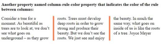
Another property named column-rule-color property that indicates the color of the rule between columns:
<!DOCTYPE html>
<html>
<head>
<style>
.journal {
  -webkit-column-rule-color: coral;
  -webkit-column-count: 3;
  -webkit-column-gap: 30px;
  -webkit-column-rule-style: solid;
  -webkit-column-rule-width: 6px;
  -moz-column-rule-color: coral;
  -moz-column-count: 3;
  -moz-column-gap: 30px;
  -moz-column-rule-style: solid;
  -moz-column-rule-width: 6px;
  column-rule-color: coral;
  column-count: 3;
  column-gap: 30px;
  column-rule-style: solid;
  column-rule-width: 6px;
}
</style>
</head>
<body>
<p><b>Another property named column-rule-color property that indicates the color of the rule between columns:</b></p>
<div class="journal">
Consider a tree for a moment. As beautiful as trees are to look at, we don't see what goes on underground – as they grow roots. Trees must develop deep roots in order to grow strong and produce their beauty. But we don't see the roots. We just see and enjoy the beauty. In much the same way, what goes on inside of us is like the roots of a tree. Joyce Meyer
</div>
</body>
</html>
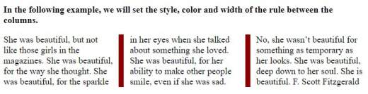
The column-rule property is the property for setting all the properties on the rule column. In the following example, we will set the style, color and width of the rule between the columns:
<!DOCTYPE html>
<html>
<head>
<style>
.journal {
  -webkit-column-rule: 9px solid DarkRed;
  -webkit-column-count: 3;
  -webkit-column-gap: 30px;
  -moz-column-rule: 9px solid DarkRed;
  -moz-column-count: 3;
  -moz-column-gap: 30px;
  column-rule: 9px solid DarkRed;
  column-count: 3;
  column-gap: 30px;
}
</style>
</head>
<body>
<p><b>In the following example, we will set the style, color and width of the rule between the columns.</b></p>
<div class="journal">
She was beautiful, but not like those girls in the magazines. She was beautiful, for the way she thought. She was beautiful, for the sparkle in her eyes when she talked about something she loved. She was beautiful, for her ability to make other people smile, even if she was sad. No, she wasn't beautiful for something as temporary as her looks. She was beautiful, deep down to her soul. She is beautiful. F. Scott Fitzgerald
</div>
</body>
</html>
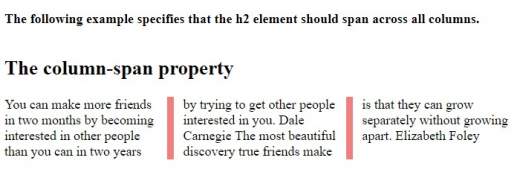
The column-span property indicates how many columns an element should span across. The following example specifies that the <h2> element should span across all columns:
<!DOCTYPE html>
<html>
<head>
<style>
.journal {
  -webkit-column-rule: 8px solid LightCoral;
  -webkit-column-count: 3;
  -webkit-column-gap: 30px;
  -moz-column-rule: 8px solid LightCoral;
  -moz-column-count: 3;
  -moz-column-gap: 30px;
  column-count: 3;
  column-gap: 30px;
  column-rule: 8px solid LightCoral;
}
h2 {
  -webkit-column-span: all;
  column-span: all;
}
</style>
</head>
<body>
<p><b>The following example specifies that the h2 element should span across all columns.</b></p>
<div class="journal">
<h2>The column-span property </h2>
You can make more friends in two months by becoming interested in other people than you can in two years by trying to get other people interested in you. Dale Carnegie
The most beautiful discovery true friends make is that they can grow separately without growing apart. Elizabeth Foley
</div>
</body>
</html>
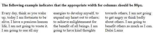
The column-width property indicates a suitable width suggested for columns. The following example indicates that the appropriate width for columns should be 80px :
<!DOCTYPE html>
<html>
<head>
<style>
.journal {
  -webkit-column-width: 80px;
  -webkit-column-count: 3;
  -webkit-column-width: 80px;
  -moz-column-count: 3;
  -moz-column-width: 80px;
  column-width: 80px;
  column-count: 3;
}
</style>
</head>
<body>
<p><b>The following example indicates that the appropriate width for columns should be 80px</b></p>
<div class="journal">
Every day, think as you wake up, today I am fortunate to be alive, I have a precious human life, I am not going to waste it. I am going to use all my energies to develop myself, to expand my heart out to others; to achieve enlightenment for the benefit of all beings. I am going to have kind thoughts towards others, I am not going to get angry or think badly about others. I am going to benefit others as much as I can. Dalai Lama
</div>
</body>
</html>
So, I’ve gone through all the essential parts needed to create more columns with CSS3, and this module works well in modern browsers. I hope you now have a fairly clear understanding of how to create CSS3 columns and that you will put into practice everything you learned here.


