


Introduction
CSS3 has introduced some very interesting features for 2D and 3D transformations. In this article, we will see some of the useful 2D features called transformation. CSS transform properties allow the developer to skew, scale, rotate and translate DOM elements using CSS. Earlier, we had to use images to achieve the same result. Personally I would continue to use images if you are performing transforms on text blocks because the anti-aliasing is quite poor on transformed text. That said, I am extremely glad to see that we can perform these operations of DOM elements. It is a matter of time before the browsers improve their font rendering algorithms and then we won’t need to use images for them.
Browser Compatibility
With all new CSS features, the questions that first comes to every developer’s mind are “Which browsers support this? Does IE support it?” More often than not, we get a mixed reply to this and finally convince ourselves that we can’t really use this feature since most of our users are on Internet Explorer or use browsers that don’t support the feature in question. Fortunately CSS transforms have been supported in most browsers from some time. More specifically, the follow browsers support CSS transforms:
- Internet Explorer 9+
- Firefox 3.5+
- Safari 3.2+
- Chrome 10.0+
Skew, rotation, scaling and translate are the building blocks of 2D transformations. By combining them, you can achieve any type of transformation you need. Although CSS3 allows you to apply these transformations to any DOM element, usually we would be using them on images and text blocks. We will first see how each of these transforms are applied to an element independently, then we will combine them.
Skew
In mathematics, skew lines are lines that are neither parallel nor intersecting. They are used to give a sense of perspective to an object. On the web, you can use skewing to give the perception of an object being in 3 dimensions. Here is the code to skew an element:
#skew {
-webkit-transform:skew(30deg);
-moz-transform:skew(30deg);
-o-transform:skew(30deg);
-ms-transform:skew(30deg);
transform:skew(30deg);
}
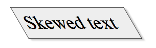
The syntax to skew is very simple, you have to specify the angle you want to skew the object in degrees. Since all browsers don’t implement the same property, we have to define it for each of the browsers individually. Here is a screenshot of how a skewed block of text looks.
Rotate
Rotation is probably a designer’s favorite transformation. If you have a few paragraphs of text and a photo to go with them, rotating the photo by a few degrees and letting the text wrap around the photo make the page look extremely pleasing to the eye. Until now, we had to rotate the image using an image editing tool and then upload it. The problem is that every time you want to change the angle of rotation, you have to fire up your image editor, rotate the image and re-export it. With CSS3, all you need to do is change the angle in the style sheet.
#rotate {
-webkit-transform:rotate(30deg);
-moz-transform:rotate(30deg);
-o-transform:rotate(30deg);
-ms-transform:rotate(30deg);
transform:rotate(30deg);
margin-top: 50px;
}
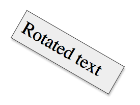
The rotation syntax is similar to the skew one so I don’t think it needs further explanation. Here is a couple of screenshots of rotated elements.
Scale
Scaling is another useful transformation when dealing with images. If you have a grid of images and when hovering over them, you want to enlarge the hovered image, we would usually make a grimace because we would need to write Javascript code that enlarges the image. However, with CSS3’s transform property, we can do it purely with CSS. You can in fact scale up or down any DOM element.
#scale {
-webkit-transform:scale(1,0.5);
-moz-transform:scale(1,0.5);
-o-transform:scale(1,0.5);
-ms-transform:scale(1,0.5);
transform:scale(1,0.5);
}
Scaling happens in two directions. Horizontal and vertical. The syntax of the scale transformation is the following:
transform: scale(
<
horizontal scaling
>
,
<
vertical scaling
>
)
The scaling value ranges of 1 being the the original dimension, values less than 1 will shrink the image and values grater than one will enlarge it. The above scaling property results in the following result:

Translate
The last of the building blocks of the 2D transforms is translate. It offsets the element horizontally and vertically. Here is a sample code for translating an element:
#translate {
-webkit-transform:translate(10px,20px);
-moz-transform:translate(10px,20px);
-o-transform:translate(10px,20px);
-ms-transform:translate(10px,20px);
transform:translate(10px,20px);
}
Similar to the scale syntax, the first value defines the horizontal translation and the second one is the vertical. You must be wondering how translate is different from positioning the element using top and left. Well, by itself it is rather useless, but if you use CSS transitions, then the translate property becomes very useful. We will see transitions in the next article.
Combining the Transformations
CSS transforms by themselves are useful, but their real power is unveiled when you combine them together and get remarkable results. Whenever you are combining them, remember that you have to define all the transforms in one line. Here is the sample syntax:
#rotate-skew-scale-translate {
transform:skew(30deg) scale(1.1,1.1) rotate(40deg) translate(10px, 20px);
}
Conclusion
This covers the CSS3 transform properties. As I mentioned above, these properties become really useful when combined together or combined with the CSS transition property which allows you to animate DOM elements using CSS. The next article will cover CSS transitions.
