


HTML elements are positioned the same way they are written in the HTML code, from top to bottom and left to right. Elements displayed this way are called static elements. CSS positioning allows you to position HTML elements anywhere you want on the screen. These can positioned in a fixed location or flow with the screen as the browser window size is adjusted. In this article, we will discuss the different ways to position such elements.
CSS has several properties to aid in positioning HTML elements. The three most common are, position, top, and left. These will be discussed in detail later, but we will touch on them briefly to help while explaining things below. Position is the property that tells the browser how to position the element. Top and left are position properties that tell the browser at what location to place the element and refers to the top-left corner of the box model.
Static Positioning
This is the default way that HTML elements are positioned. There is no top, bottom, left or right properties defined for the HTML elements.
Absolute Positioning
Absolute positioning places the HTML element on the page at a precise position. This takes the element out of the normal document flow. It will position it on top of any other HTML elements. The other static positioned HTML elements flow behind this element as if it was not there. If you look at the following example (figure 1), you will see that the blue box is overlapping the regular text. This is a <div> tag with absolute positioning. If you look at the code (figure 2), you will notice that the <div> tag comes after the <p> tags and is at the end of the document. This shows how the absolute positioning moves the HTML element to a precise place on the page.

Figure 1
Figure 2
One thing you need to keep in mind is that the position is relative to the parent element that has a position other than static. This means if you have nested HTML elements and these have positioning properties set, their positions may not be exactly where you placed them. If you look at figure 3, you will see that there are two boxes, a red one and a blue one (both are <div> tags). The blue box’s <div> tag is nested inside the red box’s <div> tag (figure 4). The red box is set with a top and left of 100px and the blue box is set with a top and left of 25px. Since the blue box is nested in the red box, the blue-box is placed relative to the red box.
Figure 3
Figure 4
Fixed Positioning
Have you ever been on a web site that had an image or text that stayed in one place even when you scrolled the page? That is fixed positioning. Fixed position elements will stay fixed in that same location regardless of the size of the browser window or if it is scrolled. Just like absolute positioned elements, fixed positioned elements are removed from the document flow and can overlap other elements. Unlike absolute positioned elements, these are not relative to parent elements.
Relative Positioning
Relative positioned elements are positioned relative to their position in the document flow. Let’s say you have five paragraphs on a page and you make the third one relative positioned, it will be moved down and left of the location it would have been in the document flow (provided you set the top and left properties). Also, even though the third paragraph was moved, its location in the document flow (size/width) is preserved as if it was still there.
In figure 5, the red box was set to relative positioning with a top and left of 25px, notice how it shifted, but the white space in between the paragraphs stayed the same as if the element was still there. This is because the relative position of the element in the document flow was shifted.
Figure 5
Also, as with absolute and fixed positioning, the relative positioned element will overlap the other elements. And its positioning works like the absolute positioning in the fact that nested elements are relative to the parent elements positioning.
How do you keep elements from overlapping?
When element positioning is specified, you can run into a situation of elements overlapping each other. The way to fix this is with the z-index property. This property allows you to specify how elements are stacked. By default, elements are stacked by their position in the HTML code. Elements with a higher z-index property number are stacked on top of elements with a lower number. This allows you to stack an almost unlimited number of elements.
If you look at figure 6, you will see the blue box is behind the red box. We want to move the blue box to the front. By setting the red boxes z-index to 1 and the blue boxes z-index to 2, we can accomplish this, see figure 7.
Figure 6
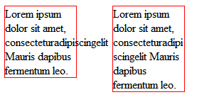
Figure 7
CSS Positioning Properties
Position
Syntax: position: absolute|fixed|relative|static
As we discussed above, this sets the position of the element. You must use top, bottom, left or right in order for this to work. The static value is the default value.
Top, Bottom, Left, Right
	Syntax: top <value>
	Syntax: bottom <value>
	Syntax: left <value>
	Syntax: right <value>
These four properties set the location position properties. These are used to set the location of the element on the page. You do not need to use all four properties when setting position, as only one is required to set position. The properties correspond to the edges of the element. The edge is set according to the edge of the containing object for absolute positioning or the normal position for relative positioning. When set to fixed positioning, the edge is set according to the page edge.
Clip
Syntax: clip: rect(<value>, <value>, <value>, <value>)
The clip property allows you to specify the dimensions of an element that are visible. The element is clipped into a shape and displayed. This only works on absolutely positioned elements. Basically, this creates a mask around an element and only displays the area defined in the properties.
Overflow
Syntax: overflow: visible|hidden|scroll|auto
The overflow property specifies how the element handles an overflow. This is used most of the time with the elements height property or block property, but can be used when top, bottom, left, and right are specified. It will work with any HTML element and does not required the position property to be set. This is used a lot with <div> tags to create a scrollable area on a page. The default value is visible. Let’s say we have a <div> tag with a height of 25px and we want to display text in it but it is too large. We get the garbled text you see in figure 8.
Figure 8
So what can be done? We can set the property to hidden. This will clip the text that overflows the element. You will notice in figure 9 that the text has been clipped. Also, notice you can still see part of the third line? This is because the clipping effect does not take into account line breaks or word wrapping.
Figure 9
So let’s add a scroll bar by setting the property to scroll. Now we have a scroll bar in figure 10. We can also set the value to auto. The difference between auto and scroll is that auto will only display the scroll bars if clipping is in effect. Using the scroll value will always display a scroll bar. This is good if you do not want your boxes to resize the content when the scroll bar becomes active.
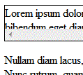
Figure 10
Conclusion
There are a lot of ways to position elements on the screen. You can do it through the normal flow of the document or by forcing the elements into a specific position. Either way, you will have greater control over your page layouts.
