


When it comes to positioning content on a page there is a handful properties to use that can help you manipulate the location of an element. This article will show you some examples containing different positioning element types using the CSS position property. To use positioning on an element, you must first declare its position property, which specifies the type of positioning method used for an element. Using the position property values, the elements are positioned using the top, bottom, left, and right properties. They also work differently depending on their position value.
There are five types of positioning values:
- static
- relative
- fixed
- absolute
- sticky
static
HTML elements are positioned static by default and the element is positioned according to the normal flow of the document; static positioned elements are not affected by the top, bottom, left, and right properties. An element with position: static; is not positioned in any special way
The CSS used for setting the position to static is:
position: static; Next is an example of using the static position value:
<!DOCTYPE html>
<html>
<head>
<style>
body {
  color: WHITE;
  font:  Helvetica;
  width: 420px;
}
.square-set,
.square {
  border-radius: 15px;
}
.square-set {
  background: darkgrey;
}
.square {
  position: static;
  background: Green;
  height: 70px;
  line-height: 40px;
  text-align: center;
  width: 90px;
}
</style>
</head>
<body>
<div class="square-set">
  <figure class="square square-1">SQUARE 1</figure>
  <figure class="square square-2">SQUARE 2</figure>
  <figure class="square square-3">SQUARE 3</figure>
  <figure class="square square-4">SQUARE 4</figure>
</div>
</body>
</html>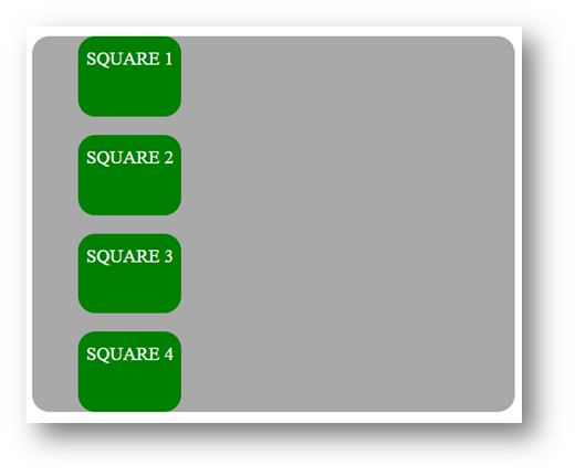
relative
The element is positioned according to the normal flow of the document is positioned relative to its normal position, and then offset relative to itself based on the values of top, right, bottom, and left. The offset does not affect the position of any other elements; thus, the space given for the element in the page layout is the same as if position were static. Setting the top, right, bottom, and left properties of a relatively-positioned element will cause it to be adjusted away from its normal position. Other content will not be adjusted to fit into any gap left by the element.
The CSS used for setting the position to relative is:
position: relative; The below example uses the relative position value:
<!DOCTYPE html>
<html>
<head>
<style>
body {
  color: white;
  font:   Helvetica ;
  width: 420px;
}
.square-set,
.square {
  border-radius: 15px;
}
.square-set {
  background: darkgrey;
}
.square {
  background: green;
  height: 70px;
  line-height: 40px;
  position: relative;
  text-align: center;
  width: 80px;
}
.square-1 {
    top: 15px;
  }
.square-2 {
  left: 50px;
}
.square-3 {
  bottom: -23px;
  right: 30px;
}
</style>
</head>
<body>
<div class="square-set">
  <figure class="square square-1">SQUARE 1</figure>
  <figure class="square square-2">SQUARE 2</figure>
  <figure class="square square-3">SQUARE 3</figure>
  <figure class="square square-4">SQUARE 4</figure>
</div>
</body>
</html>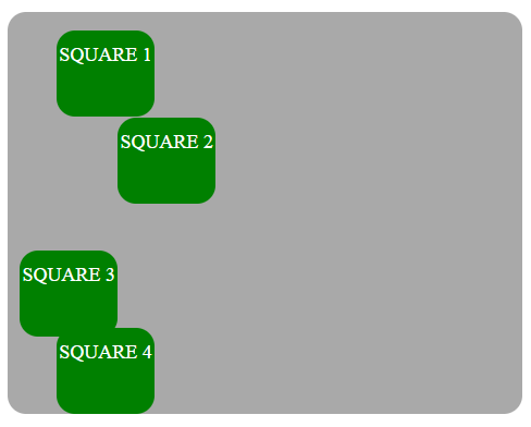
absolute
The element is removed from the normal document flow, and, in the page layout, no space is created for the element. The element is positioned relative to the closest positioned ancestor, if there is any; otherwise, it is placed relative to the initial containing block and its final position is determined by the values of top, right, bottom, and left.
The CSS used for setting the position to absolute is:
position: absolute; An element with position: absolute; is positioned relative to the closest positioned ancestor. If an absolute positioned element has no positioned ancestors, it uses the document body, and moves together with page scrolling. A “positioned” element is one whose position is anything but static.
Next example emphasizes the absolute position of elements:
<!DOCTYPE html>
<html>
<head>
<style>
.square-set {
  color: WHITE;
  background: darkgrey;
  height: 200px;
  position: relative;
  border-radius: 15px;
  font:  Helvetica ;
  width: 420px;
}
.square {
  background: green;
  height: 80px;
  position: absolute;
  width: 80px;
  border-radius: 15px;
  line-height: 60px;
}
.square-1 {
  top: 10%;
  left: 6%;
}
.square-2 {
  top: 5;
  right: -20px;
}
.square-3 {
  bottom: -15px;
  right: 40px;
}
.square-4 {
  bottom: 0;
}
</style>
</head>
<body>
<div class="square-set">
  <figure class="square square-1">SQUARE 1</figure>
  <figure class="square square-2">SQUARE 2</figure>
  <figure class="square square-3">SQUARE 3</figure>
  <figure class="square square-4">SQUARE 4</figure>
</div>
</body>
</html>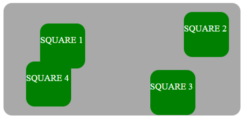
fixed
The element it is removed from the normal document flow, and, in the page layout, there is no space created for the element. The element is positioned relative to its initial containing block established by the viewport and its final position is determined by the values top, right, bottom, and left. This value always creates a new stacking context.
The CSS used for setting the position to fixed looks like this:
position: fixed; An element with position: fixed; is positioned relative to the viewport, which means it always remain in the same place even if the page is scrolled. The top, right, bottom, and left properties are used to position the element.
sticky
The element is positioned corresponding to the normal flow of the document, and then offset relative to its closest ascending block-level, including table-related elements, according to the values of top, right, bottom, and left. The offset does not affect the position of any other elements.
This value always creates a new stacking context. Note that a sticky element “sticks” to its nearest ancestor that has a “scrolling mechanism even if that ancestor isn’t the nearest actually scrolling ancestor.
The CSS used for setting the position to sticky is:
position: sticky;An element with position: sticky; is positioned based on the user’s scroll position and switches between relative and fixed position, depending on the scroll position.
Overlapping Elements
Overlapping elements on a webpage can be very useful in order to highlight, promoting, and focus on the important content on our webpages. It is very useful and a really valuable feature design practice to make the elements overlays on your website. When elements are positioned, they can overlap other elements, so to specify the order (what element should be placed in front of, or behind, the others) we should make use of the z-index property. An element with greater stack order is always in front of an element with a lower stack order. As a notice, the z-index property works only on positioned elements (position:absolute, position:relative, or position:fixed).
Next example shows how the z-index property works on different squares:
<!DOCTYPE html>
<html>
<head>
<style>
.square-set {
  color: white;
  background: purple;
  height: 170px;
  position: relative;
  border-radius: 15px;
  font:  Helvetica;
  width: 400px;
}
.square {
  background: orange;
  border: 4px solid goldenrod;
  position: absolute;
  border-radius: 15px;
  height: 80px;
  width: 80px;
}
.square-1 {
  position: relative;
  z-index: 1;
  border: dashed;
  height: 8em;
  margin-bottom: 1em;
  margin-top: 2em;
}
.square-2 {
  position: absolute;
  z-index: 2;
  background: black;
  width: 65%;
  left: 60px;
  top: 3em;
}
.square-3 {
  position: absolute;
  z-index: 3;
  background: lightgreen;
  width: 20%;
  left: 65%;
  top: -25px;
  height: 7em;
  opacity: 0.9;
}

</style>
</head>
<body>
<div class="square-set">
  <figure class="square square-1">SQUARE 1</figure>
  <figure class="square square-2">SQUARE 2</figure>
  <figure class="square square-3">SQUARE 3</figure>
</div>
</body>
</html>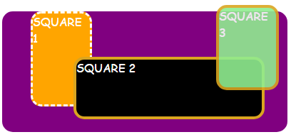
Positioning Text Over an Image
The below example overlays some text over an image using the CSS positioning values described above:
<!DOCTYPE html>
<html>
<head>
<style>
.module{
  background:
    linear-gradient{
      rgba(0, 4, 5, 0.6),
      rgba(2, 0, 3, 0.6)
    ),
    url(http://www.holtz.org/Library/Images/Slideshows/Gallery/Landscapes/43098-DSC_64xx_landscape-keltern-1_wall.jpg);
  background-size: cover;
  width: 600px;
  height: 400px;
  margin: 10px 0 0 10px;
  position: relative;
  float: left;
}
.mid h3 {
  font-family: Helvetica;
  font-weight: 900;
  color: white;
  text-transform: uppercase;
  margin: 0;
  position: absolute;
  top: 30%;
  left: 50%;
  font-size: 3rem;
  transform: translate(-50%, -50%);
}
</style>
</head>
<body>
<div class="module mid">
  <h3>Wild nature</h3>
</div>
</body>
</html>
Conclusion
In this article, we have described and given examples of the CSS positioning types and described how to overlap elements and add some text over an image.
