


5/8/13
By Emily P. Lewis
If you haven’t been living under a rock for the past year or so, you know that responsive Web design is one of the biggest trends these days. Introduced by Ethan Marcotte, the concept is simple: develop a site using methods that enable it to adapt and respond to different devices and resolutions.
When I first learned of this, I was instantly intrigued — particularly with the notion of using media queries, which I immediately applied to my own freelance site. I even wrote an article about the process: “Respond to Different Devices with CSS3 Media Queries.” (I strongly encourage you to read that article before delving further into this one. Go ahead. I’ll wait.)
As a result of my first media queries endeavor, I quickly realized I was missing a key part of the responsive design equation: flexibility.
Challenges with Fixed Widths
My freelance site is a fixed-width design, meaning all the width, margin and padding settings are specified in pixels. Traditionally, this has been my preference when building sites because it’s easier and faster for me.
But when writing the media queries for my fixed-width site, those easier and faster aspects rapidly disappeared. Why? Because with a fixed-width design, I found that I needed extremely detailed and verbose media queries to adjust for every single pixel value in my CSS. I was basically creating an entirely new layout for every potential resolution. Not easy. Not fast. Not fun.
Then I had the pleasure of listening to Mr. Marcotte speak at In Control 2011. He discussed responsive design as a theory and then dove into practicalities, like the fluid grid.
A Fluid and Flexible Formula
Fluid layouts are flexible. They resize with the browser window because width, margin and padding elements (even fonts and images) are specified with proportional values like percentages and ems. As the resolution changes, the layout adjusts proportionally. And all without a single media query.
This was when I had my “ah ha” moment for responsive design. If I had a layout based on proportional values, the fluid grid would do much of the heavy lifting I needed. My media queries wouldn’t have to include styles to, essentially, overwrite all of my width, margin and paddingvalues.
At the same time, I had an “uh oh” moment. Fluid grids require math to determine those proportional values. And I suck at math.
Fortunately, Ethan offered a formula for implementing fluid grids that looked simple enough (even for me):
target ÷ context = result
This formula takes the pixel-based width of an element on a page (the target) and divides it by the pixel-based width of its parent element (thecontext). The result becomes the proportional width for the target element.
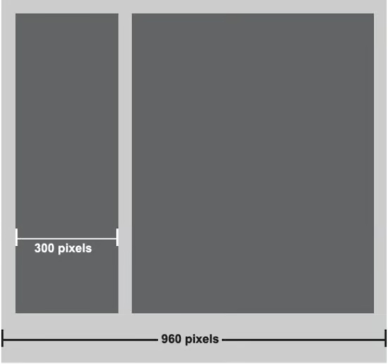
Figure 1 Example of Target (300px) and Context (960px)
In Figure 1, for example, one of the dark gray containers is 300 pixels wide and is contained in the 960-pixel light gray container. Here, the 960-pixel container is the context and the 300-pixel container is the target. And so our mathematical formula is:
Logo: 240 ÷ 940 = .255319148
Hosts: 436 ÷ 940 = .463829787
Social media links: 90 ÷ 940 = .09574468
I then translated each of these values to percentages, which I used in my CSS declarations.
Putting It to the Test
Though the formula seemed simple, I knew I had to apply it to a real-world site to know for certain. Fortunately, I’d recently joined the EE Podcast, and we were redesigning the site. When my cohost handed me her Photoshop comps, I made the commitment to develop the site with a flexible layout.
Proportional Widths
I began by documenting the widths for all my elements. (We didn’t follow a strict grid in the comp design, which I would recommend). As you can see in Figure 2, the main container for the header is 940 pixels, while the logo, hosts and social media links have their own pixel widths.

Figure 2 Pixel Widths for the Main Page and Header Elements
To determine the percentage values for the elements within the header, I followed Ethan’s formula, with the full header width of 940 pixels as my context.
Logo: 240 ÷ 940 = .255319148
Hosts: 436 ÷ 940 = .463829787
Social media links: 90 ÷ 940 = .09574468
Note that for all these values, I never round up the percentages. The exact value from the calculation needs to be used in the CSS. I didn’t have a single issue with these long percentages with any browser (including Internet Explorer).
Also note that after each of my percentage values I included comments that show the original pixel value (target) and context value, which is an invaluable development reference.
Get Your Context Right
The process of converting widthvalues to percentages is straightforward … as long as your math is correct. Or, more specifically, as long as you are referencing the correct context.
In a handful of situations, my calculations didn’t result in a percentage that displayed correctly. Every single time, this happened because I used the incorrect context value in the formula.
As Figure 3 suggests, the hosts information is a definition list (<dl>) containing elements (<dt>, <dd>, <a>, etc.) of varying widths.
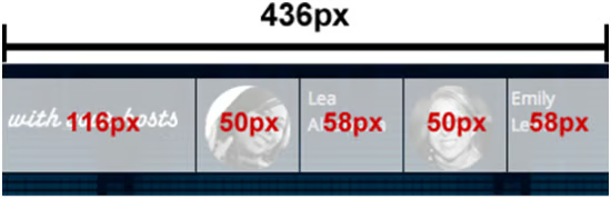
Figure 3 Pixel Widths for the <dl>
When I initially did my calculations, I used the 960-pixel header (see Figure 2) as my context. So, for the <dt> width, I calculated:
116 ÷ 960 = .120833333
Yet the resulting percentage (12.0833333%) didn’t deliver the dimensions I needed. Not until I realized that my context was different did I get the correct percentage values.
For the <dt>, the context is actually the parent <dl>, which is 436 pixels. This changed my calculation and gave me the percentage I needed:
116 ÷ 436 = .266055045
If you have problems with your percentage values, first check that you have the correct context value. You’ll save yourself headaches and time.
Proportional Fonts
The next step I took in making ee-podcast.com flexible was to use proportional fonts. This is essentially the same concept as proportional widths: instead of fixed pixel values, use a proportional value. With fonts, the proportional value of choice is ems.
The baseline font for most modern browsers is 16 pixels, so if you use the example above, where font size is 100%, your context for font sizes is 16px.
Proportional Padding and Margins
When it comes to padding and margins, the magical formula remains the same. Let’s consider the <dt> from the hosts information (Figure 3), which has a right margin of 20 pixels. To get a percentage value for this margin, I use the same formula as for width:
20 ÷ 436 = .04587159
For padding, it is the same.
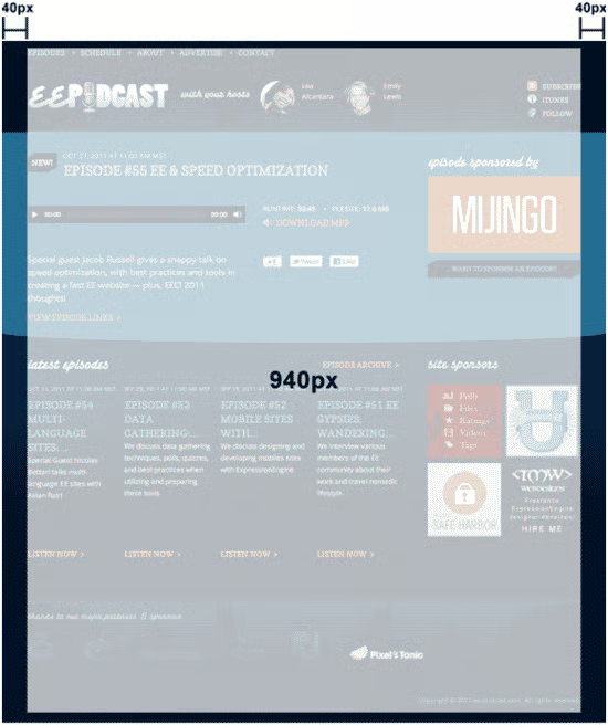
Figure 4 Horizontal Padding for Main Containers
A Special Exception
The formula for horizontal padding offers one special exception: the context is always the width of the element itself, regardless of the parent width.
For example, the social media links in the header (Figure 5) all have left padding of 25 pixels to allow for the display of icons.
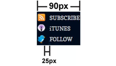
Figure 5 Context for Padding
The calculation to get a proportional value for this padding references only the element’s width (90px) for context, even though the parent element is 940px (Figure 2).
25 ÷ 90 = .277777777
This gives me the following percentage for my CSS padding:
#push li a {
padding-left: 27.7777777%; /* 25px / 90px */
}
Vertical Values
So far, we’ve dealt strictly with horizontal values—that is, left and right. However, with padding and margins you may be specifying values for both the x and y axes, which means your contexts change depending on whether you specify horizontal or vertical values.
As you’ve seen with all the calculations thus far, horizontal percentage values have a context of the parent width (padding being the exception). Vertical em values, meanwhile, have a context of the baseline font.
If you recall from the proportional font calculations, the baseline font for ee-podcast.com is 16px. So, if I want to specify vertical margin or padding, I use 16px as my context. Additionally, vertical values are specified in ems, not percentages — just like proportional font values.
The <header> and <footer> of the site each feature vertical padding: the <header>has top padding of 20px, while the <footer> has bottom padding of 20px. (See Figure 4.)
To determine the proportional values for these padding properties, I use the same formula and make sure to specify 16px (baseline font) as the context:
20 ÷ 16 = 1.25
Remember, when you are dealing with vertical values, you dealing with ems. That means the result of your formula does not have to be converted to a percentage. Simply list the exact value in your CSS:1. header, footer, .wrap {
2. padding: 1.25em 4.25531%; /* TB- 20px/16px | RL- 40px/940px*/
For this example, with padding values on each axis, I’m using the padding shorthand, and I’ve also modified my comments a little to provide a better development reference:
1. padding: 1.25em 4.25531%; /* TB- 20px/16px | RL- 40px/940px*/
In these comments, I’ve indicated the top and bottom calculation values with a TB- prefix, while the right and left values are prefixed with RL-. This is just my method for helping me remember the math I used to get these values. The format or syntax you use is up to you, but I strongly recommend you take time to comment your calculations.
Proportional Heights
In my general development, I don’t often specify height values. However, in a handful of instances on the EE Podcast site I had to. The <header>, for example, is 148px tall.
To get a proportional height value, I follow the same approach as for vertical values: context is the baseline font. So, the calculation for the <header> height is:
148 ÷ 16 = 9.25
This result, specified in ems, is what I add to my CSS:
1. header {
2. height: 9.25em; /*148px / 16px*/
3. padding: .4375em 4.25531% 0; /* T- 7px/16px | RL- 40px/ 940px */
4. }
Flexible Images
The EE Podcast site doesn’t have many inline images, and only a handful of background images. I have not yet decided what I want to do regarding images on the site. As such, I can’t detail my process for you.
A Unique Workflow
Now that I’ve discussed the process of making ee-podcast.com flexible, I should mention that I consider the site a personal project, so I work on it only as time allows. As such, the process I followed to achieve a flexible layout was iterative. I started with fixed widths and made the site flexible slowly, over about four months (and with much trepidation as I dove into the math of it all).
Why did I follow this process? Primarily because, as a flexible layout newbie, I wanted to first make sure I got the core layout in place (and working great across all browsers) with known pixel values. My logic was that I could slowly make things proportional and test along the way, knowing what my baseline (the fixed-width version) looked like.
Additionally, the site went live before I could finish this process. So, I divided it up into manageable chunks that I could test locally and release only after I assured myself the new values were doing what I expected.
I wouldn’t plan on following this workflow moving forward because it ultimately took more time (a lot more time). For my next flexible endeavor, I plan to write proportional values in the first place.
But this workflow did offer me a valuable lesson: you can mix fixed and proportional values in the same layout without any problems (provided your math is right). If you are like me and nervous about moving to proportional values, you can take the same baby steps I took: rely on your known pixel values and iteratively replace them with proportional ones.
What’s Next?
While a flexible layout does the majority of the heavy lifting for the site to resize and adjust with resolution, ee-podcast.com still needs media queries. Alas, a flexible and fluid layout doesn’t by itself deliver responsive design.
Take a look at Figure 6. This shows the fully flexible ee-podcast.com on a 24-inch desktop (1910 x 1200 resolution). Everything is proportional, but little things could be improved to provide a more comfortable viewing experience, such as tightening the spacing between the logo and hosts.

Figure 6 1910 x 1200 Resolution
Similarly, as Figure 7 shows, line lengths start to get unreadable at this resolution.

Figure 7 Line Lengths at 1910 x 1200 Resolution
At smaller resolutions, other issues arise. Figure 8 shows the site on an iPad (portrait orientation) at 1024 x 768 resolution. Proportional resizing helps, but there are issues with how floats are falling and alignments need to be addressed, along with lots of other little tweaks. As you can see, host information falls below the logo, and similar issues are evident with the Google Calendar and .ics download links.

Figure 8 1024 x 768 Portrait Orientation
On an iPhone (portrait, 320 x 480 resolution), the proportional resizing results in a horrible reading experience, as you can see in Figure 9.

Figure 9 320 x 480 Resolution
These issues are where media queries come into play, because they allow you to serve different styles to different devices and resolutions. (If you didn’t heed my advice earlier, go read “Respond to Different Devices with CSS3 Media Queries.”) In the meantime, I’ve set fixed-pixel values for both max-width and min-width on my main containers, which keeps the site constrained until I have free time to get those media queries in place.
1. header, footer, .wrap {2. … min-width: 940px; idth: 940px; }
Get in the Right Mindset
For me, the goal of developing the EE Podcast site flexibly is responsive design. And the goal of adding media queries to my freelance site was responsive design. In the end, I haven’t fully achieved my goal on either site. Yet. What I’ve learned, thanks to both experiences, is that neither approach on its own delivers responsive design.
Responsive design isn’t fluid grids. Responsive design isn’t media queries. Responsive Web design is a mindset, a workflow, a big picture concept that can’t (and shouldn’t) be compartmentalized into its parts. Especially when there are considerations like mobile-first design and new processes.
§ “Responsive Web Design” from A Book Apart
§ “I Love Responsive Design, But …” signers Workflow”
About the Author

Emily Lewis is a freelance web designer of the standardista variety, which means she gets geeky about things like semantic markup andCSS, usability and accessibility. As part of her ongoing quest to spread the good word about standards, she writes about web design on her blog, A Blog Not Limited, and is the author of Microformats Made Simple and a contributing author for the HTML5 Cookbook. She’s also a guest writer for Web Standards Sherpa, .net magazine and MIX Online.
In addition to loving all things web, Emily is passionate about community building and knowledge sharing. She co-founded and co-manages Webuquerque, the New Mexico Adobe User Group for Web Professionals, and is a co-host of the The ExpressionEngine Podcast. Emily also speaks at conferences and events all over the country, including SXSW, MIX, In Control, Voices That Matter, New Mexico Technology Council, InterLab and the University of New Mexico.
This article was reprinted with permission from Microsoft Corporation. This site does business with Microsoft Corporation.
