Web Design Goodies Critique #34
Published May 10, 2001 By Joe Burns, Ph.D.
Greetings, Fellow Designers
Every now and again I run into a site that basically stands
out from the rest. I don’t mean because of the designI
mean because of the content.
You like pigs? We got Pig stuff!
Now the obligatory release clause statement
>>>>The critique below represents the opinions of Joe Burns, Ph.D. Feel free to disagree, argue, forget, or accept anything he writes. The purpose of the critique is to offer examples that you may use, repair, or forget when it comes to your own Web site. As always, remember that there are simply no hard or fast rules to Web design. Any choice is the correct choice as long as that choice aids the user and adds to the site’s purpose for being.<<<<
Title: Pig Stuff
Author: Marty Piatkowski
http://pigstuff.com/
Load Time: 21 Seconds, 57kps modem, cleared cache, 5/03/01 10:12AM.
My Screen Size: 1024X768
Browsers Used: Internet Explorer 5.5 and Netscape Navigator
4.5
Concept: This little piggy went to marketto buy a
modem for his new DSL line in order to buy stuff online.
This site is dedicated to all things pig, specifically the
Pot-Bellied Pig. All pigs and pig lovers welcome. You
can buy just about anything dealing with, or related to
pigsincluding pigs themselves. Just as a site created
for an ASPCA might have an adopt-a-kitten program, this
site helps you adopt a pig. You can even donate money
to help pigs that have been saved from nasty owners.
Praise: This is a niche if I ever saw a niche. The audience
for this site won’t be relatively large, but I’ll bet it’ll be
loyal as anything. Usually I don’t like for a site to
basically offer everything. This site has a store, an
auction, screen savers, and an online game. I often tell
site managers to stay away from offering everything in
one fell swoop. I’m afraid I’ll have to go back on my
word on this one. This is a real niche and hereit works.
Offer it all. Those that love their pigs will love this site if
for nothing else but its content. I don’t even like pigs and
I liked the site. Here we go.
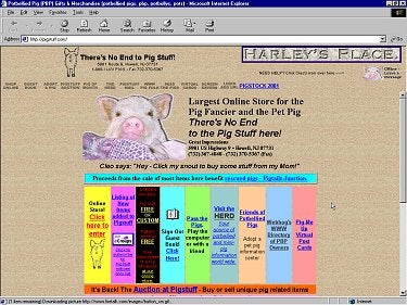
1. Concern: I’m going to hit a few little things right off
the bat. First off, I think the site has a fairly decent
background image. I like the placement of the pig face.
However, the site doesn’t have proper boundaries.
Notice how the top frame window spans the entire screen
and the bottom one doesn’t? It makes the letter T.
Suggestion: Lose the frame format. There is no reason
this site must be in a frame set. Move the logo and the
rollover links down and nestle that banner ad in there
under the most important stuff on the page. Right now
the site looks like two separate pages put together. Make
it one and keep the borders set in the bottom frame.